Scoring genre clarity...

DOPROS capsule

DOPROS

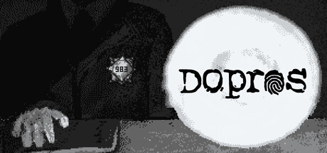
DOPROS is a narrative-driven Orwell-inspired interrogation experience. Will you break and give it all away, or will you try to get free? It's only up to you, but keep in mind, your every word may and will be used against you…

Visual NovelChoices MatterStory Rich
The Witches CircleTo be announced

DOPROS scores 73/100 — better than 56% of Steam capsules we've analysed (n=22,658).

Released To be announced · By The Witches Circle

Quick text summary

DOPROS scored 73/100 on Steam Analyzer — Good for a Steam capsule. Top priority fix: [composition] Reframe the figure to include the face or at least the top of the head, ensuring the human subject reads as a full silhouette rather than a headless torso at small size.

Capsule scores by dimension

  • Genre Clarity: 8/10 — Interrogation noir tone clear. The dithered pixel-art figure wearing a badge numbered 983, leaning over a table under a harsh spotlight, immediately reads as a police or interrogation setting. At tiny size the badge and desk posture still suggest authority and investigation. The noir monochrome treatment reinforces a tense, Orwell-style atmosphere that aligns well with narrative interrogation games.
  • Title Readability: 7/10 — Bold title readable at small. DOPROS is set in a large, high-contrast black serif font on a bright white circular spotlight background, giving strong legibility at full and small sizes. The fingerprint replacing the letter O is a clever branded touch that reads at medium size but becomes an indistinct blob at tiny size. No tagline or secondary text competes for attention, which keeps the hierarchy clean.
  • Contrast & Color: 8/10 — Strong monochrome value contrast. The stark white circular spotlight against the dark dithered pixel figure creates a high-contrast split that pops clearly against Steam's dark #1b2838 background. In grayscale the separation is excellent since the composition is already essentially grayscale. At tiny size the white circle anchor on the right side remains the dominant light shape and draws the eye effectively.
  • Uniqueness & Polish: 7/10 — Distinctive pixel noir aesthetic. The dithered pixel-art rendering style is deliberately lo-fi and cohesive, evoking Soviet-era aesthetic and classic point-and-click interrogation games, which feels intentional rather than cheap. The fingerprint-as-letter gimmick in the title is a smart thematic touch that communicates the game's subject matter. Compared to benchmark titles like Buckshot Roulette or Contraband Police, it holds its own with a distinctive visual identity, though the overall composition is somewhat simple.
  • Brand Consistency: 7/10 — Cohesive lo-fi noir identity. The monochrome dithered pixel-art style, badge motif, spotlight framing, and fingerprint logo element together form a recognizable visual signature. The internal rendering style is consistent with no clashing tones or mismatched asset quality. The stark black-and-white palette and Soviet interrogation room theme create a memorable identity cue that could be recognized across screenshots.
  • Composition: 7/10 — Clear split focal structure. The capsule is divided into a left dark subject zone and a right bright title zone, creating a natural left-to-right read from the authority figure to the game title. The circular spotlight doubles as a title background, unifying both halves. At small size the composition holds well, though the figure's face and top are cropped, which loses some human connection, and the left half becomes a murky dark mass that competes slightly with the title zone.

What works

  • High-contrast spotlight circle. The large white circular spotlight behind the title creates immediate contrast against Steam's dark background and anchors the title at all sizes.
  • Thematic badge and posture. The numbered police badge and hunched-over-table posture communicate the interrogation setting clearly without needing text.
  • Fingerprint letter gimmick. The fingerprint replacing the O in DOPROS is a clever thematic device that reinforces the interrogation subject matter and adds brand personality.
  • Deliberate lo-fi pixel dithering. The consistent dithered monochrome pixel art feels intentional and genre-appropriate rather than a budget shortcut, giving the capsule a distinctive visual identity.

What hurts the capsule

  • Figure face cropped out. The character's head is cut off at the top edge, losing human connection and making the left side read as an anonymous dark mass at tiny size.
  • Left half becomes murky at tiny size. The dithered dark figure blends into a flat gray-black texture at tiny thumbnail size, reducing the left half's visual contribution significantly.
  • Fingerprint detail lost at tiny size. The fingerprint inside the O collapses into an indistinct blob at 120x45, removing the one branded typographic element that makes the title distinctive.
  • No color signal for genre mood. Fully desaturated monochrome, while thematically valid, risks blending into other dark capsules in a quick scroll without any accent hue to catch the eye.

Priority fixes

  1. [composition] Reframe the figure to include the face or at least the top of the head, ensuring the human subject reads as a full silhouette rather than a headless torso at small size.
  2. [contrast_color] Add a subtle desaturated accent color, such as a cold blue or dim amber lamp glow, to differentiate from other monochrome capsules during quick scroll.
  3. [title_readability] Slightly increase the size of the fingerprint-O detail or simplify it to a bolder print that survives compression at tiny thumbnail size.
  4. [genre_clarity] Consider adding a very small secondary visual cue such as a document or handcuffs on the desk to reinforce the interrogation simulation genre for players unfamiliar with the title.

Store copy priority fixes

  1. [uniqueness] Replace 'Orwell-inspired interrogation experience' with a specific mechanical or thematic differentiator (e.g., 'an interrogation where your interrogator adapts to your lies in real-time' or 'a game where every answer locks you into a personality that determines your ending').
  2. [feature_communication] Expand the persuasion mini-games description to include concrete gameplay example (e.g., 'When accused, choose from three stance cards—deny, deflect, or confess—then match a timing prompt to succeed or fail under pressure').
  3. [audience_targeting] Add a sentence explicitly naming the intended player type (e.g., 'Perfect for fans of branching narratives and high-replayability choice games who want meaningful consequences') to help the right audience self-identify.
  4. [hook_strength] Clarify the stakes in the short description by replacing 'get free' with specific outcome (e.g., 'escape conviction' or 'preserve your secrets'), making the goal concrete rather than vague.

Related guides

Steam app ID: 4348260