Project Emerald scores 67/100 — better than 18% of RPG capsules (n=3,544).

Quick text summary

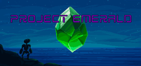
Project Emerald scored 67/100 on Steam Analyzer — Solid for a RPG capsule. Top priority fix: [title_readability] Increase title outline weight to 2–3px and ensure solid contrast against gradient; test at 120x45px to confirm legibility.

Capsule scores by dimension

  • Genre Clarity: 7/10 — Fantasy RPG premise clear. The glowing emerald crystal floating above a silhouetted character on a coastline effectively communicates a fantasy adventure setting with magical themes. At TINY size, the bright green gem and character pose remain readable and suggest an RPG with magical discovery. However, the turn-based JRPG specificity and complexity systems are not visually apparent from the capsule alone.
  • Title Readability: 6/10 — Magenta text struggles small. PROJECT EMERALD uses a magenta outlined sans-serif font positioned above the central gem with adequate letter spacing. At SMALL size the text remains legible against the blue gradient, but at TINY size the thin outline loses definition and letterforms blur together, reducing instant recognition. The title placement is safe from crop but the outline weight is insufficient for sub-100px viewing.
  • Contrast & Color: 8/10 — Strong value separation achieved. The bright lime-green crystal provides excellent luminance contrast against the dark teal-blue ocean and night sky gradient, creating a clear focal point that pops at all sizes. The silhouetted character in near-black at bottom-left maintains clean separation from the water gradient. Even at TINY size, the green jewel reads distinctly against the dark background, and grayscale conversion preserves the bright-to-dark value hierarchy effectively.
  • Uniqueness & Polish: 6/10 — Competent but familiar fantasy. The composition—glowing magical object hovering above an isolated explorer against a mystical seascape—follows common fantasy adventure visual language seen in top-tier releases like Viewfinder and COCOON. The rendering is clean with smooth gradients and professional lighting, but the scene lacks a distinctive mechanical or thematic hook that signals what makes Project Emerald's systems unique. The capsule communicates 'fantasy discovery' generically rather than 'turn-based JRPG with weakness-shield synergy gameplay.'
  • Brand Consistency: 6/10 — Minimal identity signals detected. The emerald crystal is the primary visual anchor and could serve as a recognizable brand element if repeated across store pages and marketing materials. The magenta-outline title aesthetic establishes a color pairing (magenta + green), but without reference to the six available store screenshots, internal consistency cannot be fully assessed. The silhouette style and gradient lighting suggest a cohesive art direction, though no iconic character, motif, or signature visual language emerges clearly from this capsule alone.
  • Composition: 7/10 — Clear hierarchy with safe layout. The emerald crystal anchors the center as the primary focal point, with the character silhouette positioned bottom-left to provide scale and narrative context without competing for attention. The title sits comfortably in the upper half with adequate safe margins and will not suffer from Steam cropping. At SMALL and TINY sizes, the eye naturally gravitates to the bright green gem, and the dark water foreground creates depth layering that maintains clarity even under blur.

What works

  • Luminous gem focal point. The bright lime-green emerald crystal commands immediate attention and maintains visual dominance across all viewing sizes, providing a memorable and distinct centerpiece.
  • Effective value contrast. The dark ocean-to-night-sky gradient creates strong separation from the glowing crystal and character silhouette, ensuring clear silhouettes even in grayscale and at thumbnail size.
  • Clean professional rendering. Smooth gradients, cohesive lighting, and intentional depth layering communicate polish and care in execution without clutter or visual noise.

What hurts the capsule

  • Title outline loses definition small. The thin magenta outline on PROJECT EMERALD becomes illegible and blurs together at TINY size, reducing immediate text recognition during quick scrolling.
  • Generic fantasy scene composition. The floating gem and explorer silhouette trope is familiar across many fantasy adventure capsules, lacking visual differentiation or a unique mechanical hook that signals gameplay distinctiveness.
  • Gameplay systems invisible visually. The turn-based JRPG mechanics, weakness-shield synergy, and strategic depth are completely absent from the capsule's visual language, missing an opportunity to communicate core appeal.

Priority fixes

  1. [title_readability] Increase title outline weight to 2–3px and ensure solid contrast against gradient; test at 120x45px to confirm legibility.
  2. [genre_clarity] Add a subtle UI element, shield icon, or secondary visual cue that hints at turn-based combat or strategic depth to differentiate from generic fantasy.
  3. [uniqueness_polish] Integrate an iconic motif or color accent from in-game UI (e.g., shield or attack indicator) to signal JRPG systems and create memorable brand identity.

Store copy priority fixes

  1. [hook_strength] Rewrite the short description to lead with H.A.R.C. the robotic chef and the clash between culinary artistry and cosmic apocalypse—this is your most differentiating hook and should appear first.
  2. [uniqueness] Add one concrete sentence explaining what the 'weakness and shield system' does mechanically and how it creates synergies (e.g., 'Shield types counter specific weaknesses, rewarding team composition planning').
  3. [feature_communication] Expand the crafting description to clarify how cooking ties to combat or exploration, since cooking by a robot chef is the game's narrative spine and should feel integral to gameplay.

Related guides

Steam app ID: 4351850 · Tags: RPG, 2.5D, Singleplayer, Party-Based RPG, Turn-Based Combat