Scoring genre clarity...

Hidden Folks capsule

Hidden Folks

Search for hidden folks in hand-drawn, interactive, miniature landscapes. Unfurl tent flaps, cut through bushes, slam doors, and poke some crocodiles! Rooooaaaarrrr!!!!!

$7.49Overwhelmingly Positive(14)
Hidden ObjectCasualHand-drawn
Hidden FolksFeb 15, 2017

Hidden Folks scores 73/100 — better than 56% of Steam capsules we've analysed (n=22,658).

Overwhelmingly Positive (14 reviews) · $7.49 · Released Feb 15, 2017 · By Hidden Folks

Quick text summary

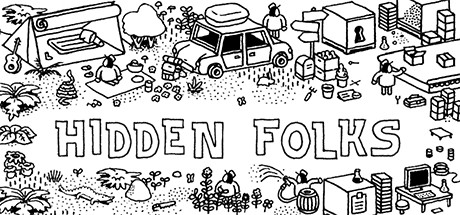
Hidden Folks scored 73/100 on Steam Analyzer — Good for a Steam capsule. Top priority fix: [contrast_color] Add a subtle warm or colored background wash or vignette border to the capsule so the white illustration separates cleanly from the Steam dark #1b2838 background during quick scroll.

Capsule scores by dimension

  • Genre Clarity: 8/10 — Hidden object game clearly implied. The dense, hand-drawn scene packed with tiny figures, objects, and interactive elements immediately reads as a hidden object or seek-and-find game. The isometric-style crowd scene with dozens of small characters is a strong genre signal recognizable even at small sizes. At tiny size the visual density still communicates 'find things in a crowd' even if individual elements become unreadable.
  • Title Readability: 7/10 — Bold hand-drawn title reads well. The title 'HIDDEN FOLKS' is rendered in large, chunky hand-drawn block letters positioned in a relatively clear white zone of the composition, giving good contrast against the surrounding linework. At small capsule size the two-line stacked title still reads clearly due to the thick letterforms. At tiny thumbnail size the letters become very small but the bold weight and white fill against the surrounding black linework keeps them marginally readable, though it gets close to collapsing.
  • Contrast & Color: 5/10 — Monochrome struggles on dark background. The entirely black-and-white illustration style creates an immediate challenge against Steam's dark #1b2838 background, as the black outlines on the image edges bleed into the dark UI. The white background of the artwork does provide internal contrast, but the capsule as a whole lacks color saturation or value pop to grab attention during a quick scroll. In grayscale the silhouette separation is fine within the image, but the image itself doesn't separate strongly from the Steam dark background context.
  • Uniqueness & Polish: 8/10 — Distinctive hand-drawn monochrome style. The entirely hand-drawn black-and-white aesthetic is immediately distinctive and clearly sets the game apart from genre peers who rely on painted or 3D rendered art. The dense, charming linework communicates craft and intentionality rather than a cheap asset-flip look. The visual style is a genuine unique selling point and directly communicates the game's core mechanic of searching through intricate hand-drawn scenes.
  • Brand Consistency: 9/10 — Iconic monochrome identity, instantly recognizable. The black-and-white hand-drawn aesthetic is the game's signature identity and is applied completely consistently across the capsule with no competing visual styles. The dense miniature scene format, simple rounded character designs, and flat ink illustration style create a memorable and cohesive brand identity that would be immediately recognizable across multiple thumbnails. The FTV van, tent, car, and varied mini-scenes reinforce the 'interactive diorama' world feel that is central to the game's identity.
  • Composition: 7/10 — Title centered, scene fills frame well. The title is placed in a relatively open white area slightly left of center, giving it breathing room against the busy surrounding scene. The composition spreads interest across the full horizontal header format effectively, with varied scene types creating natural left-to-right eye movement. At small and tiny sizes the overall scene reads as a unified dense illustration rather than chaos, though there is no single dominant focal point competing for attention with the title, which is appropriate for the genre.

What works

  • Unique monochrome art style. The fully hand-drawn black-and-white aesthetic is instantly distinctive among casual indie capsules and directly communicates the game's core visual identity.
  • Genre signaling through density. The packed scene of tiny figures and objects immediately reads as a seek-and-find hidden object game without requiring any extra text or iconography.
  • Strong brand cohesion. The consistent ink illustration style with rounded minimalist characters creates a recognizable and memorable visual identity that holds together as a complete design.
  • Title placement in clear zone. Positioning the bold stacked title in a relatively open white region of the scene ensures it stands out against the surrounding detailed linework.

What hurts the capsule

  • Monochrome clashes with Steam dark background. The black-and-white art style does not pop against #1b2838 and risks blending into the dark UI frame during quick scroll browsing.
  • No color to guide the eye. Without any color accents or value hierarchy, the capsule has no single element that commands immediate visual priority at tiny thumbnail size.
  • Tiny size title borderline. At 120x45 the hand-drawn letterforms of the title shrink to near-illegibility, and the decorative style adds extra risk of collapsing at that size.
  • No clear single focal hero. While genre-appropriate, the uniformly distributed scene means there is no dominant character or element to anchor the composition at tiny sizes.

Priority fixes

  1. [contrast_color] Add a subtle warm or colored background wash or vignette border to the capsule so the white illustration separates cleanly from the Steam dark #1b2838 background during quick scroll.
  2. [title_readability] Increase the title letter size slightly or add a very thin drop shadow or halo behind the letters to ensure 'HIDDEN FOLKS' survives at 120x45 thumbnail size.
  3. [composition] Introduce one slightly emphasized character or focal element near the title to give tiny-size viewers an anchor point beyond the uniform scene density.
  4. [contrast_color] Consider adding a minimal spot color accent to one or two key scene elements to create a value hierarchy that draws the eye in quick-scroll conditions.

Store copy priority fixes

  1. [feature_communication] Replace the repeated opening with a brief second hook about the game's visual style or social/family-friendly nature; e.g., 'Perfect for playing solo or with friends watching, Hidden Folks is designed to be stress-free and endlessly fun.'
  2. [audience_targeting] Add a sentence clarifying playtime expectations and audience, such as 'Whether you're looking for a quick puzzle break or hours of relaxed exploration, this game scales to your pace—no timers, no pressure.'
  3. [uniqueness] Emphasize what makes these interactions special; expand from 'interaction count' to a concrete example: 'Every object responds to your touch—pull levers, flip switches, interact with a living world in ways that surprise and delight.'

Related guides

Steam app ID: 435400