Scoring genre clarity...

FINAL FANTASY VII REVELATION capsule

FINAL FANTASY VII REVELATION

The final battle to decide the fate of the world has begun. Take to the skies, chart your course, and stand with your companions against Sephiroth one last time. A vast planet awaits. Everything leads here.

RPGActionAdventure
Square Enix2027

FINAL FANTASY VII REVELATION scores 87/100 — better than 99% of RPG capsules (n=3,703).

Released 2027 · By Square Enix

Quick text summary

FINAL FANTASY VII REVELATION scored 87/100 on Steam Analyzer — Excellent for a RPG capsule. Top priority fix: [uniqueness_polish] Consider adding a subtle silhouette of Sephiroth's figure or his wing motif in the background to reinforce the antagonist and raise emotional stakes without cluttering the focal point.

Capsule scores by dimension

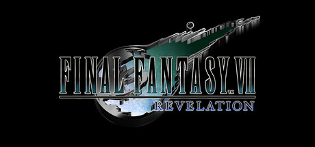
  • Genre Clarity: 8/10 — Strong RPG/Action fantasy identity. The airship with glowing engine core and the ornate fantasy typography immediately signal a classic JRPG with high-stakes action. At TINY size, the silhouette of the airship remains readable and the game's scale and adventure tone come through clearly. The composition strongly implies an epic, world-threatening narrative typical of major fantasy RPGs.
  • Title Readability: 9/10 — Excellent legibility across all sizes. The title uses a strong serif-outlined font with excellent letter spacing and internal shading that maintains clarity even at TINY size. The word 'REVELATION' sits below in smaller but equally readable script. The metallic outline and crisp contrast against the black background ensure the text does not collapse when scaled down or during quick scroll.
  • Contrast & Color: 9/10 — Striking value separation and silhouette. The pale blue-white airship and cyan accents create strong luminous contrast against the pure black background, making the focal point instantly distinct. Metallic silver text adds further separation through value and reflection, while the dark engine glow adds depth without muddying readability. At TINY size, the bright airship core and text remain clearly separated from the background in grayscale.
  • Uniqueness & Polish: 8/10 — Premium craftsmanship, iconic imagery. The design leverages the instantly recognizable Highwind airship as the central visual anchor, avoiding generic fantasy imagery and instead delivering a specific, beloved asset from the franchise. The metallic text treatment, precise shading on the ship, and atmospheric lighting all signal high-quality production. The composition feels intentional and polished rather than templated or hastily assembled.
  • Brand Consistency: 9/10 — Strong franchise identity and coherent style. The Highwind airship is an iconic, instantly recognizable symbol of Final Fantasy VII, creating immediate brand reinforcement. The metallic serif typography and cool blue-silver palette align with the game's established visual language and the 'Revelation' subtitle maintains narrative continuity. The rendering style and atmospheric lighting are consistent with how the franchise presents its most important moments.
  • Composition: 9/10 — Excellent focal hierarchy and balance. The airship occupies the upper-right quadrant with clear visual dominance, while the title occupies the center-left in a complementary layout that avoids crowding. The black background provides ample safe margin and breathing room, with no critical elements pushed to dangerous edges. The focal point (airship) remains unmistakably primary at all sizes, and the supporting text guides rather than competes for attention.

What works

  • Iconic airship anchor. The Highwind is instantly recognizable to franchise fans and communicates both scale and adventure without needing explanation.
  • Text clarity at scale. Metallic outlined serif typography maintains perfect readability from full header down to tiny thumbnail, with excellent letter spacing and outline thickness.
  • Value contrast mastery. Luminous pale ship and text against pure black background create exceptional silhouette separation that survives grayscale and quick-scroll conditions.
  • Premium visual polish. Shading, lighting, and atmospheric effects on the airship convey high production value and intentional craft rather than generic template assembly.

What hurts the capsule

  • Limited action or character presence. The capsule relies entirely on the airship and text; no human characters, party members, or antagonist (Sephiroth) are visible, which may feel less visceral than competitor capsules featuring confrontational character imagery.
  • Subtitle scale at tiny sizes. While readable, 'REVELATION' becomes quite small at TINY capsule size and may require closer attention compared to single-word titles used by some benchmark competitors.

Priority fixes

  1. [uniqueness_polish] Consider adding a subtle silhouette of Sephiroth's figure or his wing motif in the background to reinforce the antagonist and raise emotional stakes without cluttering the focal point.
  2. [composition] Ensure the airship engine glow remains visible and prominent in the 120x45 thumbnail preview to maintain focal clarity at extreme reduction.

Related guides

Steam app ID: 4354570 · Tags: RPG, Action, Adventure, Action RPG, JRPG