Quick text summary
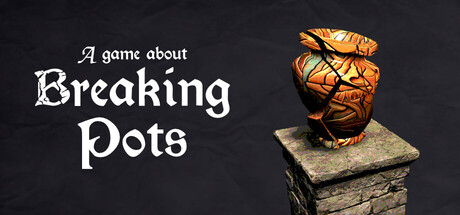
A Game About Breaking Pots scored 72/100 on Steam Analyzer — Good for a Short capsule. Top priority fix: [uniqueness_polish] Add a subtle visual signature such as a distinctive texture treatment on the pot (mosaic pattern, rune inscriptions) or a unique lighting signature that creates immediate brand recognition.
Capsule scores by dimension
- Genre Clarity: 7/10 — Clear casual adventure hook. The golden pot as a central 3D object immediately communicates the core mechanic of pot-breaking, supported by the tagline 'A game about Breaking Pots' which explicitly states the premise. At TINY size, the warm glowing pot is visually distinct and reads as an interactive object, though the medieval setting is subtly indicated by the stone pedestal rather than overt environmental cues. The casual, relaxing tone is less obvious at thumbnail scale, requiring the text to reinforce genre positioning.
- Title Readability: 8/10 — Clean serif typography, strong contrast. The white serif 'Breaking Pots' text is well-spaced and maintains excellent contrast against the dark background, with an italic serif style that feels intentional and readable even at SMALL size. The tagline 'A game about' is smaller but legible at full size, though it becomes difficult to parse at TINY scale due to reduced letter size and stroke weight. The overall composition places the title on the left third with minimal background noise, supporting legibility across all viewing contexts.
- Contrast & Color: 8/10 — Strong warm-cold value separation. The golden-orange pot with heavy shadow strokes creates bold value contrast against the dark navy-charcoal background, making it pop immediately on Steam's #1b2838 background. The white serif text reinforces this high-contrast strategy without competing with the object's visual weight. At TINY size, the pot remains the clear focal point due to saturation and luminance separation, though the stone pedestal loses detail and reads as a simplified silhouette, which is actually beneficial for clarity.
- Uniqueness & Polish: 6/10 — Competent but familiar casual aesthetic. The 3D rendered pot with dynamic lighting and the hand-drawn italic serif typography show craft and intentionality, but the overall presentation feels within the expected range for indie casual games rather than distinctly memorable. The concept of breaking pots is clear and the visual execution is clean, yet comparable titles like Tiny Glade and Moonstone Island offer more complex or visually striking art directions. The capsule communicates the game's premise effectively without introducing a signature visual hook or unexpected artistic flourish that would elevate it above competent baseline work.
- Brand Consistency: 6/10 — Readable identity without iconic markers. The serif typography and warm-on-dark color palette are internally consistent and suit the relaxing medieval theme, but there are no distinctive brand motifs, recurring symbols, or signature visual language that would make this capsule immediately recognizable in future marketing. The golden pot is the closest thing to an iconic element, yet it functions primarily as a mechanic illustration rather than a branded symbol. Without access to in-game visuals, the capsule reads as visually coherent but generic within the casual indie space, with no clear differentiators that signal a unique identity.
- Composition: 8/10 — Balanced focal hierarchy, safe margins. The layout divides the canvas into text on the left (title and tagline) and the 3D pot object on the right, creating a natural left-to-right reading flow with clear visual hierarchy. The pot sits on a pedestal centered in the right half, with adequate spacing from edges and no clipping risks across common Steam crop scenarios. At SMALL size, both text and pot remain readable with clear separation; at TINY size, the pot dominates as the primary focal point while text remains legible, maintaining compositional integrity. The background texture is subtle and does not distract from the foreground elements.
What works
- Strong value contrast. The warm golden pot pops decisively against the cool dark background, ensuring the primary object remains visually dominant and readable at all sizes.
- Clear mechanical communication. The golden pot with visible cracks and the explicit 'Breaking Pots' text immediately convey the core gameplay loop without ambiguity.
- Readable typography at scale. The serif italic title font maintains legibility at SMALL size with good spacing and outline clarity, supporting quick recognition during Steam browsing.
What hurts the capsule
- Generic casual aesthetic. The overall visual presentation lacks distinctive stylistic markers or memorable visual hooks that would differentiate it from other mid-tier indie casual titles.
- No iconic brand symbol. While the pot communicates the mechanic, it does not function as a recognizable brand asset that would carry across future marketing or sequels.
- Tagline legibility at tiny size. The secondary text 'A game about' becomes difficult to parse at TINY thumbnail scale due to reduced font size and weight, potentially losing atmospheric context at quick glance.
Priority fixes
- [uniqueness_polish] Add a subtle visual signature such as a distinctive texture treatment on the pot (mosaic pattern, rune inscriptions) or a unique lighting signature that creates immediate brand recognition.
- [title_readability] Consider increasing the tagline's font size or weight slightly, or repositioning it to a more prominent area to ensure it remains readable at TINY size without sacrificing the title hierarchy.
- [brand_consistency] Develop a recognizable color or style motif (e.g., consistent warm golden accent color, distinctive serif usage) that can carry across future marketing and in-game imagery for brand cohesion.
Store copy priority fixes
- [uniqueness] Elevate the 'playful behaviors' concept earlier: change 'Some pots might behave a little… different' to 'Each pot has its own personality—some bounce, teleport, fly, or clone themselves—turning the castle into a dynamic puzzle of destruction.' This immediately differentiates from generic pot-breaking games.
- [hook_strength] Replace the redundant opening of the detailed description with a sensory hook: 'Feel the weight of each swing and the satisfying crack of porcelain. Every pot breaks differently, and every corner of this castle hides something new to destroy.' This avoids repetition and deepens engagement.
- [audience_targeting] Add explicit comfort signals after 'A short, relaxing first-person experience': 'No combat, no timers, no pressure—just you, your sword, and 300+ pots waiting to be discovered at your own pace.' This clarifies the experience for casual players.
- [feature_communication] Reorder the key features to lead with 'Pots with playful behaviors' or create a new bullet: 'Dynamic, unpredictable pots that bounce, teleport, and clone—each one a surprise.' Moving this earlier emphasizes what makes this game unique.
Related guides
Steam app ID: 4355090 · Tags: Short, Exploration, Walking Simulator, Relaxing, Hidden Object