Scoring genre clarity...

Swaddle capsule

Swaddle

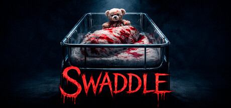
You are a young intern in the maternity ward, and your job is to watch over the newborns on the second floor every night. But something very hungry wants to reach these children and devour them. Stop it immediately. Save the babies.

$3.24Positive(12)
HorrorDarkAtmospheric
REVVALUTION Studio, RomoollApr 23, 2026

Swaddle scores 77/100 — better than 87% of Horror capsules (n=3,118).

Positive (12 reviews) · $3.24 · Released Apr 23, 2026 · By REVVALUTION Studio

Quick text summary

Swaddle scored 77/100 on Steam Analyzer — Good for a Horror capsule. Top priority fix: [genre_clarity] Subtly integrate a visual cue that hints at the simulation management aspect (e.g., a faint clipboard, ward window, or interface element) to signal this is simulation-adjacent rather than pure horror.

Capsule scores by dimension

  • Genre Clarity: 7/10 — Horror survival with disturbing setup. The teddy bear in a meat-filled container with dripping red text immediately signals horror and body horror elements, clearly distinguishing this from typical wholesome simulation games. At tiny size, the grotesque imagery and red dripping text still register as dark/horror, though the specific 'protect babies from monster' premise is not self-evident without context. The visual theme aligns with indie horror rather than mundane simulation.
  • Title Readability: 8/10 — Strong red title with excellent contrast. SWADDLE is rendered in bold, bright red with a dripping gore effect that stands out dramatically against the dark blue-black background. The letterforms remain fully legible at small and tiny sizes due to weight and saturation contrast. The dripping detail adds thematic cohesion without compromising readability, and the title sits in a clean lower zone away from the competing visual elements above.
  • Contrast & Color: 8/10 — High value separation, strong silhouettes. The bright red title and the teddy bear's warm tan-brown tones create clear separation from the dark teal-blue background and black container. The red dripping effect further enhances the macabre contrast. At tiny size, the silhouette of the bear and the red text remain clearly readable despite small dimensions, and grayscale conversion maintains strong value differentiation between subject and background.
  • Uniqueness & Polish: 8/10 — Distinctive horror-comedy subversion. The juxtaposition of an innocent teddy bear with grotesque meat and gore creates a memorable, unsettling visual hook that subverts expectations and stands out from typical simulation game packaging. The cinematic lighting, tray geometry, and color grading suggest intentional art direction rather than asset recycling. This visual concept directly supports the game's core premise of protecting innocence from horror.
  • Brand Consistency: 7/10 — Cohesive dark comedy horror identity. The capsule establishes a consistent tone of dark, surreal body horror with comedic undertones through the juxtaposition of cute and grotesque elements. The warm-cool color palette and cinematic staging appear consistent with indie horror-comedy aesthetic and likely align with in-game visual style based on the description. However, without viewing all 10 store screenshots, internal brand iconography cannot be fully confirmed.
  • Composition: 8/10 — Clear focal point with balanced hierarchy. The teddy bear in the center of the metal tray forms an unambiguous primary focal point, with the overhead lighting guiding attention downward. The title anchors the lower portion without competing with the central subject. Safe margins are respected, and the composition remains readable at all three stress-test sizes; the stacked arrangement (bear above, title below) maintains clarity even at tiny scale without edge-hugging or unsafe cropping concerns.

What works

  • Bold red title with dripping gore effect. The large, saturated red letterforms remain readable at tiny size and thematically reinforce the horror premise through the dripping blood detail.
  • Strong central focal point. The teddy bear positioned in the metal tray creates an unambiguous primary subject that survives the tiny thumbnail stress test.
  • High contrast against dark background. The warm bear and bright red title pop clearly against the cool dark blue-black base, ensuring silhouette separation even in grayscale.
  • Memorable subversive visual hook. The juxtaposition of innocent teddy bear with grotesque meat creates a distinctive, unsettling concept that communicates the game's dark tone and horror-comedy genre.

What hurts the capsule

  • Dark upper region lacks clear identity cue. The moody teal-blue background contributes atmosphere but contains no recognizable brand symbol or recurring visual motif that would aid later recognition.
  • Simulation genre signals are minimal. While the horror elements are clear, there is no visual indication of the 'maternity ward intern' or management simulation aspects; the capsule communicates pure horror rather than simulation-horror hybrid.
  • Specific monster threat is not visualized. The capsule shows the babies (teddy bear) in danger but does not depict the 'very hungry' creature seeking them, which is the core antagonist and driving conflict.

Priority fixes

  1. [genre_clarity] Subtly integrate a visual cue that hints at the simulation management aspect (e.g., a faint clipboard, ward window, or interface element) to signal this is simulation-adjacent rather than pure horror.
  2. [uniqueness_polish] Consider adding a faint silhouette or shadow hint of the creature/monster reaching toward the bear to strengthen the central conflict and make the threat more explicit.
  3. [brand_consistency] Introduce a subtle recurring visual motif (e.g., a specific color accent, symbol, or UI style) that could appear consistently across marketing materials to build brand recognition.

Store copy priority fixes

  1. [feature_communication] Replace 'A great song playing on the radio, meant to calm you down. But for how long?' with a concrete explanation of how many shifts/nights exist and whether player choices unlock different endings or story branches beyond the two stated outcomes.
  2. [uniqueness] Add a 1-2 sentence statement that explicitly differentiates this game from other hospital/asylum horror titles—e.g., 'Unlike traditional horror games, you are not fighting a monster—you are protecting the vulnerable while managing institutional apathy' to deepen the emotional hook.
  3. [tone_match] Reduce capitalization of IT and EVIL to lowercase; replace with more atmospheric language like 'the presence' or 'the hunger' to maintain the clinical-turned-unnerving tone without feeling clichéd.
  4. [hook_strength] Optionally add a brief atmospheric detail to the short description—e.g., 'Every night, you must choose: protect the children or preserve your sanity' to add psychological tension to the already strong premise.

Related guides

Steam app ID: 4383370 · Tags: Horror, Dark, Atmospheric, Demons, Simulation