Scoring genre clarity...

The Company capsule

The Company

The Company wants you productive. The Company wants you calm. The Company wants you compliant.

$3.99No user reviews
Psychological HorrorExplorationWalking Simulator
Crawler GamesMay 12, 2026

The Company scores 67/100 — better than 18% of Psychological Horror capsules (n=2,167).

No user reviews · $3.99 · Released May 12, 2026 · By Crawler Games

Quick text summary

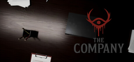
The Company scored 67/100 on Steam Analyzer — Solid for a Psychological Horror capsule. Top priority fix: [title_readability] Add white or light gray outline/background container behind 'THE COMPANY' text to ensure legibility at small and tiny sizes

Capsule scores by dimension

  • Genre Clarity: 7/10 — Atmospheric indie with mystery cues. The red demonic eye symbol and dark workplace setting clearly signal a narrative-driven indie game with horror or dark comedy undertones, distinct from typical casual fare. At tiny size, the bold red icon remains recognizable and anchors the genre impression, though the exact gameplay loop remains ambiguous from visuals alone. The minimalist aesthetic and corporate theme hint at puzzle or adventure mechanics without explicit gameplay iconography.
  • Title Readability: 6/10 — Readable at full, deteriorates at tiny. The title 'THE COMPANY' is placed center-right in gray text and reads clearly at full header size with solid contrast against the dark background. At small and tiny sizes, the text becomes cramped and gray loses separation; the all-caps treatment helps slightly, but legibility drops noticeably under 120px width. Strategic white space around text helps at medium size, but the absence of outline or background container leaves it vulnerable to compression blur.
  • Contrast & Color: 7/10 — Strong red icon, muted title contrast. The crimson eye symbol pops distinctly against the near-black background and remains visible even when squinted, creating a clear silhouette and focal point. The gray title text sits in mid-tone range and blends into the dark background when squinting or at tiny size, reducing clarity. Overall value separation is acceptable for the icon but the title needs stronger separation to maintain readability at smallest sizes.
  • Uniqueness & Polish: 7/10 — Distinctive horror-corporate aesthetic. The juxtaposition of a corporate office setting with a demonic eye symbol creates a memorable and unusual visual hook that stands apart from generic indie adventure fare. The minimalist design and restrained color palette feel intentional and polished rather than template-based, with the red eye serving as a strong brand anchor. However, the composition feels somewhat static and the desk/office elements in the background lack visual interest or storytelling depth beyond the initial concept.
  • Brand Consistency: 7/10 — Iconic red eye, cohesive dark palette. The red eye symbol is distinctive and would be recognizable across multiple marketing materials as the core brand mark for The Company. The consistent dark monochromatic palette with red accent creates strong internal cohesion and fits the game's dystopian corporate theme. Without access to the 10 store screenshots, adherence to established visual systems cannot be fully verified, but the capsule demonstrates a clear signature aesthetic that could carry through marketing.
  • Composition: 6/10 — Clear focal point, weak supporting elements. The red eye positioned in the upper-right quadrant serves as the primary focal point and guides attention effectively at all sizes. The desk and office items on the left side are underutilized and create visual dead weight that competes for space without adding clarity or narrative depth. Text placement is conservative and safe from cropping, but the overall layout feels slightly unbalanced with too much dark void in the lower half.

What works

  • Memorable red eye symbol. The crimson eye logo is distinctive, reads clearly even at tiny size, and creates a strong immediate visual identity that differentiates The Company from competing indie titles.
  • Cohesive dark aesthetic. The monochromatic palette with strategic red accent creates intentional, polished visual direction that reinforces the game's dystopian corporate theme.
  • Safe text placement. Title positioning avoids edge cropping and maintains readable positioning across standard Steam display formats.

What hurts the capsule

  • Title gray contrast degradation. The gray 'THE COMPANY' text lacks sufficient value separation from the dark background and becomes nearly illegible at tiny sizes or when viewed quickly during scroll.
  • Underutilized office background. Desk and office elements on the left side add visual clutter without communicating gameplay, theme depth, or narrative hook beyond the eye symbol.
  • Composition imbalance. Significant empty space in the lower half creates a top-heavy layout that wastes prime compositional real estate and reduces overall visual density and impact.

Priority fixes

  1. [title_readability] Add white or light gray outline/background container behind 'THE COMPANY' text to ensure legibility at small and tiny sizes
  2. [composition] Expand the red eye or reposition supporting visual elements to fill the lower void and create stronger vertical balance
  3. [contrast_color] Increase title text brightness or add subtle glow effect to improve separation from dark background at all viewing scales

Store copy priority fixes

  1. [hook_strength] Revise the short description to open with 'Work late at The Company' or similar action-oriented verb to signal gameplay alongside the atmospheric hook, while keeping the 'wants you productive/calm/compliant' refrain.
  2. [feature_communication] Add one sentence to the detailed description explicitly stating whether choice outcomes differ substantially across playthroughs and if there are multiple distinct endings.
  3. [genre_clarity] Add a single clarifying phrase in the short description such as 'first-person' or 'psychological horror experience' to eliminate ambiguity for players who skim only the headline.

Related guides

Steam app ID: 4389840 · Tags: Psychological Horror, Exploration, Walking Simulator, Interactive Fiction, Choose Your Own Adventure