Scoring genre clarity...

Unbox the Room 2 capsule

Unbox the Room 2

The cozy unboxing and interior design experience returns — bigger, warmer, and more reactive. From homes to small businesses, each space responds to your choices and reflects its owner’s personality.

RelaxingDecoratingOrganizing
Weird Penguin GamesQ4 2026

Unbox the Room 2 scores 75/100 — better than 68% of Steam capsules we've analysed (n=22,658).

Released Q4 2026 · By Weird Penguin Games

Quick text summary

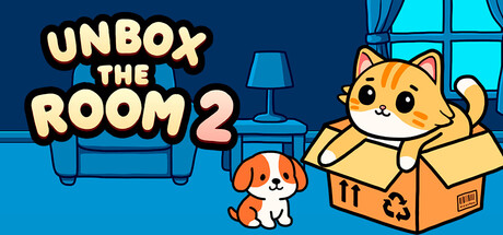
Unbox the Room 2 scored 75/100 on Steam Analyzer — Good for a Steam capsule. Top priority fix: [uniqueness_polish] Add a subtle visual differentiator — such as a partially decorated room behind the cat or small floating furniture items — to hint at the interior design mechanic and separate it from generic cozy animal games.

Capsule scores by dimension

  • Genre Clarity: 8/10 — Cozy unboxing sim reads well. The cat sitting in a cardboard box and the puppy in a cozy interior setting immediately communicate a casual, cozy simulation vibe. The cardboard box is a direct visual metaphor for the unboxing mechanic, and the warm domestic interior background reinforces the home/interior design angle. At tiny size the cat-in-box silhouette and bold title still suggest a lighthearted cozy game, though the specific unboxing-plus-decorating nuance is slightly lost.
  • Title Readability: 8/10 — Bold bubbly font reads clearly. The title 'UNBOX THE ROOM 2' uses a thick, rounded, white bubble font with a strong dark outline, placed against the relatively controlled blue background on the left side. At full size it is very legible and charming. At tiny size the letters remain distinguishable due to the high-contrast outline, though 'THE ROOM 2' becomes slightly compressed and harder to parse individually — the overall block still reads as a title rather than noise.
  • Contrast & Color: 7/10 — Warm characters pop on cool blue. The warm orange cat and tan puppy contrast well against the cool blue background, creating natural subject separation even against Steam's dark #1b2838 background. The white title outline provides strong separation from both the blue background and the Steam dark chrome. In grayscale the cat silhouette holds reasonably well, though the puppy blends slightly into the mid-toned floor at tiny size.
  • Uniqueness & Polish: 7/10 — Charming but familiar cozy style. The illustration style is clean, professional, and appealing with well-rendered cartoon characters and a warm cozy atmosphere. However, the overall art direction sits comfortably within the crowded 'cute animals in cozy settings' space without a strongly distinctive hook that separates it from titles like Little Kitty Big City or similar. The cardboard box as a focal motif is smart and on-brand for the game's core mechanic, adding a small degree of uniqueness.
  • Brand Consistency: 7/10 — Cohesive palette and character identity. The warm-versus-cool color split, the rounded bubbly typography, and the cartoon animal characters form a recognizable internal identity. The cat-in-box motif is a strong recurring brand anchor that could be remembered across store pages. The style feels consistent and deliberate, though without seeing the screenshots it reads as a strong but not exceptionally distinctive branded identity within the cozy sim space.
  • Composition: 8/10 — Clear left-right split with good hierarchy. The composition uses a clean left-right split: title text on the left third, characters on the right two-thirds, with the cat-in-box as the primary focal point and the puppy as a supporting element. The layering of background furniture, midground puppy, and foreground box creates readable depth. At small and tiny sizes the cat-in-box remains the dominant focal point and the title block holds its position without competing, though the puppy becomes a small secondary detail that slightly competes for attention near the bottom center.

What works

  • Strong thematic icon. The cat sitting in a cardboard box is an instantly readable visual metaphor for the game's core unboxing mechanic and doubles as a memorable brand symbol.
  • High-contrast title treatment. The thick dark outline on the bubbly white title text ensures readability against the blue background at both full and small sizes.
  • Warm-cool color contrast. The orange and tan characters pop naturally against the cool blue interior background, creating clear subject separation even on Steam's dark UI.
  • Clean left-right compositional hierarchy. Title and characters occupy distinct zones with no overlap, making the capsule easy to parse in under one second during a quick scroll.

What hurts the capsule

  • Genre blends into crowded cozy space. The cute-animals-in-cozy-room visual language is shared by many competing titles, reducing distinctiveness without a stronger differentiating visual hook.
  • Puppy competes with cat at tiny size. At tiny thumbnail size the puppy and cat both vie for attention near the center, slightly diluting the single clear focal point.
  • Interior background detail lost at small size. The sofa, lamp, and window detail in the background become indistinct at tiny size, reducing the interior-design genre cue to just a vague blue wash.
  • No distinctive typography beyond the style. The bubbly rounded font, while appropriate, is a common style in the casual cozy genre and does not add a unique identity signal on its own.

Priority fixes

  1. [uniqueness_polish] Add a subtle visual differentiator — such as a partially decorated room behind the cat or small floating furniture items — to hint at the interior design mechanic and separate it from generic cozy animal games.
  2. [genre_clarity] Introduce a secondary design element like a small furniture item or paint swatch near the box to reinforce the room-decorating mechanic at tiny size.
  3. [contrast_color] Increase the value contrast between the puppy and the floor beneath it so the puppy silhouette reads more clearly at tiny and grayscale sizes.
  4. [brand_consistency] Consider adding a small recurring logo mark or icon badge near the title that could serve as a standalone brand recognition cue across store assets.

Store copy priority fixes

  1. [hook_strength] Rewrite the short description opening to: 'Design beautiful homes and small businesses for quirky clients in this cozy unboxing and interior design game' — this clarifies the genre and core loop for players new to the series without losing the sequel signal.
  2. [feature_communication] Add one sentence to the detailed description explaining what 'reactive' means — e.g., 'Watch clients react emotionally to your design choices, encouraging experimentation and re-design.'
  3. [uniqueness] Add a sentence contrasting this game with typical design sims, such as 'Unlike other design games, your clients' personalities drive the story—no two playthroughs are the same.'

Related guides

Steam app ID: 4394130