Scoring genre clarity...

Office Hours capsule

Office Hours

Sort forms, get to know your mysterious new collegues & unravel mysteries they're trying to cover up as you step in to replace the previous RH at this mysterious pharmaceutical company.

Free to PlayMostly Positive(21)
Psychological HorrorCapitalismPoint & Click
PipoteamApr 22, 2026

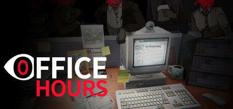
Office Hours scores 73/100 — better than 66% of Psychological Horror capsules (n=2,166).

Mostly Positive (21 reviews) · Free to Play · Released Apr 22, 2026 · By Pipoteam

Quick text summary

Office Hours scored 73/100 on Steam Analyzer — Good for a Psychological Horror capsule. Top priority fix: [genre_clarity] Add a subtle visual hint of the investigation/mystery mechanic, such as highlighted documents or a character silhouette, to clarify the mystery-solving gameplay loop

Capsule scores by dimension

  • Genre Clarity: 7/10 — Office simulation mystery clear. The retro computer monitor, desk setup, and 90s office aesthetic immediately signal a workplace simulation with puzzle/mystery elements. At tiny size, the vintage CRT and cluttered desk clearly communicate an office-based game, though the mystery/investigation angle is less obvious without text. The visual language reads as indie simulation rather than action or puzzle game.
  • Title Readability: 8/10 — Bold title, strong legibility. The 'OFFICE HOURS' text uses a bold sans-serif with high contrast white and red against the dark background, maintaining excellent readability at full, small, and tiny sizes. The iconic eye logo paired with red text creates a memorable typographic anchor. At tiny size the text remains clearly legible, though the eye detail becomes abstract.
  • Contrast & Color: 8/10 — Strong value separation throughout. The white eye logo and red 'OFFICE HOURS' text pop sharply against the dark desaturated background, creating excellent silhouette separation in grayscale. The warm golden-beige tones of the desk and monitor provide mid-tone contrast that prevents flatness. Even at tiny size, the light red and white elements remain distinct and readable against the dark periphery.
  • Uniqueness & Polish: 7/10 — Distinctive retro aesthetic cohesive. The 90s office aesthetic with authentic CRT monitor, keyboard, papers, and vintage color grading feels intentional and distinct from generic office sims. The eye logo adds personality and hints at the mystery angle, suggesting surveillance or hidden secrets thematically. However, the composition is somewhat static and doesn't show gameplay mechanics or unique visual hooks that set it apart from broader indie sim trends.
  • Brand Consistency: 7/10 — Retro style identity clear. The capsule establishes a strong internal identity through consistent retro office aesthetic, muted desaturated palette, and the recurring eye motif that works as a visual signature. The 90s-authentic props and lighting treatment suggest coherent art direction and a recognizable brand feel. Without comparing to store screenshots, the visual language feels intentional and reproducible, though the eye logo could be more prominently iconic.
  • Composition: 7/10 — Clear focal point, good depth. The CRT monitor serves as a strong central focal point with the desk and props creating layered depth that reads clearly at all sizes. The title placement in top left with the eye logo is strategically positioned on a controlled background region, avoiding clutter. At tiny size, the composition remains balanced and readable, though the desk clutter becomes abstract and loses some thematic impact.

What works

  • Title legibility at all sizes. The bold white and red 'OFFICE HOURS' text maintains excellent readability from full to tiny size with strong contrast and clean letterforms.
  • Thematic visual consistency. The retro 90s office aesthetic with authentic CRT monitor, keyboard, and cluttered desk creates an immediately recognizable and cohesive atmosphere.
  • Strong silhouette against background. The light-colored props and white eye logo create clean separation from the dark desaturated background, ensuring clarity during quick scroll.

What hurts the capsule

  • Limited gameplay communication. The capsule shows office setting and mystery mood but doesn't visually hint at core mechanics like form-sorting, dialogue trees, or investigation systems.
  • Generic office clutter at small sizes. When scaled down, the desk props and papers become abstract visual noise that doesn't communicate unique mechanics or story hooks.
  • Subdued palette lacks pop. The desaturated muted tones serve atmosphere but don't create the visual 'pop' that top-performing indie sims achieve through more saturated or unexpected color choices.

Priority fixes

  1. [genre_clarity] Add a subtle visual hint of the investigation/mystery mechanic, such as highlighted documents or a character silhouette, to clarify the mystery-solving gameplay loop
  2. [uniqueness_polish] Introduce a secondary accent color or visual element that reinforces the pharmaceutical company setting and differentiates from generic office sims
  3. [composition] Consider repositioning or stylizing the desk clutter to create a more readable focal hierarchy that survives at tiny size without becoming abstract noise

Store copy priority fixes

  1. [hook_strength] Rewrite short description to replace one 'mysterious' and lead with the core moral conflict: 'As the new HR at a pharmaceutical giant, you must choose between following sinister corporate orders or helping colleagues uncover a deadly conspiracy.' This is more specific and emotionally gripping.
  2. [uniqueness] Add a sentence articulating the game's mechanical distinctiveness, such as: 'Unlike typical choice games, every form you sort and rule you follow directly shapes your colleagues' fates and the story's ending.' This clarifies what makes the form-sorting central to the narrative.
  3. [feature_communication] Clarify the mystery-gameplay link by adding: 'Clues about the PANACEA™ project are hidden in the forms and colleague conversations—your job review is also an investigation.' This bridges the gap between simulation and mystery.
  4. [audience_targeting] Add a sentence addressing player type: 'Perfect for players who love moral dilemmas, dark satire, and story-driven experiences over mechanical challenge.' This sets expectation for the intended audience.

Related guides

Steam app ID: 4395630 · Tags: Psychological Horror, Capitalism, Point & Click, 2D, First-Person