Scoring genre clarity...

Grey Legend: Survivors capsule

Grey Legend: Survivors

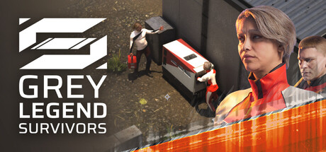
Your survivors will bond, break under pressure, and make memories together. Your choices will guide their fate in a post-apocalyptic tactical RPG. Explore the secrets of the outside world through high-stake encounters. Unlock new ways to play, and try again. Find your way to rebuild human society.

Base BuildingStrategyTactical RPG
Silver Legend2027

Grey Legend: Survivors scores 62/100 — better than 2% of Base Building capsules (n=976).

Released 2027 · By Silver Legend

Quick text summary

Grey Legend: Survivors scored 62/100 on Steam Analyzer — Solid for a Base Building capsule. Top priority fix: [contrast_color] Replace or darken the large pale grey-white background area with a deeper atmospheric tone — dark charcoal, stormy sky, or muted industrial environment — to create stronger separation from Steam's dark UI and improve silhouette clarity at tiny size.

Capsule scores by dimension

  • Genre Clarity: 5/10 — Sci-fi survivors, genre ambiguous. The two photorealistic characters in tactical-looking suits and the angular logo suggest a sci-fi or post-apocalyptic setting, but the genre could read as action, shooter, or visual novel rather than RPG or strategy. At tiny size, the characters shrink to near-unrecognizable figures and the genre cues collapse entirely, leaving only a vague 'sci-fi game' impression with no strategy or management mechanics implied.
  • Title Readability: 7/10 — Readable at full, weak at tiny. The title 'GREY LEGEND SURVIVORS' uses a clean sans-serif font in white with good weight at full size, sitting on the left half of the image against a relatively controlled light-grey background region. At small capsule size the text remains legible, but at tiny thumbnail size 'SURVIVORS' as a subtitle line becomes very difficult to read and the word hierarchy between 'GREY LEGEND' and 'SURVIVORS' is lost.
  • Contrast & Color: 6/10 — Moderate contrast, pale background hurts. The warm orange and red accent tones on the characters and logo provide some pop against Steam's dark background, but the large light-grey to white background area in the center-right is a significant liability — it risks blending into lighter Steam UI elements and reduces the overall punch of the silhouettes. In the grayscale mental test, the two characters sitting against a near-white background lose clear edge separation, particularly the male figure on the left.
  • Uniqueness & Polish: 6/10 — Competent but generically sci-fi. The photorealistic character rendering and angular red logo are professional in execution, giving a polished AAA-adjacent feel, but the overall composition of two characters standing against a pale abstract background is a very common genre trope that does not communicate the unique survivor community management or roguelite aspects at all. Compared to benchmarks like Frostpunk 2 or Shadow Gambit which visually encode their core mechanics, this capsule reads as a generic sci-fi action title.
  • Brand Consistency: 7/10 — Cohesive palette and style internally. The red, white, and dark grey palette is consistently applied across the logo, character suits, and background gradients, creating a recognizable internal identity. The angular 'G' logo mark is distinctive and could serve as a recognizable brand icon over time. However, the overall visual language is somewhat generic sci-fi corporate and may not differentiate strongly from other titles in a crowded feed.
  • Composition: 6/10 — Serviceable layout, weak focal hierarchy. The logo and title occupy the left third while the two characters anchor the right two-thirds, creating a standard split composition that is functional but not dynamic. The male character on the far left of the character group is partially cropped and slightly blends into the background, weakening the focal hierarchy. At small and tiny sizes, the two characters compete equally for attention without a clear single focal point, and the large pale background area in the center creates a visual void that reduces visual tension and draw.

What works

  • Clean professional typography. The sans-serif title font has good weight and spacing, remaining legible at small capsule size against the lighter left background region.
  • Distinctive angular logo mark. The red geometric 'G' logo in the top left is sharp, memorable, and serves as a potential recognizable brand icon across store pages.
  • Consistent red and grey palette. Warm red-orange accents on suits and logo create internal cohesion and provide the strongest contrast against Steam's dark background.
  • Photorealistic character quality. Character rendering quality signals a professional production level that elevates perceived game quality at full header size.

What hurts the capsule

  • Large pale background bleeds identity. The expansive white-grey background in the center-right reduces contrast against Steam's dark UI and makes the image feel washed out at small sizes.
  • No genre or mechanic visual cues. Nothing in the image communicates survivor management, base building, or roguelite strategy, causing the capsule to mislead toward action or shooter genres.
  • Weak single focal point at tiny size. Two equally-weighted characters with no clear hierarchy mean attention splits at tiny thumbnail size, reducing immediate visual parsing.
  • Subtitle 'Survivors' collapses at tiny size. The secondary 'SURVIVORS' line below the main title becomes unreadable at tiny thumbnail size, losing the key thematic word.

Priority fixes

  1. [contrast_color] Replace or darken the large pale grey-white background area with a deeper atmospheric tone — dark charcoal, stormy sky, or muted industrial environment — to create stronger separation from Steam's dark UI and improve silhouette clarity at tiny size.
  2. [genre_clarity] Introduce a visual element that implies the strategy or survivor management genre — such as a ruined settlement in the background, a map overlay, or other survivors in the distance — to avoid the current action-game misread.
  3. [title_readability] Increase visual weight of 'SURVIVORS' subtitle by enlarging it or adding a subtle dark backing strip so it remains readable at tiny thumbnail size.
  4. [composition] Establish a single dominant focal character by pushing one figure slightly forward or larger, and reduce the dead-center background void to create stronger visual tension and a clearer entry point for the eye.

Store copy priority fixes

  1. [hook_strength] Rewrite the opening line to lead with a specific consequence or moment: instead of 'character management RPG,' try 'Your survivors will betray, bond, and break under pressure—and your choices determine their fate in a post-apocalyptic tactical RPG.'
  2. [feature_communication] Clarify roguelite persistence: add a sentence explaining whether the base, research, and character bonds survive a failed run, or if the player starts fresh each attempt.
  3. [uniqueness] Strengthen the personality mechanic with a concrete gameplay example: explain one specific way procedurally generated dialogue changes tactics or forces a decision (e.g., 'A survivor's anxiety might cause them to abandon an ally in combat unless you invest time bonding first').
  4. [tone_match] Cut or condense the alien lore paragraph (20 years after collapse, mothership retrofitting) to a single sentence and move the focus back to immediate survivor decisions and consequences.

Related guides

Steam app ID: 4399290 · Tags: Base Building, Strategy, Tactical RPG, Sci-fi, Post-apocalyptic