Scoring genre clarity...

Wriggle apple capsule

Wriggle apple

Help the worm reach the apple! Navigate through tricky paths, avoid spikes, and use stones to climb higher. Each apple makes the worm bigger, but it may cause challenges. Can you help him?

$2.99Positive(17)
PuzzlePlatformerLogic
WormWorld Studios, SharkgameFeb 24, 2026

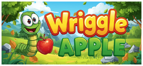
Wriggle apple scores 77/100 — better than 77% of Steam capsules we've analysed (n=22,658).

Positive (17 reviews) · $2.99 · Released Feb 24, 2026 · By WormWorld Studios

Quick text summary

Wriggle apple scored 77/100 on Steam Analyzer — Good for a Steam capsule. Top priority fix: [uniqueness_polish] Add a subtle visual hint of a tricky path, spike obstacle, or stone element in the background to communicate the puzzle-platformer challenge and differentiate from generic casual games.

Capsule scores by dimension

  • Genre Clarity: 8/10 — Clear casual puzzle platformer vibes. The green worm character with exaggerated cartoon eyes, the red apple, and the pastoral outdoor setting with grass and trees immediately signal a casual, family-friendly puzzle game. At tiny size, the worm silhouette and apple remain visually distinct enough to convey the core mechanic of movement and collection, though some environmental detail fades.
  • Title Readability: 9/10 — Excellent legibility across all sizes. The bold 'Wriggle Apple' title uses a thick yellow and red outlined font that maintains perfect clarity from full header down to tiny thumbnail. The text sits on a controlled light background region with strong contrast against the #1b2838 Steam background, and letter spacing is generous and well-balanced.
  • Contrast & Color: 8/10 — Strong value separation and saturation. The capsule leverages bright primary colors (red apple, green worm, yellow text) against a mid-tone sky blue and grass green background, creating clear visual pop on the dark Steam interface. The worm's white eye highlights and the apple's intense red provide strong local contrast that survives the grayscale squint test and remains readable at tiny size.
  • Uniqueness & Polish: 6/10 — Competent but conventional casual style. The art direction is polished with clean vector-style rendering, smooth gradients, and intentional charm in the worm's expression and pose. However, the overall aesthetic—cheerful cartoon character, pastoral setting, bright primary colors—follows well-worn casual game design conventions without a distinctive visual hook that sets it apart from similar titles like Snufkin or Sticky Business.
  • Brand Consistency: 7/10 — Coherent art style with clear identity. The capsule establishes a consistent cartoon visual language with the worm as a recognizable mascot character, bright saturated palette, and playful tone that should translate across marketing materials. The worm's specific design (green body, large expressive eyes, cheerful smile) serves as a memorable identity anchor, though without access to the store screenshots, internal consistency cannot be fully verified.
  • Composition: 8/10 — Balanced hierarchy with clear focal point. The worm occupies the left-center prime real estate with the title to its right, creating a natural left-to-right reading flow that works at all sizes. The environmental elements (trees, sky, grass) provide depth layering without competing for attention, and the overall layout maintains safe margins from edges; at tiny size, the worm and apple remain the dominant visual anchors.

What works

  • Bold, readable typography. The thick-outlined 'Wriggle Apple' title maintains perfect clarity from full size to tiny thumbnail, with strong value contrast against the Steam dark background.
  • Effective color saturation and pop. Primary colors (red, green, yellow) are vibrant and distinct, ensuring the capsule stands out in quick scrolls and maintains readability in grayscale.
  • Recognizable character mascot. The worm's expressive cartoon design with large eyes and playful pose creates a memorable identity that communicates personality and charm.
  • Clean compositional balance. The worm-left, title-right layout creates a natural focal hierarchy with environmental elements supporting rather than competing for attention.

What hurts the capsule

  • Generic casual game aesthetic. The cheerful cartoon style, pastoral setting, and bright primary palette follow predictable casual game conventions without a distinctive visual differentiator.
  • Limited visual storytelling depth. The capsule shows the core elements (worm, apple) but doesn't visually communicate unique mechanics like path navigation, spikes, or stone climbing that are key to gameplay.

Priority fixes

  1. [uniqueness_polish] Add a subtle visual hint of a tricky path, spike obstacle, or stone element in the background to communicate the puzzle-platformer challenge and differentiate from generic casual games.
  2. [genre_clarity] Consider adding a small UI element or visual cue (like a stone or spike silhouette) in the lower foreground to better signal the navigation and obstacle-avoidance mechanics at tiny size.

Store copy priority fixes

  1. [hook_strength] Replace "Can you help him?" with a specific curiosity hook about the growth mechanic's puzzle implications, e.g., "But beware—each apple makes navigation harder. Can you master levels designed to exploit your own growth?"
  2. [uniqueness] Add a concrete example of how the growth mechanic creates puzzles unique to this game, such as "Use your growing body to push multi-ton boulders, bridge gaps, or squeeze through passages that shrink as you expand."
  3. [audience_targeting] Add a single sentence clarifying the intended player: "Perfect for puzzle lovers seeking bite-sized brain-teasers with surprising depth" or "Ideal for families seeking a charming, accessible challenge."

Related guides

Steam app ID: 4400120