Scoring genre clarity...
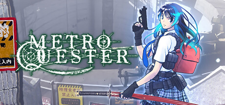
METRO QUESTER is a dungeon exploration RPG based in a post-apocalyptic futuristic world created by the manga artist Kazushi Hagiwara, with a deep game system designed by Hironori Kato that offers the excitement and surprises reminiscent of 1980s computer games through hack and slash.
$19.997 user reviews
RPGDungeon CrawlerExploration
Thousand GamesApr 23, 2026