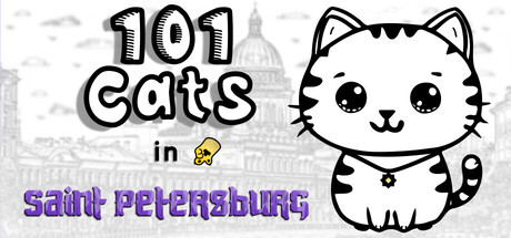
101 Cats in Saint Petersburg scores 70/100 — better than 25% of Cats capsules (n=740).

Quick text summary

101 Cats in Saint Petersburg scored 70/100 on Steam Analyzer — Good for a Cats capsule. Top priority fix: [title_readability] Increase 'saint petersburg' text size and use white or cream color with strong black outline to match primary title legibility—must read clearly at TINY size

Capsule scores by dimension

  • Genre Clarity: 8/10 — Cute casual search adventure clear. The kawaii cat mascot with big eyes, the magnifying glass hint ('🔎'), and 'Saint Petersburg' location immediately signal a casual hidden-object or exploration game. At TINY size, the cat silhouette and numeric title '101' remain clearly readable, establishing a collection-based casual gameplay hook typical of find-it games.
  • Title Readability: 7/10 — Bold outline text mostly legible. The '101 cats' headline uses thick black outlines with white fill that maintains legibility down to small sizes. However, 'in saint petersburg' drops to smaller, purple-colored text that becomes difficult to parse at TINY size—the purple lacks sufficient contrast against potential dark backgrounds. At FULL size it reads well, but tiny viewing degrades secondary text clarity.
  • Contrast & Color: 8/10 — Strong black white cat pops. The white cat with bold black line work creates excellent silhouette separation against the light textured background, and will read sharply against Steam's dark #1b2838 backdrop. The 'saint petersburg' purple text and yellow accent ('in') provide warm tonal variety. In grayscale test, the cat outline remains crisp and distinct from background noise, maintaining excellent value separation at all viewing sizes.
  • Uniqueness & Polish: 6/10 — Cute but familiar casual template. The art style is clean and charming with a hand-drawn kawaii aesthetic that fits the indie casual space well, but the presentation follows common genre patterns—cute mascot character, rounded outline typography, playful emoji accents. While execution is polished, the overall concept (cute animal + collection hunt) lacks a distinctive visual hook or memorable angle that would differentiate it from similar indie titles like Little Kitty, Big City or Moonstone Island.
  • Brand Consistency: 6/10 — Coherent but generic cute branding. The white cat mascot with large eyes and smile is consistently rendered and could become a recognizable character, supported by a warm color palette and rounded typography. However, without seeing store screenshots, the capsule shows no iconic motif, signature symbol, or distinctive art signature that screams 'only 101 Cats'—the design feels like it could apply to several cat-themed casual games.
  • Composition: 7/10 — Good focal point, minor text placement. The cat mascot sits prominently right of center as the clear focal point, with '101 cats' text anchoring top-left and location text below—creating a logical reading flow. The right-side cat positioning works well at TINY sizes where it remains the dominant visual. Minor weakness: the purple 'saint petersburg' text competes visually with the cat rather than clearly supporting it, and sits in a slightly awkward mid-lower zone that could be better integrated or more boldly weighted.

What works

  • Clear mascot focal point. The kawaii cat character is instantly recognizable and maintains strong visual presence at all zoom levels from full to tiny size.
  • Excellent title contrast and outline. Black-outlined white '101 cats' text uses proven legibility technique that reads sharply against both light and dark backgrounds without blur or collapse.
  • Strong genre signaling. Combination of cat mascot, '101' number, and hidden-object visual hints immediately communicate casual collection-based gameplay to the target audience.
  • Polished execution. Clean linework, intentional typography choices, and cohesive color use create a premium indie aesthetic that avoids cheap or template vibes.

What hurts the capsule

  • Purple subtitle text too small and dim. The 'saint petersburg' secondary text uses purple color with insufficient contrast and becomes nearly unreadable at TINY sizes, degrading clarity of the location value proposition.
  • Generic casual aesthetic. While well-executed, the cute kawaii cat + rounded fonts + emoji accents follow familiar indie casual templates seen in multiple competing titles without distinctive visual innovation.
  • No iconic brand symbol. The mascot is charming but not yet iconic—lacks a memorable motif, signature visual tag, or recognizable design element specific only to this game's brand identity.
  • Secondary text integration awkward. The 'in' and 'saint petersburg' text placement below the cat feels loosely composed rather than purposefully designed into a unified visual hierarchy.

Priority fixes

  1. [title_readability] Increase 'saint petersburg' text size and use white or cream color with strong black outline to match primary title legibility—must read clearly at TINY size
  2. [uniqueness_polish] Develop a signature visual motif or brand symbol (icon, pattern, or visual tag) unique to 101 Cats that differentiates it from generic cute-casual competitors
  3. [composition] Redesign secondary text placement to feel integrated with the overall composition—consider repositioning below or adjacent to mascot with better visual weight balance
  4. [genre_clarity] Add subtle UI element or visual cue (map corner, achievement badge, or search crosshair) to reinforce 'discovery' and 'collection' gameplay loop beyond the generic location text

Store copy priority fixes

  1. [uniqueness] Add 1-2 specific visual or thematic elements that differentiate this game—e.g., 'hand-drawn art style,' 'Saint Petersburg landmarks reimagined,' or 'procedural cat placement' rather than generic praise of the landscape.
  2. [hook_strength] Lead the short description with a stronger action verb or emotional hook instead of the generic 'Join this adventure'—e.g., 'Find all 101 hidden cats lurking in a beautiful Saint Petersburg—but they're sneaky' to create curiosity.
  3. [feature_communication] Clarify the speed/competition mechanic: explicitly state whether timed mode is optional, required, or a separate challenge mode, since 'Be quick!' contradicts the 'Playable without Timed Input' category.
  4. [genre_clarity] Add a one-liner early in the detailed description that names the genre outright (e.g., 'a hidden object game where...') to ensure genre-searchers immediately identify it as their target game.

Related guides

Steam app ID: 4422770 · Tags: Cats, Casual, Hidden Object, Wholesome, Puzzle