Scoring genre clarity...
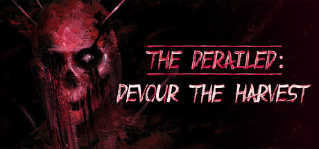
The Derailed: Devour the Harvest capsule

The Derailed: Devour the Harvest

The Derailed: Devour the Harvest - a standalone story set in the world of The Derailed. While investigating a mass disappearance, you find yourself at an abandoned factory. Answers lie within - but they come at a high price. Are you ready?

HorrorPsychological HorrorAdventure
Deformed Dreams Studio2026

The Derailed: Devour the Harvest scores 67/100 — better than 18% of Horror capsules (n=3,268).

Released 2026 · By Deformed Dreams Studio

Quick text summary

The Derailed: Devour the Harvest scored 67/100 on Steam Analyzer — Solid for a Horror capsule. Top priority fix: [title_readability] Reduce subtitle 'DEVOUR THE HARVEST' size or reposition to ensure legibility at 120x45 TINY size, or consolidate into single readable line.

Capsule scores by dimension

  • Genre Clarity: 7/10 — Horror-adventure tone clear. The grotesque skull imagery with red atmospheric lighting strongly signals horror or dark adventure genre. At TINY size, the skull silhouette and blood-red color palette remain recognizable as horror-adjacent content. However, the specific adventure gameplay loop is not visually communicated, leaving genre interpretation slightly ambiguous between pure horror and narrative adventure.
  • Title Readability: 6/10 — Readable but stylized font. Title text 'THE DERAILED: DEVOUR THE HARVEST' is legible at full size with clear stroke weight and contrast against the dark background. At SMALL size (231x87) the text remains parseable but requires focus. At TINY size (120x45), the subtitle becomes compressed and loses clarity, though the main series title 'THE DERAILED' holds reasonably well due to the outline styling.
  • Contrast & Color: 8/10 — Strong red-dark separation. The bright magenta-red skull and text create excellent value contrast against the near-black background (#1b2838). The neon-style text outline ensures readability and visual pop on quick scroll. In grayscale, the skull maintains clear silhouette separation with strong luminosity difference, making it one of the strongest technical elements of this capsule.
  • Uniqueness & Polish: 6/10 — Atmospheric but familiar horror. The aesthetic employs standard horror capsule conventions—skull iconography, red atmospheric lighting, and distressed texture treatment. While competently executed with clean rendering, it lacks distinctive visual storytelling that communicates the specific 'devour the harvest' premise or unique mechanics. The presentation feels thematically appropriate but not memorable against comparable horror-adventure titles like DREDGE or Slay the Princess.
  • Brand Consistency: 6/10 — Generic horror style applied. The capsule uses red-on-black aesthetic and skull imagery, but without reference to the 10 available store screenshots, internal cohesion cannot be fully assessed. The styling appears consistent within this single asset (matching neon text treatment and atmospheric lighting), but lacks distinctive brand markers like signature character designs, unique iconography, or a memorable visual motif that would distinguish The Derailed franchise identity.
  • Composition: 7/10 — Clear focal hierarchy with balance. The skull anchors the left side as primary focal point with strong visual weight, while text occupies controlled right space. At SMALL and TINY sizes, this arrangement maintains clarity with the skull dominating attention and text remaining secondary. The composition avoids clutter and uses depth effectively, though at TINY size the lower text line compresses and the overall balance shifts slightly toward the skull-heavy left side.

What works

  • Excellent contrast against dark background. Bright red skull and neon outline text create strong value separation and silhouette clarity that reads clearly even at TINY size and maintains visual pop on quick scroll.
  • Clear hierarchical focal point. Skull imagery dominates left side as primary subject, directing immediate attention while text supports without competing for focus across all size reductions.
  • Atmospheric mood communication. Red lighting, skull motif, and distressed texture effectively convey a dark horror-adventure tone that aligns with the game's premise.

What hurts the capsule

  • Subtitle loses legibility at TINY. The second text line 'DEVOUR THE HARVEST' compresses significantly at 120x45 size and becomes difficult to parse without deliberate focus, reducing title hierarchy effectiveness.
  • Generic horror visual language. Skull, red lighting, and atmospheric grain are common horror genre elements without distinctive brand markers or unique selling point communication specific to The Derailed franchise.
  • Limited visual storytelling. The capsule communicates mood but does not visually hint at core mechanics (investigation, factory setting, disappearance mystery) that would differentiate it from standard horror offerings.

Priority fixes

  1. [title_readability] Reduce subtitle 'DEVOUR THE HARVEST' size or reposition to ensure legibility at 120x45 TINY size, or consolidate into single readable line.
  2. [uniqueness_polish] Introduce a distinctive visual element (signature character, unique factory aesthetic, or franchise motif) that communicates what makes The Derailed standout from generic horror adventure titles.
  3. [genre_clarity] Add subtle environmental or mechanical visual hint (abandoned factory architecture, harvest/ritual iconography, or investigation UI element) to clarify adventure gameplay beyond pure horror atmosphere.

Related guides

Steam app ID: 4428800 · Tags: Horror, Psychological Horror, Adventure, Walking Simulator, Alternate History