Scoring genre clarity...
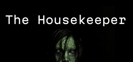
The Housekeeper is a psychological horror simulation game where you will work as the new night shift housekeeper at an ominous hotel. As you work through your shifts, you will start to experience strange events. Will these events reveal a dark secret, or will they be the cause of your demise?
$3.996 user reviews
Psychological HorrorIndieHorror
Chano GamesMar 19, 2026