Scoring genre clarity...
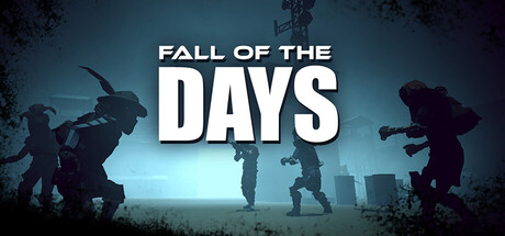
Fall of the Days capsule

Fall of the Days

Fall of the Days is a systemic isometric immersive sim where the world reacts to how you play — not just what you choose. A 3D action and stealth experience amplified by social interaction systems, where systems collide and every action has consequences.

RPGAction RoguelikeExploration
MAD GENERATION STUDIO2027

Fall of the Days scores 70/100 — better than 33% of RPG capsules (n=3,707).

Released 2027 · By MAD GENERATION STUDIO

Quick text summary

Fall of the Days scored 70/100 on Steam Analyzer — Good for a RPG capsule. Top priority fix: [uniqueness_polish] Introduce a distinctive visual hook—such as a unique character silhouette, signature color accent, or thematic symbol—that visually communicates the systemic or stealth mechanics and differentiates the capsule from generic military-action competitors.

Capsule scores by dimension

  • Genre Clarity: 7/10 — Action-adventure with tactical silhouettes. The image shows armed figures in combat poses against a cityscape, clearly communicating action-adventure gameplay. At TINY size, the character silhouettes and weapon outlines remain readable, though the isometric immersive sim and stealth mechanics are not visually apparent from the capsule alone. The sci-fi military aesthetic aligns with action genres but doesn't distinctly convey the systemic or RPG depth.
  • Title Readability: 8/10 — Bold white text, strong hierarchy. The title 'FALL OF THE DAYS' uses large, clean white sans-serif letterforms with high contrast against the dark background and a semi-transparent white backing panel. At SMALL and TINY sizes, the title remains legible due to weight and size hierarchy. The clean layout and centered placement on a controlled background ensures readability across all viewing conditions.
  • Contrast & Color: 8/10 — Strong light-dark separation throughout. The capsule employs a dark teal-to-black gradient background with bright white title text and illuminated character silhouettes that create excellent value separation against the Steam #1b2838 background. The glowing cityscape and lit figures in the midground provide clear silhouette definition even at TINY size, with no muddy mid-tone blending. Grayscale squint test shows solid contrast and edge clarity.
  • Uniqueness & Polish: 6/10 — Competent but familiar action aesthetic. The composition uses a standard post-apocalyptic militarized setting with armed figures and urban ruins, which is a common trope in action-adventure marketing. The execution is clean and professional, but the visual hook lacks distinctive character design, iconic motifs, or a unique visual storytelling element that sets it apart from other action titles in the genre. The systemic immersive-sim mechanics and social interaction systems are not telegraphed visually.
  • Brand Consistency: 6/10 — Coherent but generic presentation. The capsule maintains consistent rendering with unified lighting, a cohesive color palette, and a clear art direction across the composition. However, without reference to the five store screenshots or in-game branding, the visual identity does not contain a memorable iconic symbol, character, or signature palette that would distinguish Fall of the Days from other military-action titles. Internal cohesion is strong but external recognition potential is limited.
  • Composition: 7/10 — Balanced layering with clear focal hierarchy. The composition uses effective depth layering with foreground silhouettes, a glowing midground cityscape, and a dark atmospheric background, guiding attention naturally to the central title area. The title placement is well-centered with breathing room and does not interfere with character poses or the horizon line. At SMALL and TINY sizes, the focal points (title and central figures) remain clear, though supporting character details on the edges become less distinct.

What works

  • Title contrast and legibility. White sans-serif text with a backing panel reads clearly at all sizes, including TINY, with strong value separation against the dark background.
  • Silhouette clarity and depth. Armed figures maintain readable outlines and pose dynamism even at reduced sizes, with effective foreground-to-background layering that creates visual hierarchy.
  • Professional lighting and polish. Consistent rim lighting, glowing cityscape, and atmospheric effects convey a AAA production quality without visual clutter or cheap asset feel.

What hurts the capsule

  • Generic sci-fi military setting. Post-apocalyptic armed figures and urban ruins are common tropes that fail to communicate the game's unique systemic, stealth, and social interaction mechanics.
  • No iconic character or symbol. The visual presentation lacks a memorable protagonist, mascot, or signature visual motif that could aid brand recall or differentiation in the crowded action-adventure category.
  • Limited gameplay affordance visibility. The immersive sim, systemic reactivity, and stealth elements are core selling points but are not visually suggested by the composition or visual language.

Priority fixes

  1. [uniqueness_polish] Introduce a distinctive visual hook—such as a unique character silhouette, signature color accent, or thematic symbol—that visually communicates the systemic or stealth mechanics and differentiates the capsule from generic military-action competitors.
  2. [genre_clarity] Subtly reinforce the immersive sim or stealth aspects through environmental cues, such as shadow play, visibility lines, or tactical UI hints that hint at the reactive world and social systems without cluttering the composition.
  3. [brand_consistency] Ensure the central character figure or a key recurring protagonist is visually prominent and consistent with in-game representation to build a recognizable brand identity across marketing materials.

Store copy priority fixes

  1. [uniqueness] Add one 2-3 sentence paragraph that explicitly contrasts this game with immersive sim peers—for example: 'Unlike [similar game], Fall of the Days integrates [specific mechanic] to create [specific outcome]' or clarify what makes the faction system, social systems, or post-apocalyptic setting mechanically distinct.
  2. [feature_communication] Expand the 'Reactive environments' bullet and one other feature with a single sentence of gameplay context—e.g., 'Light and shadow affect NPC awareness, forcing you to adapt your approach mid-mission when enemies shift patrol routes.'
  3. [genre_clarity] Clarify or remove the 'roguelike' tag if not accurate, or add a sentence explaining progression structure (permadeath, runs, persistent progression, etc.) to resolve the disconnect between tags and description.

Related guides

Steam app ID: 4490940 · Tags: RPG, Action Roguelike, Exploration, Immersive Sim, Action RPG