Scoring genre clarity...

phase knight capsule

phase knight

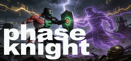
In this cyber-knight action RPG, you are Renn Kale—part human, part machine, blessed with divine blood. Master three combat forms, slash through the war-torn galaxy, and decide the fate of flesh, steel, and data. The revolution begins with your blade

$5.00
RPGAction-AdventureAction RPG
Qin StudioApr 1, 2026

phase knight scores 75/100 — better than 74% of RPG capsules (n=3,544).

$5.00 · Released Apr 1, 2026 · By Qin Studio

Quick text summary

phase knight scored 75/100 on Steam Analyzer — Good for a RPG capsule. Top priority fix: [uniqueness_polish] Add a signature visual element or iconic pose that distinctly identifies Renn Kale (e.g., a distinctive weapon design, aura effect, or hybrid flesh-machine transition visual) to elevate from competent to memorable.

Capsule scores by dimension

  • Genre Clarity: 8/10 — Strong action RPG cyberpunk cues. The armored protagonist with glowing shield, electrical effects, and futuristic aesthetic clearly signal action RPG gameplay with a sci-fi/cyberpunk angle. At tiny size, the green shield glow and purple lightning effects remain readable and reinforce the genre immediately, though the 'divine blood' fantasy element is less visually apparent without text. The visual language aligns well with comparable titles like Armored Core VI.
  • Title Readability: 8/10 — Clean sans-serif legible at all sizes. Bold white sans-serif 'phase knight' text is positioned cleanly in the lower left against a dark background, maintaining excellent contrast and readability at full, small, and tiny sizes. The letterforms are simple and well-spaced, avoiding decorative collapse at thumbnail scale. At tiny size the title remains a clear focal point despite surrounding visual complexity.
  • Contrast & Color: 8/10 — Vibrant purple lightning excellent separation. Strong value contrast between bright purple electrical effects, neon green shield accent, and the dark #1b2838 background creates immediate visual pop and silhouette clarity. The armored figure benefits from warm orange/red tones that read distinctly in grayscale, and the lightning trails provide high-saturation separation that survives squinting. The overall dark-to-bright gradient hierarchy supports quick scroll recognition.
  • Uniqueness & Polish: 7/10 — Polished cyberpunk knight execution. The concept of blending medieval knight aesthetics with cyberpunk armor and electrical effects feels fresh and is rendered with clean craft—the shield design, lighting on the armor, and particle effects show intentionality. The visual hook of 'cyber-knight with divine blood' comes through effectively, though the execution is competent rather than iconically distinctive compared to top-tier genre references like Black Myth: Wukong or Hellblade II. The effect work is cohesive but not revolutionary.
  • Brand Consistency: 6/10 — Functional visual identity no standout signature. The armored protagonist, green shield, and purple electrical palette form a coherent internal aesthetic that should be recognizable across marketing materials, but there is no iconic character pose, symbol, or signature motif that immediately cements brand identity. The cyberpunk knight concept is distinctive enough to avoid generic overlap, but the design relies on the central character rather than a memorable brand cue or visual signature.
  • Composition: 8/10 — Strong focal point clear hierarchy. The armored protagonist is positioned as the clear primary focal point in the center-right frame, with supporting elements (background structures, lightning effects) guiding attention without competing. Title placement in lower left balances the composition and avoids overlap with the character. At small and tiny sizes the focal point remains strong, and the layering of background city, midground figure, and foreground effects creates readable depth without clutter.

What works

  • Bold readable title at all sizes. Clean white sans-serif 'phase knight' text maintains clarity and contrast from full header down to tiny thumbnail without collapse or blur.
  • High-saturation color pop against dark background. Purple lightning and green shield glow create instant visual separation and draw the eye quickly even in fast scroll conditions.
  • Clear action RPG genre signaling. Armored cyber-knight protagonist with shield, electrical effects, and futuristic setting immediately communicate the action RPG + sci-fi fusion without ambiguity.
  • Well-structured focal hierarchy. Central armored figure serves as the primary subject with supporting background and lighting effects that enhance rather than distract from the main read.

What hurts the capsule

  • Generic cyberpunk execution lacks signature motif. While the cyber-knight concept is solid, the visual identity lacks a memorable brand cue or iconic symbol that would make it instantly recognizable compared to top peers.
  • Limited narrative visual storytelling. The capsule communicates genre and aesthetic but does not strongly suggest the core mechanic (three combat forms) or the protagonist's hybrid human-machine-divine nature beyond armor surface detail.
  • Composition relies heavily on central character. The design is dependent on the armored figure's appeal; without stronger environmental or concept storytelling, the visual hook feels character-focused rather than mechanically distinctive.

Priority fixes

  1. [uniqueness_polish] Add a signature visual element or iconic pose that distinctly identifies Renn Kale (e.g., a distinctive weapon design, aura effect, or hybrid flesh-machine transition visual) to elevate from competent to memorable.
  2. [brand_consistency] Introduce a repeatable brand symbol or visual motif (UI element, shield crest, or energy pattern) that could anchor brand recognition across all marketing materials and store presence.
  3. [composition] Consider emphasizing the 'three combat forms' mechanic through subtle visual layering or silhouette variation that hints at form-switching gameplay rather than static pose alone.

Store copy priority fixes

  1. [feature_communication] Define and name the three combat forms in the short or early detailed description with one sentence per form explaining mechanical identity (e.g., 'Blade Form for melee damage, Shield Form for interrupts, Pulse Form for area control').
  2. [genre_clarity] Remove 'Turn-Based Tactics' from tags or add a sentence clarifying that turn-based elements exist only in specific mode/context; confirm combat is real-time action with timing windows.
  3. [feature_communication] Add one sentence explaining the mechanical difference between Free Adventure and Survival Combat modes to help players choose the right mode for their playstyle.
  4. [tone_match] Rewrite the mechanical breakdown (Timing Judgment, Left/Right Movement) as narrative-integrated gameplay description (e.g., 'Read enemy tells and dodge at the last moment to break their assault') to maintain dramatic tone throughout.

Related guides

Steam app ID: 4513950 · Tags: RPG, Action-Adventure, Action RPG, 3D Platformer, Turn-Based Tactics