Scoring genre clarity...

Overcome Your Fears - Lighthouse capsule

Overcome Your Fears - Lighthouse

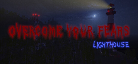
Adam Foster, a 23-year-old office worker whose life is turned upside down after a breakup with his girlfriend. In an attempt to escape from himself, he takes a job as a lighthouse keeper, hoping to clear his mind. He could never have imagined the horror he would have to endure at his new workplace.

Walking SimulatorPsychological HorrorHorror
markuwaaaaa2026

Overcome Your Fears - Lighthouse scores 65/100 — better than 11% of Steam capsules we've analysed (n=22,658).

Released 2026 · By markuwaaaaa

Quick text summary

Overcome Your Fears - Lighthouse scored 65/100 on Steam Analyzer — Solid for a Steam capsule. Top priority fix: [title_readability] Increase the size and contrast of "LIGHTHOUSE" text or reposition it on a darker background zone to ensure legibility at small and tiny sizes.

Capsule scores by dimension

  • Genre Clarity: 7/10 — Atmospheric horror adventure clear. The lighthouse setting, moody nighttime atmosphere, and red warning lights immediately signal a psychological horror or dark adventure game. At tiny size, the lighthouse silhouettes and ominous sky are still recognizable genre cues, though the specific subgenre (psychological horror vs. action) remains slightly ambiguous without the text.
  • Title Readability: 6/10 — Main title readable, tagline struggles. The large red "OVERCOME YOUR FEARS" text reads clearly at full size and remains legible at small size due to high contrast against the dark sky. However, "LIGHTHOUSE" in blue neon at smaller resolutions becomes harder to parse, and at tiny size the secondary text blur together, reducing the immediate clarity of the full title stack.
  • Contrast & Color: 7/10 — Strong red contrast, blue neon works. The red text pops well against the dark blue-gray background, and the blue neon "LIGHTHOUSE" provides secondary color separation. The lighthouse structures and red warning beacons create clear silhouettes at small sizes, though the overall mid-tone sky reduces maximum contrast impact in grayscale testing.
  • Uniqueness & Polish: 6/10 — Thematic but genre-familiar aesthetic. The lighthouse setting and neon text treatment feel deliberate and thematic to the narrative, but the moody horror sky and typography are common in indie psychological horror capsules. The execution is clean and professional, but the visual approach does not stand out distinctly from comparable titles like DREDGE or similar atmospheric horror games.
  • Brand Consistency: 6/10 — Consistent mood, limited identity markers. The color palette of red warning lights, dark sky, and blue neon is cohesive and matches the psychological horror tone described. However, without unique character art, signature symbols, or distinctive visual motifs beyond the lighthouse itself, the capsule lacks a memorable brand hook that would make it instantly recognizable across multiple marketing touchpoints.
  • Composition: 7/10 — Balanced focal points, clear hierarchy. The lighthouse structures in the background provide depth and visual interest, while the large red text anchors the foreground, creating a clear layered composition. Title placement is safe from edge cropping at small sizes, and the centered layout maintains readability, though the composition relies heavily on the sky gradient rather than dynamic element placement.

What works

  • Strong red-on-dark contrast. The crimson "OVERCOME YOUR FEARS" text delivers excellent value separation against the dark background and remains readable even at tiny capsule sizes.
  • Thematic lighthouse setting. The dual lighthouse structures and moody maritime atmosphere effectively communicate the game's unique setting and reinforce the psychological horror tone.
  • Safe title placement. Text is centered and positioned away from edges, ensuring no important elements are cut off during Steam cropping at any size.

What hurts the capsule

  • Blue neon tagline legibility. "LIGHTHOUSE" in blue neon becomes increasingly difficult to read at small and tiny sizes, risking text blur and reduced title clarity during quick scrolling.
  • Generic horror aesthetic. The moody night sky, distant lighthouse, and warning lights follow a familiar indie horror template that does not immediately distinguish this game from competitors like DREDGE or similar titles.
  • Limited brand identity markers. The capsule lacks distinctive character art, iconic symbols, or signature visual motifs that would make the game instantly recognizable across marketing campaigns.

Priority fixes

  1. [title_readability] Increase the size and contrast of "LIGHTHOUSE" text or reposition it on a darker background zone to ensure legibility at small and tiny sizes.
  2. [uniqueness_polish] Incorporate a distinctive visual element such as the protagonist's silhouette, a unique color accent, or a signature horror motif that sets this apart from standard psychological horror capsules.
  3. [brand_consistency] Develop a more iconic visual anchor—such as a recurring character, object, or color motif—that becomes immediately recognizable across store pages and marketing assets.

Store copy priority fixes

  1. [hook_strength] Rewrite the short description opening to lead with the core tension: 'As a new lighthouse keeper, Adam Foster discovers his isolated refuge harbors psychological horrors no solitude can escape.' This moves from backstory to the actual conflict immediately.
  2. [uniqueness] Add a sentence to the detailed description that explains what makes this episode's horror specific: e.g., 'The lighthouse's isolation becomes the setting for intimate, dialogue-driven encounters that blur the line between external threat and internal breakdown.' This differentiates from generic psychological horror.
  3. [feature_communication] Replace vague feature bullets with concrete descriptions: instead of 'Atmospheric environment,' write 'Explore a decaying lighthouse where each room and sound design choice deepens unease.' Instead of 'Unique sound effects,' write 'Binaural audio and environmental cues that respond to your presence.'
  4. [audience_targeting] Add a single sentence to the short description clarifying who this is for: 'Perfect for players seeking story-driven, narrative-focused horror over jump scares' or 'Ideal for fans of introspective psychological horror who value atmosphere and dialogue over action.'

Related guides

Steam app ID: 4537820