Scoring genre clarity...

The Labyrinth capsule

The Labyrinth

The labyrinth never ends. In this dark and visceral maze, your sense of direction is your only weapon against madness. Step into the shadows, but do not expect to come out unscathed.

$2.99
Psychological HorrorFirst-PersonHorror
R.C.CApr 9, 2026

The Labyrinth scores 70/100 — better than 35% of Psychological Horror capsules (n=2,167).

$2.99 · Released Apr 9, 2026 · By R.C.C

Quick text summary

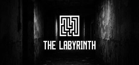
The Labyrinth scored 70/100 on Steam Analyzer — Good for a Psychological Horror capsule. Top priority fix: [uniqueness_polish] Introduce a distinctive visual element—a silhouetted figure, creature, or environmental detail—that communicates the game's core hook and differentiates it from generic maze aesthetics.

Capsule scores by dimension

  • Genre Clarity: 7/10 — Puzzle maze with psychological dread. The geometric maze logo and dark architectural setting clearly signal a puzzle or maze-based game with atmospheric tension. The monochromatic palette and shadowy corridor environment hint at psychological horror or survival themes, though at tiny size the genre reads as 'dark maze puzzle' rather than a specific subgenre. The maze symbol is iconic enough to communicate intent, but gameplay type (first-person navigation, top-down, puzzle logic) remains ambiguous at small sizes.
  • Title Readability: 8/10 — Clean sans-serif, excellent contrast. The title 'THE LABYRINTH' uses a bold, geometric sans-serif font with strong white-on-black contrast that holds legibility across all sizes from full header to tiny thumbnail. The text is centered and positioned on a controlled dark background, avoiding texture collision. The maze icon above serves as a secondary focal point that reinforces the title without competing for attention, and both elements remain readable even at 120×45 resolution.
  • Contrast & Color: 8/10 — High value separation, clean silhouettes. Stark white geometric logo and title text create excellent value contrast against the deep black background, with no muddy midtones or blend-in effects. The grayscale test confirms strong edge definition and silhouette clarity. The textured dark corridor environment in the background adds visual interest without undermining the primary white elements, and this separation remains effective at small sizes and under squint conditions.
  • Uniqueness & Polish: 6/10 — Competent but minimal execution. The design demonstrates clean craft with intentional typography and a simple geometric maze symbol that feels premium and purposeful. However, the execution is relatively minimal—a logo, title, and atmospheric background without narrative visual hook or distinctive art style that sets it apart from other dark indie puzzle games. Compared to top peers like DREDGE or Chants of Sennaar, this lacks a memorable character, creature, or unique visual premise that communicates core gameplay or tone beyond 'dark maze.'
  • Brand Consistency: 6/10 — Simple palette, minimal identity signals. The monochromatic black-and-white scheme and geometric maze motif are internally consistent and convey a cohesive minimalist brand direction. However, there are no iconic characters, signature color palette shifts, or distinctive brand flourishes that create strong recognition cues for later encounters. The visual identity is functional but generic within the indie horror-puzzle space, lacking a memorable symbol or visual signature that would distinguish it from competitors.
  • Composition: 7/10 — Clear hierarchy, centered balance. The composition follows a strong vertical hierarchy with the maze icon anchoring the top center, title text in the middle, and atmospheric background texture supporting without dominating. The focal point is unambiguous at all sizes, and safe margins protect key elements from Steam's edge cropping. At tiny size, the design remains legible due to this centered, uncrowded approach, though the background texture adds slight visual noise that could be reduced for even sharper definition at 45-pixel heights.

What works

  • Excellent title contrast and legibility. White sans-serif text on deep black background maintains perfect readability from full header to tiny thumbnail with no letterform collapse or outline loss.
  • Iconic geometric maze symbol. The symmetrical labyrinth logo is simple, memorable, and immediately communicates the core mechanic while adding visual interest above the title.
  • Strong atmospheric mood reinforcement. The shadowy corridor background and monochromatic palette effectively evoke psychological tension and isolation that aligns with the game description.

What hurts the capsule

  • Minimal visual differentiation in genre. The black-and-white minimalist approach, while clean, is common among indie horror and puzzle games, reducing the capsule's ability to stand out in a crowded category.
  • No gameplay or narrative hook visible. The capsule communicates mood and theme but not a distinctive selling point—no character, mechanic, or unique visual element that explains why this labyrinth is different from generic maze games.
  • Limited visual depth and layering. The background texture, while atmospheric, does not create clear foreground-midground-background separation that would enhance composition sophistication at smaller sizes.

Priority fixes

  1. [uniqueness_polish] Introduce a distinctive visual element—a silhouetted figure, creature, or environmental detail—that communicates the game's core hook and differentiates it from generic maze aesthetics.
  2. [composition] Add subtle color accent or lighting effect (e.g., dim red glow, eerie white light source) to increase visual depth and draw focus without compromising legibility.
  3. [brand_consistency] Develop a recognizable secondary icon or motif (e.g., a signature pattern within the maze, or a repeating visual symbol) that creates a memorable brand marker for later store encounters.

Store copy priority fixes

  1. [feature_communication] Replace 'Mental Challenge: Test your sense of direction and stress resistance' with specific mechanics: 'Navigate an ever-shifting maze while managing a sanity meter that degrades when you hear whispers or see strange shapes in the darkness. Solve environmental puzzles to find exits or face permanent psychological damage.'
  2. [uniqueness] Add a concrete differentiator after 'The Labyrinth is more than just a maze': specify whether the maze dynamically changes based on player psychology, whether choices permanently alter the environment, or what narrative or structural element makes this labyrinth distinct from survival-horror competitors.
  3. [audience_targeting] Insert a sentence after the opening paragraph clarifying the difficulty and player type: 'Designed for horror fans who value psychological dread and exploration over combat, with difficulty scaling for both newcomers and veteran horror players.'
  4. [feature_communication] Expand the bullet points with one concrete example: add a fourth feature like 'Persistent Consequences: Your mental state permanently affects navigation, perception, and available paths forward.'

Related guides

Steam app ID: 4544690 · Tags: Psychological Horror, First-Person, Horror, Singleplayer, Survival Horror