Scoring genre clarity...

What You Don't See capsule

What You Don't See

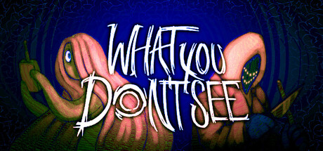
A first-person horror game that has you explore the surreal mindscape of a murder victim. Armed with your trusty flashlight, you must gather evidence to try and piece together the details of the murder and free them from their suffering.

Free to PlayPositive(11)
HorrorFirst-PersonSupernatural
Maroon Moon StudioApr 30, 2026

What You Don't See scores 77/100 — better than 87% of Horror capsules (n=3,119).

Positive (11 reviews) · Free to Play · Released Apr 30, 2026 · By Maroon Moon Studio

Quick text summary

What You Don't See scored 77/100 on Steam Analyzer — Good for a Horror capsule. Top priority fix: [genre_clarity] Consider adding subtle visual hints of investigation tools (e.g., a faint flashlight beam or evidence artifact) to reinforce the first-person detective mechanic without overwhelming the creature focus.

Capsule scores by dimension

  • Genre Clarity: 7/10 — Horror and mystery clearly signaled. The grotesque octopus-like creature with glowing eyes and organic, unsettling design immediately communicates psychological horror. At tiny size, the alien creature silhouette and eerie color palette (deep blues and sickly pinks) read as horror-adjacent, though the first-person investigation mechanic is not visually apparent. The surreal, nightmarish aesthetic supports the murder mystery theme effectively.
  • Title Readability: 8/10 — Bold hand-painted lettering reads well. The title 'WHAT YOU DON'T SEE' uses chunky, expressive brush-stroke lettering in white with strong outlines that maintain legibility at small sizes. At tiny size, the two-line split is readable and the handmade quality feels intentional. Minor risk is that decorative letterforms lose slight detail at extreme compression, but the weight and contrast sustain clarity.
  • Contrast & Color: 8/10 — Strong value separation with saturated accent. The composition uses a deep blue background (#1b2838 blend) that provides excellent separation for the coral-pink tentacles and white title text. The warm orange-pink creature pops distinctly against cool blues in both full and grayscale contexts. At tiny size, the silhouette remains clear and the warm-cool contrast drives visual impact without muddy mid-tones.
  • Uniqueness & Polish: 8/10 — Distinctive surreal creature and craft. The hand-painted octopus creature with glowing pupils and organic tentacle work feels premium and intentional, not templated. The brushwork quality and color control suggest thoughtful art direction specific to the game's surreal mindscape setting. This stands apart from generic horror clichés and communicates a unique visual identity aligned with the psychological horror angle.
  • Brand Consistency: 7/10 — Cohesive surreal horror aesthetic. The creature design, color palette (deep blue-purple with coral accents), and hand-painted typography create internal visual harmony. The style appears intentional and recognizable as a branded voice. Without seeing all 8 screenshots, the octopus motif and surreal organic rendering style should remain consistent and memorable across store assets.
  • Composition: 8/10 — Balanced focal point with strong hierarchy. The creature occupies the center-lower composition as the primary focal point with clear dominance, while the title floats above in the upper-center region without competing for attention. Background detail and vignetting frame the subject without creating clutter. The layout remains well-balanced and readable at small sizes, with safe margins protecting text from edge crop hazards.

What works

  • Distinctive creature design. The hand-painted octopus with glowing eyes immediately communicates psychological horror and stands out from generic horror game templates.
  • Title legibility and personality. Bold brush-stroke lettering with strong outlines and contrast maintains readability across all sizes while adding handcrafted charm.
  • Warm-cool color contrast. The saturated coral-pink creature against deep blue background creates strong visual separation that pops at tiny size and works well in grayscale.
  • Cohesive visual direction. The overall composition balances the creature and title without clutter, creating a polished, intentional presentation aligned with surreal horror themes.

What hurts the capsule

  • Gameplay mechanic not visually implied. The first-person flashlight investigation aspect and evidence-gathering mechanic are not suggested by the creature-focused capsule alone.
  • Potential confusion with multiple genres. While horror reads clearly, the free-to-play indie adventure angle and murder mystery narrative could be more visually distinct from pure cosmic horror.

Priority fixes

  1. [genre_clarity] Consider adding subtle visual hints of investigation tools (e.g., a faint flashlight beam or evidence artifact) to reinforce the first-person detective mechanic without overwhelming the creature focus.
  2. [composition] Ensure creature tentacles and title text remain within safe margins on all Steam platform crops to prevent edge clipping during display scaling.

Store copy priority fixes

  1. [feature_communication] Replace 'gather evidence' and 'piece together details' with concrete examples: 'Examine ghostly impressions of the crime scene, interview fragmented memories of witnesses, and solve environmental puzzles that reveal the truth of Irene's death.'
  2. [uniqueness] Add a sentence emphasizing the game's distinct perspective: 'Unlike traditional detective games, you experience the murder through the victim's fractured consciousness, uncovering truth from the inside out.'
  3. [hook_strength] Strengthen the detailed description's opening to match the visceral hook of the short description: 'Step into the fractured mind of a murdered woman and uncover the truth of her death before her suffering consumes her entirely.'

Related guides

Steam app ID: 4592990 · Tags: Horror, First-Person, Supernatural, Mystery, Collectathon