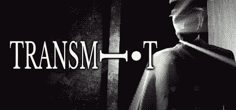
Scoring genre clarity...

TRANSMIT capsule

TRANSMIT

A 1-bit, point & click and puzzle short story about horror, mystery and deception. TRANSMIT, translate and search for coded messages as part of your telegraph operator job and figure out what's behind the new SS PURGO.

HorrorPixel GraphicsPoint & Click
zolduck2026

TRANSMIT scores 73/100 — better than 67% of Horror capsules (n=3,252).

Released 2026 · By zolduck

Quick text summary

TRANSMIT scored 73/100 on Steam Analyzer — Good for a Horror capsule. Top priority fix: [composition] Reduce clutter in corner elements or consolidate mechanical objects to frame the title more intentionally, directing eye movement more clearly toward TRANSMIT at small sizes.

Capsule scores by dimension

  • Genre Clarity: 7/10 — Mystery puzzle vibe clear. The monochromatic telegraph/machinery aesthetic and mechanical texturing clearly signal a retro mystery or puzzle game with industrial/noir undertones. At tiny size, the mechanical elements and stark black-and-white palette immediately evoke a 1-bit or retro computing theme, though the specific point-and-click puzzle mechanic is not obvious from visuals alone. The telegraph operator context is communicated through visual style rather than explicit UI hints.
  • Title Readability: 8/10 — Strong outlined title hierarchy. TRANSMIT is rendered in a bold, outlined serif font with clear letterspacing and sits prominently in the center of the composition against the mechanical background. The white outline provides excellent contrast separation at full size and remains legible at small size due to the thick stroke weight. At tiny size the title holds together well, though individual letterforms become simplified; the word remains recognizable as a cohesive unit.
  • Contrast & Color: 8/10 — Stark monochrome against dark background. The pure white and black palette creates maximum value separation from Steam's #1b2838 background, with the white title and mechanical details popping cleanly. The grayscale treatment ensures no muddy mid-tones—everything reads as either highlight or shadow with sharp silhouette definition. Even at tiny size, the high contrast silhouette of the machinery and title text maintains clarity under quick scroll conditions.
  • Uniqueness & Polish: 7/10 — Distinctive 1-bit aesthetic executed well. The choice to embrace a monochromatic telegraph/mechanical design sets this apart from typical indie horror-mystery capsules and communicates the core theme (telegraph operator) with intentional craft. The striped machinery texture and period-appropriate visual language feel cohesive and thematic rather than random. However, the composition itself is relatively straightforward—a centered title over textured background without a character focal point or unexpected visual storytelling hook that would elevate it to premium territory.
  • Brand Consistency: 7/10 — Cohesive industrial identity. The monochromatic, mechanical aesthetic appears consistent with a 1-bit puzzle game identity and the telegraph operator premise. The serif font choice and vintage machinery texture create a recognizable visual language that would likely persist across UI and store assets. Without access to full store screenshots, the score reflects strong internal cohesion and thematic integrity visible here; the iconic telegraph/machinery motif serves as a memorable brand anchor.
  • Composition: 7/10 — Centered title with texture depth. The title TRANSMIT anchors the center with mechanical texture layering (machinery striping and objects) creating visual depth and preventing a flat look. The composition has clear hierarchy with the title as primary focal point and supporting mechanical elements as secondary detail. At small and tiny sizes, the centered layout holds together cleanly, though the scattered mechanical elements in the corners add minor visual noise that could compete slightly with the title at smallest viewing sizes.

What works

  • Excellent monochrome contrast. Pure white and black palette ensures maximum value separation from Steam's dark background and maintains clarity through all viewing sizes including tiny thumbnails.
  • Thematic visual language. Telegraph/mechanical aesthetic directly communicates the core premise and game setting, avoiding generic horror clichés in favor of specific period-appropriate identity.
  • Legible title treatment. Bold outlined serif font with strong stroke weight and clear spacing remains readable at small size and doesn't collapse under the squint test.

What hurts the capsule

  • Scattered supporting elements. Mechanical objects in corners and edges create minor visual noise that competes with the title focal point, especially noticeable when viewing at small sizes.
  • No character or primary subject. The composition relies entirely on texture and title with no distinctive character or central figure to anchor the visual story, limiting memorable impact.
  • Generic texture-over-title approach. While thematic, the execution is relatively straightforward—text on textured background without unexpected compositional depth or visual hook that would distinguish it from competent-but-conventional designs.

Priority fixes

  1. [composition] Reduce clutter in corner elements or consolidate mechanical objects to frame the title more intentionally, directing eye movement more clearly toward TRANSMIT at small sizes.
  2. [uniqueness_polish] Introduce a subtle central focal point—a silhouetted telegraph operator hand, a key detail, or period artifact—to add character and visual storytelling beyond the aesthetic foundation.
  3. [genre_clarity] Consider adding a subtle UI element or coded message visual hint (partial text overlay, blurred code pattern) to make the puzzle/code-breaking mechanic more visually apparent at tiny size.

Store copy priority fixes

  1. [hook_strength] Rewrite the opening line to lead with narrative stakes instead of aesthetics: 'You're a telegraph operator aboard a ship receiving increasingly disturbing coded messages—and something is listening.' This immediately signals psychological horror and mystery without burying the hook.
  2. [uniqueness] Add 1–2 sentences explaining what makes the puzzle or narrative mechanic distinctive, such as how the morse code system works differently than standard decoding games, or why the Captain's role creates genuine moral/survival tension.
  3. [audience_targeting] Include a brief scope signal in the short description or opening paragraph, e.g., 'a 2–3 hour experience' or 'for players who love tense, logic-based puzzle games,' to help self-selection.
  4. [uniqueness] Explicitly connect the 1-bit aesthetic to gameplay or narrative purpose: e.g., 'The monochrome world strips away distraction, forcing you to focus on what the messages reveal' to show it's a deliberate creative choice, not just a visual style.

Related guides

Steam app ID: 4603020 · Tags: Horror, Pixel Graphics, Point & Click, Puzzle, Psychological Horror