Scoring genre clarity...

Apiary in Flow capsule

Apiary in Flow

Apiary in Flow is an incremental game with automation elements where you place bees inside a hive to build efficient honey-gathering chains. Unlock new bee types and spend your harvest on permanent skill tree upgrades!

IncrementalIdlerAutomation
AkinoEgo2026

Apiary in Flow scores 85/100 — better than 96% of Incremental capsules (n=1,373).

Released 2026 · By AkinoEgo

Quick text summary

Apiary in Flow scored 85/100 on Steam Analyzer — Excellent for a Incremental capsule. Top priority fix: [title_readability] Ensure the full title "APIARY IN FLOW" reads as a unified unit by slightly increasing orange "FLOW" size or adding a visual connector between words at small scales.

Capsule scores by dimension

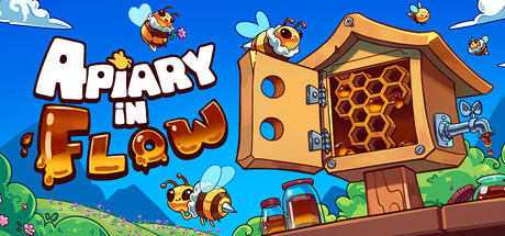
  • Genre Clarity: 9/10 — Bee automation clearly communicated. The open hive with visible honeycomb structure, flying bees in organized patterns, and the core mechanic of bee placement are immediately recognizable at all sizes. At tiny size, the hive silhouette and bee activity still read distinctly as a management/automation game, not action or puzzle-based.
  • Title Readability: 9/10 — Bold legible title at all scales. "APIARY" in large white sans-serif with a red-brown outline pops clearly against the blue sky background and remains readable even at tiny size. "FLOW" in smaller orange text below maintains legibility and hierarchy without competing for attention at small scales.
  • Contrast & Color: 9/10 — Vibrant value separation throughout. Bright blue sky background creates strong contrast with warm brown hive, orange text, and white title lettering. The composition uses saturated, distinct colors that maintain silhouette clarity in grayscale and stand out immediately against Steam's dark theme at all viewing sizes.
  • Uniqueness & Polish: 8/10 — Charming art style, clear hook. The hand-drawn aesthetic with rounded character designs and detailed hive interior (honeycomb visible through open door) distinguishes it from generic mobile game templates. The visual storytelling of an active beehive immediately communicates the core loop, though the overall execution is solid craft rather than exceptional innovation.
  • Brand Consistency: 8/10 — Cohesive warm, cheerful palette. The consistent cartoon art style, warm color scheme (orange, brown, yellow tones), and recognizable bee characters with consistent proportions signal a unified brand identity. The friendly, approachable aesthetic reinforces the casual incremental game positioning and would be memorable across marketing materials.
  • Composition: 8/10 — Balanced hierarchy with clear focal point. The hive structure anchors the center-right area as the primary focal point with supporting bee characters distributed around it, creating depth and guiding the eye without clutter. Title placement in the upper left is safe from Steam cropping and maintains visibility; the composition remains readable at small and tiny sizes without dead space or edge-hugging elements.

What works

  • Immediate genre recognition. The open hive, honeycomb detail, and active bee placement communicate the automation/incremental game loop instantly, even at thumbnail size.
  • Strong title contrast and placement. White and orange text with brown outline stands bold against blue sky and remains fully legible at all scales without degradation.
  • Cohesive cheerful aesthetic. Hand-drawn cartoon style with warm color palette and friendly character design creates a memorable and distinctive brand voice within the casual game space.
  • Clean focal point hierarchy. The hive structure clearly dominates the composition while supporting bees guide attention without creating competing focal points or visual clutter.

What hurts the capsule

  • Minor text hierarchy ambiguity. "FLOW" tagline is smaller and in orange, which could read as secondary despite being part of the title; at tiny size the relationship might feel slightly disconnected.
  • Limited vertical breathing room. The composition is horizontally balanced but the title and main visual sit in a fairly compact zone, leaving some unused upper-left headroom that could be optimized.

Priority fixes

  1. [title_readability] Ensure the full title "APIARY IN FLOW" reads as a unified unit by slightly increasing orange "FLOW" size or adding a visual connector between words at small scales.
  2. [composition] Verify all assets remain clear when Steam crops edges; test the composition resilience if the right edge (rightmost bees) gets trimmed during platform display.

Store copy priority fixes

  1. [hook_strength] Rewrite the opening line to lead with the satisfying core reward: 'Build a living, efficient hive by placing bees to create flowing chains of honey production—and watch your empire grow with each run.' This adds anticipation and visual satisfaction to the mechanical explanation.
  2. [feature_communication] Add one sentence explicitly clarifying passive progression: mention whether honey keeps flowing when you close the game, or if all progress requires active management, to align 'automation' with actual gameplay.
  3. [uniqueness] Insert a sentence after 'Master the hexagonal layout' explaining the specific advantage: e.g., 'Hexagonal geometry creates richer bee connections and more surprising combos than grid systems, rewarding creative problem-solving.' This justifies the design choice and differentiates from competing incrementals.

Related guides

Steam app ID: 4614870 · Tags: Incremental, Idler, Automation, Casual, Resource Management