Scoring genre clarity...
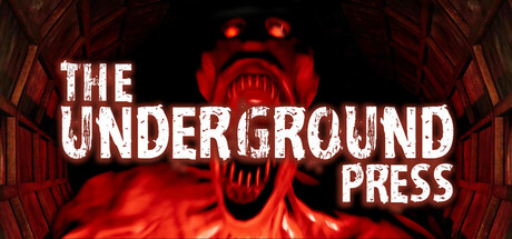
The Underground Press capsule

The Underground Press

A first-person psychological indie horror with investigation elements. Explore the dark, abandoned subway, restore power to machinery, and solve puzzles. Gather clues to uncover the mystery of the closed stations. But remember: you are not alone in the tunnels, and the darkness does not forgive.

Psychological HorrorHorrorFirst-Person
Parfenov AlekseiComing soon

The Underground Press scores 72/100 — better than 50% of Horror capsules (n=3,252).

Released Coming soon · By Parfenov Aleksei

Quick text summary

The Underground Press scored 72/100 on Steam Analyzer — Good for a Horror capsule. Top priority fix: [uniqueness_polish] Integrate a distinctive visual element—such as a unique creature design detail, signature puzzle symbol, or subway-specific motif—that differentiates this horror from genre competitors and builds recognizable brand identity.

Capsule scores by dimension

  • Genre Clarity: 8/10 — Horror atmosphere clearly communicated. The red-tinted, demonic creature face with open maw centered in the image immediately signals psychological horror. At TINY size, the grotesque silhouette and warm red color palette strongly imply danger and dread rather than action-adventure. The subway tunnel architectural elements in the background reinforce the confined, claustrophobic setting expected from the game description, though the exact investigation/puzzle elements are less visible.
  • Title Readability: 7/10 — Title readable but font dependent. THE UNDERGROUND PRESS uses a clean, bold serif typeface with white outlines that stands out clearly against the dark red background at full size and SMALL size. At TINY size, the outline strokes remain legible due to the stark contrast, though individual letterforms compress slightly. The title placement spans the upper-middle region without competing with the focal creature, maintaining reasonable clarity across all viewing sizes.
  • Contrast & Color: 8/10 — Strong value separation with warm tones. The high-contrast white title text and bright red-orange creature glow create excellent separation against the #1b2838 dark Steam background. The warm saturated reds and oranges of the demonic entity pop distinctly in both full view and at TINY thumbnail size where the silhouette remains readable. The darker architectural elements in the background provide layered depth without muddying the primary focus.
  • Uniqueness & Polish: 7/10 — Distinctive horror imagery, solid execution. The capsule features a memorable demonic creature design with clear craft in the lighting and texture rendering, standing above generic horror clichés. The subway tunnel setting combined with the grotesque entity creates a specific atmosphere that hints at the game's unique psychological horror identity. While the execution is polished, the composition relies on a relatively straightforward horror trope without establishing a particularly distinctive visual hook that competitors like DREDGE or Slay the Princess achieve.
  • Brand Consistency: 6/10 — Cohesive but generic horror branding. The red-and-darkness color palette and demonic creature establish internal visual consistency that would carry across marketing materials. However, without reference to the 9 available store screenshots, the creature and palette feel more like standard indie horror signaling than a uniquely memorable brand identity. The subway setting is thematic to the title but does not yet create a distinctive visual signature that would be instantly recognizable as THE UNDERGROUND PRESS specifically.
  • Composition: 7/10 — Clear focal point, title placement functional. The demonic creature occupies the center-upper region as the dominant focal point, with the title integrated into the upper half without blocking or competing with the creature's impact. At SMALL and TINY sizes, the eye naturally lands on the red creature first, then reads the title. The composition maintains good depth layering with tunnel architecture receding behind the creature, though some edge elements (tunnel walls) risk minor cropping at extreme sizes without significantly damaging recognition.

What works

  • Strong color contrast against dark background. White title and bright red-orange creature glow create excellent value separation that reads clearly even at TINY thumbnail size, ensuring immediate visual impact during quick Steam scrolling.
  • Clear psychological horror genre signaling. The grotesque demonic creature face and confined subway tunnel setting immediately communicate the game's psychological horror and investigation focus without ambiguity.
  • Readable title with outline strategy. Bold serif typeface with white outlines on warm background maintains legibility across full, SMALL, and TINY viewing sizes through strategic stroke weight.

What hurts the capsule

  • Generic horror creature design lacks distinction. While well-executed, the demonic entity is a familiar horror archetype that does not immediately differentiate THE UNDERGROUND PRESS from competitor horror titles in the genre.
  • Limited visual storytelling of core mechanics. The capsule does not visually hint at the investigation, puzzle-solving, or power-restoration gameplay elements mentioned in the description, reducing communicative depth beyond atmosphere.
  • No clear brand identity hook or motif. The subway setting and creature feel thematic but do not establish a signature visual motif or iconic symbol that would make the game instantly recognizable without the title.

Priority fixes

  1. [uniqueness_polish] Integrate a distinctive visual element—such as a unique creature design detail, signature puzzle symbol, or subway-specific motif—that differentiates this horror from genre competitors and builds recognizable brand identity.
  2. [composition] Consider adding subtle investigative or mechanical visual cues (evidence markers, machinery elements, puzzle hints) in the background or creature design to communicate the investigation and puzzle-solving core gameplay without losing atmospheric focus.
  3. [brand_consistency] Reference the 9 available store screenshots to ensure the creature, palette, and tunnel aesthetic create a cohesive visual language that reinforces identity across all marketing materials.

Store copy priority fixes

  1. [uniqueness] Add a specific sentence explaining what sets the journalist-as-protagonist investigation mechanic apart: e.g., 'Unlike typical horror exploration, your success depends on finding and interpreting evidence—gathered documents directly shape your ending.'
  2. [audience_targeting] Clarify tone and difficulty: add a brief line about whether jump-scares are central, whether the game rewards stealth/evasion, and what kind of horror intensity players should expect.
  3. [feature_communication] Expand on the non-linear ending mechanic to show how document collection ties directly to multiple possible outcomes, reinforcing the consequence of investigation choices.
  4. [hook_strength] Consider opening the detailed description with the journalist angle and personal stakes first ('In pursuit of a truth that could clear your name...') before explaining the setting, to lead with motivation rather than geography.

Related guides

Steam app ID: 4637060 · Tags: Horror, Adventure, Atmospheric, Psychological Horror, Exploration