Scoring genre clarity...
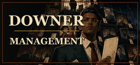
Downer Management capsule

Downer Management

The CEO is giving his empire to the most ruthless boss in the building. Build yours. Lead a department of doomed employees through 3v3 auto-battles, claw up a corporate succession contest floor by floor — then take your boss vigilante on the weekend. Permadeath. Zero microtransactions.

$8.99
Tactical RPGRogueliteAuto Battler
adarkfableJun 16, 2026

Downer Management scores 78/100 — better than 88% of Tactical RPG capsules (n=494).

$8.99 · Released Jun 16, 2026 · By adarkfable

Quick text summary

Downer Management scored 78/100 on Steam Analyzer — Good for a Tactical RPG capsule. Top priority fix: [genre_clarity] Add subtle UI or positioning hints (such as small rank badges, document stacks, or strategic markers on figures) to telegraph the 3v3 autobattler mechanic more clearly

Capsule scores by dimension

  • Genre Clarity: 7/10 — Corporate comedy strategy clear. The boardroom setting with five suited figures at a desk immediately signals workplace management and strategy gameplay. The formal, bureaucratic aesthetic communicates indie comedy rather than action or RPG, and the centered authority figure suggests turn-based decision-making or organizational hierarchy mechanics. At tiny size, the silhouette of figures in formal poses and office setting remains readable enough to convey management/strategy intent, though specific gameplay mechanics are not obvious.
  • Title Readability: 8/10 — Bold serif title excellent contrast. DOWNER MANAGEMENT uses a strong, all-caps serif font centered at the top with excellent contrast against the cream-colored background panel. The letterforms are clean and uniform, maintaining legibility at small and tiny sizes without collapsing or becoming muddy. Even at tiny thumbnail size, the two-word title reads clearly due to generous letter spacing and high value separation from the background.
  • Contrast & Color: 8/10 — Cream panel creates strong separation. The warm cream/tan background panel containing the scene creates strong visual separation from the dark Steam background #1b2838, with excellent value contrast throughout. The dark suits and boardroom elements read clearly against the lighter interior, and the horizontal venetian blinds at top and bottom add depth without muddying the focal area. In grayscale and at tiny size, the silhouettes and composition remain distinct and readable due to controlled value ranges.
  • Uniqueness & Polish: 8/10 — Distinctive retro art direction standout. The muted, retro-minimalist illustrated style with 1950s boardroom aesthetic feels deliberately crafted and distinct from generic game art, communicating the game's satirical corporate humor through visual storytelling alone. The careful character design with varied expressions, the period-appropriate office setting, and the controlled color palette all suggest premium indie production rather than asset-flipped or template-based work. The composition and artistic coherence clearly communicate that this is a thoughtfully designed game with a specific comedic voice.
  • Brand Consistency: 8/10 — Iconic retro boardroom visual identity. The distinctive muted retro-corporate visual language with simplified character silhouettes, earth-tone palette, and 1950s-era boardroom setting creates a recognizable and cohesive brand identity that would be memorable across marketing materials. The boardroom-as-game-board metaphor is a strong visual motif that immediately anchors the game's unique premise and could serve as a signature identity element. The consistent flat illustration style, character design logic, and color discipline suggest strong internal art direction.
  • Composition: 8/10 — Balanced focal point strong hierarchy. The centered authority figure in the black suit serves as the clear primary focal point, with the four supporting characters flanking left and right creating perfect bilateral balance and drawing the eye inward. The cream panel acts as a framing device that isolates the scene from the dark background, and the title placement at top leaves adequate breathing room without crowding the composition. At small and tiny sizes, the central figure and grouped silhouettes read clearly as a cohesive unit, with no scattered attention or distracting elements competing for focus.

What works

  • Typography stands out at all sizes. The bold serif title maintains perfect readability from full header down to tiny thumbnail, with no letterform degradation or contrast loss.
  • Cream panel isolates focal area. The framing device creates strong separation from dark Steam background and ensures the entire scene remains legible in quick scroll conditions.
  • Retro visual language is distinctive. The carefully executed 1950s boardroom aesthetic with muted palette and simplified characters communicates both genre and unique comedic voice clearly.
  • Balanced symmetric composition. Bilateral symmetry with central authority figure creates natural eye guidance and memorable focal hierarchy that works at all viewing scales.

What hurts the capsule

  • Minimal gameplay mechanic cues. While the setting communicates management theme, specific autobattler or positional strategy mechanics are not visually hinted at or immediately apparent.
  • Limited color saturation. The muted palette, while distinctive and thematic, offers less immediate visual pop than higher-saturation competitors like Balatro or Lethal Company in quick-scroll contexts.

Priority fixes

  1. [genre_clarity] Add subtle UI or positioning hints (such as small rank badges, document stacks, or strategic markers on figures) to telegraph the 3v3 autobattler mechanic more clearly
  2. [contrast_color] Consider a warm accent color (burnt orange or deep red) on one figure or object to add visual pop while maintaining retro aesthetic and helping it stand out in genre-heavy storefronts

Store copy priority fixes

  1. [feature_communication] Clarify the run structure and progression: Add one sentence explaining whether employees permanently die within runs or across runs, and whether there is meta-progression between playthroughs (e.g., unlocking new departments or cosmetics).
  2. [feature_communication] Expand on aura mechanics: Replace 'Bench composition becomes a strategy puzzle' with a concrete example such as 'A benched IT employee silences enemies in their position; stack three IT members on the bench to silence the entire enemy row.'
  3. [audience_targeting] Specify the roguelike difficulty and length: Add a sentence about run duration and whether the game suits casual or hardcore strategy players (e.g., 'Runs last 20-60 minutes; difficulty scales with employee experience.').

Related guides

Steam app ID: 4668480 · Tags: Tactical RPG, Roguelite, Auto Battler, Perma Death, PvE