Scoring genre clarity...

PUTRID/SHARP capsule

PUTRID/SHARP

Slice your way through the stages of rot and search for someone lost in a world that is waiting to end.

RPGInteractive FictionPsychological Horror
unsecondsTo be announced

PUTRID/SHARP scores 65/100 — better than 12% of RPG capsules (n=3,703).

Released To be announced · By unseconds

Quick text summary

PUTRID/SHARP scored 65/100 on Steam Analyzer — Solid for a RPG capsule. Top priority fix: [title_readability] Redesign the title with cleaner letterforms and consistent spacing while retaining thematic distortion only at stroke edges, not internal letterform geometry, to preserve legibility at tiny sizes.

Capsule scores by dimension

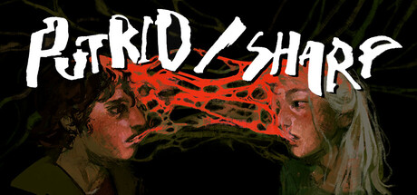
  • Genre Clarity: 7/10 — Horror-adventure with combat clarity. The red organic/flesh imagery and slash visual effect clearly communicate a dark, grotesque adventure with action elements. At tiny size, the silhouette of two figures and violent red slash remain readable, though the specific RPG mechanics are not immediately apparent. The rot and decay aesthetic strongly signals horror-adventure over pure RPG, which aligns with the game's premise of navigating decay and decay stages.
  • Title Readability: 5/10 — Distressed style compromises legibility. The fractured, jagged letterforms of 'PUTRID/SHARP' create an on-brand thematic effect but sacrifice clarity at small and tiny sizes. At full size the title is decodable, but at small (231×87) and especially tiny (120×45) the letterform fragmentation and irregular spacing cause the words to blur together into abstract shapes rather than distinct readable text. The white outline helps separation from the dark background, but the internal distortion dominates.
  • Contrast & Color: 7/10 — Strong value separation with effective accents. The white title text and pale skin tones of the two figures create clear separation against the dark background and murky green-brown color palette. The hot red slash and organic texture deliver a vivid accent that cuts through the muddy midtones. In grayscale, the silhouettes hold their definition and the high-contrast red slash remains a focal point, though the detailed facial features flatten somewhat at tiny sizes.
  • Uniqueness & Polish: 7/10 — Distinctive visual identity with polish. The organic, infected aesthetic with two symmetrical figures and the slash motif creates a memorable and unusual hook that stands apart from standard adventure fare. The rendering quality is clean, the color grading feels intentional, and the fractured title reinforces the theme of corruption and damage. However, the execution, while competent, does not yet feel exceptional compared to benchmarks like DREDGE or Slay the Princess, which have more immediate visual impact.
  • Brand Consistency: 6/10 — Thematic coherence without iconic motif. The capsule establishes a consistent visual language around rot, duality, and conflict that aligns with the game's core premise of navigating decay. The two figures, the slash effect, and the organic color palette all reinforce each other coherently. However, there is no single instantly recognizable icon or signature element that would anchor brand recall across multiple touchpoints without seeing the title.
  • Composition: 7/10 — Balanced focal points with clear hierarchy. The two figures anchor the center-left and center-right, with the red slash creating a dynamic horizontal divider that guides the eye across the composition. The title sits at the top with solid separation from the subject matter below. At small and tiny sizes, the composition holds reasonably well—the figures remain distinct, the slash reads as a unifying element, and no critical details are lost to edge cropping. The symmetry is intentional and works, though it risks feeling static compared to more diagonal or asymmetric arrangements.

What works

  • Horror theme unmistakable. The flesh, decay, and grotesque imagery immediately communicate a dark, mature aesthetic that differentiates the capsule from bright fantasy or action-adventure peers.
  • Accent color creates focal impact. The hot red slash is a bold, memorable visual element that cuts through the muted palette and ensures the capsule does not disappear into muddy midtones.
  • Strong silhouette separation at small size. Even at tiny resolution, the two figures and the slash effect maintain clear outline and do not merge into the background noise.

What hurts the capsule

  • Title legibility collapses at small sizes. The distressed, fractured letterforms of 'PUTRID/SHARP' become abstract noise at tiny size, forcing users to rely on context or prior knowledge to decode the game name.
  • No iconic brand element. While the visual language is thematic and coherent, there is no distinctive symbol, character motif, or signature design that would aid immediate brand recognition on second exposure.
  • Symmetry risks static composition. The mirrored figure placement and centered slash, while thematically justified, create a formal, passive read compared to asymmetric or more dynamic benchmark capsules like DREDGE.

Priority fixes

  1. [title_readability] Redesign the title with cleaner letterforms and consistent spacing while retaining thematic distortion only at stroke edges, not internal letterform geometry, to preserve legibility at tiny sizes.
  2. [uniqueness_polish] Introduce a signature visual motif—such as a distinctive icon, branded texture, or unique treatment of the rot effect—that becomes immediately recognizable as PUTRID/SHARP across all marketing assets.
  3. [composition] Consider adding subtle directional cues or asymmetric balance (e.g., off-center slash, angled figures) to create more visual momentum and differentiate from formulaic centered compositions.

Store copy priority fixes

  1. [feature_communication] Add a 1-2 sentence explanation of how nonogram puzzles work in combat and what the player is solving during encounters—e.g., 'Identify living tissue among rot using logic puzzles to land attacks.'
  2. [feature_communication] Explicitly list 2-3 core RPG systems (dialogue choices, character progression, inventory, etc.) to clarify what mechanical depth exists beyond combat and exploration.
  3. [genre_clarity] Expand the opening to include a sentence about the narrative/choice structure—linear story vs. branching paths—since the tag 'Interactive Fiction' implies choice mechanics not yet mentioned.
  4. [audience_targeting] Add a sentence explicitly stating this is for players seeking story-first horror with minimal action pressure, referencing accessibility features (Playable without Timed Input, Adjustable Difficulty) to signal inclusive design.

Related guides

Steam app ID: 4682620 · Tags: RPG, Interactive Fiction, Psychological Horror, Atmospheric, Romance