Scoring genre clarity...

Manifold Garden capsule

Manifold Garden

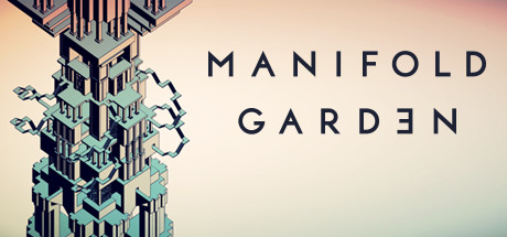
Rediscover gravity and explore an Escher-esque world of impossible architecture. Witness infinity in first-person and master its rules to solve physics-defying puzzles. Cultivate a garden to open new paths forward, where an eternal expanse awaits.

$4.99Overwhelmingly Positive(78)
PuzzleSurrealAbstract
William Chyr StudioOct 20, 2020

Manifold Garden scores 75/100 — better than 68% of Steam capsules we've analysed (n=22,658).

Overwhelmingly Positive (78 reviews) · $4.99 · Released Oct 20, 2020 · By William Chyr Studio

Quick text summary

Manifold Garden scored 75/100 on Steam Analyzer — Good for a Steam capsule. Top priority fix: [title_readability] Tighten letter-spacing on the logo by approximately 30% and add a very subtle dark drop shadow or thin outline so MANIFOLD GARDEN remains legible at 120x45 pixel thumbnail size.

Capsule scores by dimension

  • Genre Clarity: 7/10 — Architectural puzzle world implied. The vertiginous perspective of infinite geometric architecture immediately signals a spatial/perspective-puzzle game in the vein of Monument Valley or Portal, which is accurate. The Escher-esque impossible tower vanishing into a bright focal point communicates the gravity-defying premise well at full size. At tiny size the architectural detail collapses into an abstract light-and-lines composition, but the sense of spatial disorientation still hints at a puzzle or exploration game.
  • Title Readability: 7/10 — Clean logo, tiny size marginal. The spaced, geometric sans-serif title 'MANIFOLD GARDEN' with the mirrored E in GARDEN is distinctive and reads cleanly at full size, placed centrally on a mid-value zone of the architecture. At small capsule size the letterforms hold but begin to thin out, and at tiny size the title becomes very difficult to parse with confidence, especially the GARDEN row. The wide letter-spacing that gives the logo elegance at full size works against it at tiny scale.
  • Contrast & Color: 7/10 — Strong central light, soft edges. The warm central light burst against the cool purple-blue corners creates a strong value gradient that separates the image from Steam's dark #1b2838 background, particularly in the lower corners. The grayscale test reveals the central triangle of light reads with high contrast, but the architectural line detail on either side merges into mid-tone noise. At tiny size the silhouette collapses to a bright triangle with dark flanks, which is still distinctive but loses the architectural storytelling.
  • Uniqueness & Polish: 8/10 — Distinctive art direction, premium feel. The capsule is genuinely distinctive among indie puzzle-adventure titles, avoiding character-forward clichés in favor of pure architectural geometry and light. The reversed E in GARDEN is a subtle but memorable typographic choice that signals intentional design thinking. The overall craft feels polished and premium, though it sits closer to 'art gallery' than 'game product,' which may cost some genre discoverability at a glance.
  • Brand Consistency: 8/10 — Cohesive geometric identity. The capsule's cool-to-warm gradient palette, geometric architectural motif, and clean spaced typography form a recognizable internal identity that would carry across store screenshots and marketing. The custom mirrored-E letterform in GARDEN is an identity anchor that could become recognizable on repeat exposure. There are no clashing elements or inconsistent rendering styles; the art direction is singular and coherent.
  • Composition: 8/10 — Strong central triangle hierarchy. The vanishing-point perspective creates a powerful natural triangle leading the eye to the bright central focal point, with the title placed at the visual center of gravity where mid-tones provide a readable background. The dark lower corners frame without crowding and give breathing room against Steam's dark UI. At small and tiny sizes the central light burst remains the clear focal point, though the title placement in the middle of the image means it competes slightly with the architectural detail behind it rather than sitting on a clean controlled zone.

What works

  • Distinctive perspective composition. The vertiginous upward vanishing point is immediately arresting and communicates the game's impossible-architecture premise without any text.
  • Premium typographic identity. The spaced geometric logotype with the mirrored E is a polished, memorable identity marker that elevates the capsule above generic indie presentation.
  • Strong value contrast at center. The bright warm light burst at the focal point punches against Steam's dark background and anchors the eye even at tiny thumbnail size.
  • Cohesive palette and art direction. The cool purple-blue to warm gold gradient is internally consistent and gives the capsule a distinctive recognizable signature across all viewing sizes.

What hurts the capsule

  • Title collapses at tiny size. The wide letter-spacing of MANIFOLD GARDEN, while elegant at full size, causes the letterforms to thin and become unreadable at approximately 120x45 pixels.
  • Architectural detail becomes noise at small size. The intricate circuit-like line work on the building faces, which is a key selling point, reduces to indistinct mid-tone texture at small and tiny viewing sizes.
  • Genre ambiguity for new viewers. Without genre knowledge, the pure architectural composition could read as a walking sim, screensaver, or abstract art piece rather than an active puzzle game, potentially losing casual browsers.
  • Title placed on busy mid-tone zone. The logo sits over the gradient transition of the architecture rather than on a fully controlled dark or light region, reducing its contrast resilience across different monitors.

Priority fixes

  1. [title_readability] Tighten letter-spacing on the logo by approximately 30% and add a very subtle dark drop shadow or thin outline so MANIFOLD GARDEN remains legible at 120x45 pixel thumbnail size.
  2. [genre_clarity] Introduce a subtle environmental puzzle element, such as a small floating object or gravity-break visual cue, in the foreground to push genre legibility from architectural-aesthetic toward active puzzle game.
  3. [contrast_color] Slightly darken the mid-zone behind the title text to create a more controlled background region, improving logo contrast without disrupting the overall gradient composition.
  4. [uniqueness_polish] Consider adding a minimal color-coded block element, referencing the in-game colored cubes used for puzzle solving, to hint at the core mechanic and distinguish from pure walking-sim aesthetics.

Store copy priority fixes

  1. [feature_communication] Add 1–2 sentences explaining the garden cultivation mechanic: what the player plants, how it progresses, and how it unlocks new areas or puzzle solutions.
  2. [audience_targeting] Add a sentence clarifying difficulty level and expected playtime (e.g., 'suitable for puzzle fans of all skill levels' or 'a challenging 8–12 hour experience') to help players self-select.
  3. [genre_clarity] Emphasize the 'psychedelic' and 'experimental' nature more explicitly in the short description, as the Escher reference hints at it but doesn't fully capture the surreal mood of the tags.

Related guides

Steam app ID: 473950