Scoring genre clarity...
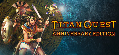
Titan Quest Anniversary Edition capsule

Titan Quest Anniversary Edition

For its 10 year anniversary, Titan Quest will shine in new splendour. This Anniversary Edition combines both Titan Quest and Titan Quest Immortal Throne in one game, and has been given a massive overhaul for the ultimate ARPG experience.

$4.99Very Positive(105)
RPGHack and SlashAction RPG
Iron Lore Entertainment, THQ NordicAug 31, 2016

Titan Quest Anniversary Edition scores 78/100 — better than 90% of RPG capsules (n=3,703).

Very Positive (105 reviews) · $4.99 · Released Aug 31, 2016 · By Iron Lore Entertainment

Quick text summary

Titan Quest Anniversary Edition scored 78/100 on Steam Analyzer — Good for a RPG capsule. Top priority fix: [title_readability] Increase subtitle contrast or slightly enlarge ANNIVERSARY EDITION text to ensure legibility at 120x45 thumbnail size without compromising overall hierarchy

Capsule scores by dimension

  • Genre Clarity: 8/10 — Clear action-RPG with mythological setting. The central female warrior in combat stance with sword and ornate shield immediately signals action gameplay, while the classical Greek/Roman aesthetic and divine iconography establish the mythological ARPG setting. At tiny size, the warrior silhouette and weapon clarity still read as melee action-RPG, though fine details of the ornate circular backdrop become abstract texture.
  • Title Readability: 8/10 — Bold orange title readable at all sizes. TITAN QUEST text in large orange caps with clean lettering maintains excellent legibility even at tiny 120x45 thumbnail size, standing well clear of the background. The subtitle ANNIVERSARY EDITION is smaller but still readable at small size, though becomes challenging at ultra-tiny sizes. Strategic right-side placement on negative space avoids competing with the character.
  • Contrast & Color: 8/10 — Strong warm-cool separation with vibrant accents. The warm golden-orange title and character details pop distinctly against the cool teal-blue background gradient, creating excellent value separation that survives the dark Steam background. The ornate shield and weapon highlights maintain sharp silhouettes even when squinting, while the cool blue atmospheric effect provides clear depth layering away from the warm character foreground.
  • Uniqueness & Polish: 7/10 — Premium mythological presentation with polish. The ornate circular frame around the warrior, intricate armor detailing, and divine iconography (sun symbol, celestial elements) convey a high-production ARPG with mythological flavor beyond generic fantasy. Craftsmanship is evident in the lighting and material rendering, though the overall composition remains somewhat expected for the anniversary edition rerelease positioning rather than introducing a new unique hook.
  • Brand Consistency: 8/10 — Cohesive mythological ARPG identity established. The warm gold palette, classical Greek/Roman aesthetic, warrior protagonist, and ornate decorative framing create a recognizable visual identity consistent with the Titan Quest franchise legacy. The character's pose, armor style, and weapon selection align with expected brand signaling for a mature action-RPG set in antiquity, establishing memorable internal cohesion without feeling derivative of competitors.
  • Composition: 8/10 — Strong focal hierarchy with balanced layout. The warrior character anchors center-left as clear primary subject, with the ornate shield providing circular framing that guides eye movement inward. The title occupies clean right-side negative space without crowding, and depth layering from ornate back-circle through warrior to foreground creates clear visual hierarchy that survives reduction to tiny thumbnail size with minimal information loss.

What works

  • Excellent color contrast and separation. Warm orange-gold title and character elements create strong value separation against cool teal background, maintaining clarity at all viewing sizes including tiny thumbnails.
  • Clear genre identity and visual focus. Warrior in combat stance with ornate shield immediately communicates melee action-RPG with mythological setting, leaving no ambiguity about game type.
  • Strategic text placement on negative space. Title and subtitle positioned on right side away from character, avoiding overlap and maintaining readability without competing for attention at any size.
  • Premium ornamental framing and detail. The ornate circular frame, intricate armor rendering, and divine iconography convey high production quality and mythological authenticity beyond generic fantasy.

What hurts the capsule

  • Subtle subtext readability at extreme sizes. ANNIVERSARY EDITION subtitle becomes difficult to parse at tiny 120x45 size, risking communication of the key edition differentiation.
  • Limited visual novelty for rerelease positioning. While well-executed, the composition follows conventional mythological ARPG visual language without introducing a distinctive hook that differentiates this anniversary edition from the original release.
  • Dense background detail at thumbnail scale. The ornate circular frame and rune elements become visual noise at tiny sizes, reducing the clean readability that top-tier capsules achieve through simplification.

Priority fixes

  1. [title_readability] Increase subtitle contrast or slightly enlarge ANNIVERSARY EDITION text to ensure legibility at 120x45 thumbnail size without compromising overall hierarchy
  2. [composition] Simplify ornamental background elements or increase opacity separation to reduce visual density and sharpen the primary character silhouette at tiny scales
  3. [uniqueness_polish] Add a distinctive visual marker or badge that clearly communicates the Anniversary Edition upgrade value—such as a 10-year celebration badge or special edition emblem in the composition

Store copy priority fixes

  1. [hook_strength] Lead the short description with the narrative hook ('Discover the Courage that Turns Heroes Into Legends') instead of focusing on 'Anniversary Edition combines,' and replace 'massive overhaul' with a specific gameplay or story promise (e.g., 'Battle the Titans across ancient Greece, Egypt, and Asia with 28 customizable classes').
  2. [tone_match] Integrate the Anniversary Edition technical updates into the narrative tone by reframing them as 'Enhanced heroic journey' improvements (e.g., 'Remastered multiplayer for true 2-6 player epic quests, rebalanced Masteries, and dozens of new legendary bosses') rather than dry patch notes.
  3. [uniqueness] Add a paragraph explicitly comparing what makes this Anniversary Edition distinct (e.g., 'The first complete ARPG set across authentic ancient civilizations with creator-driven multiplayer and a full modding toolset' or 'The only action RPG where you build your hero across 28 unique classes and battle mythological legends in co-op campaigns').
  4. [audience_targeting] Include a sentence segmenting player types early in the detailed description (e.g., 'Whether you're a solo player hunting legendary loot, a co-op team conquering harder difficulties, or a modder creating custom worlds, Titan Quest offers endless replayability').

Related guides

Steam app ID: 475150 · Tags: RPG, Hack and Slash, Action RPG, Loot, Mythology