Scoring genre clarity...

Sokobomb capsule

Sokobomb

Sokobomb is a puzzle game about blowing things up to find your way forward.

SokobanPuzzleLogic
Socially Awkward Studio Ltd.Q4 2026

Sokobomb scores 77/100 — better than 79% of Sokoban capsules (n=198).

Released Q4 2026 · By Socially Awkward Studio Ltd.

Quick text summary

Sokobomb scored 77/100 on Steam Analyzer — Good for a Sokoban capsule. Top priority fix: [contrast_color] Reduce explosion particle density in background to strengthen character silhouette separation and improve tiny-size readability by 1-2 steps

Capsule scores by dimension

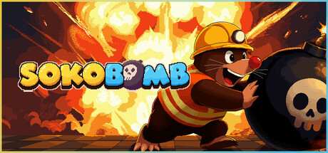
  • Genre Clarity: 8/10 — Clear puzzle action game identity. The cartoon bomb character with dynamic action pose, explosive fire background, and skull icon immediately signal a casual puzzle-action game with destructive mechanics. At tiny size, the character silhouette and fiery backdrop remain readable enough to convey the explosive puzzle theme, though fine details of the bomb's expression blur slightly.
  • Title Readability: 9/10 — Excellent bold logo legibility. The SOKOBOMB title uses thick, chunky yellow lettering with strong black outline that maintains perfect clarity at all sizes, including tiny thumbnails where the letter forms remain distinct and the color pops crisply. Strategic placement in the upper-left quadrant keeps the text away from the busy explosion effects in the center-right, ensuring reliable readability during quick scrolls.
  • Contrast & Color: 8/10 — Strong warm tones stand out well. The dominant orange and yellow explosion palette creates excellent separation from the dark Steam background (#1b2838), with the warm fire gradients reading clearly even at tiny size. The black bomb character provides a solid silhouette against the bright flames, though the red tones in the mid-ground slightly reduce overall contrast depth at the smallest viewport.
  • Uniqueness & Polish: 7/10 — Charming character with solid craft. The anthropomorphic bomb character with determined expression and mining helmet delivers personality and visual clarity that distinguishes it from generic puzzle game art. The explosive effects and dynamic action pose show solid technical execution, though the overall composition reads as well-executed derivative casual game aesthetics rather than a standout visual identity—competent within genre conventions but not breakthrough.
  • Brand Consistency: 6/10 — Functional but generic character design. The bomb character with mining helmet is a clear mascot and appears recognizable as a consistent identity element, but relies on straightforward visual design without memorable signature style cues or distinctive palette markers. Without reference to other game assets, the character alone doesn't communicate a uniquely recognizable brand beyond 'cute bomb puzzle game'—functional but somewhat interchangeable with similar indie titles.
  • Composition: 8/10 — Well-balanced focal hierarchy. The bomb character anchors the right side as a clear primary focal point with the explosive background providing context and energy without overwhelming the subject, while the title occupies safe upper-left space away from content margins. At small and tiny sizes the character remains the dominant visual anchor and the layout holds together effectively, though the scattered explosion particles could be tightened slightly to reduce visual noise at the smallest scales.

What works

  • Bold readable title treatment. Yellow-outlined SOKOBOMB letterforms maintain crystal clarity from full header down to tiny 120x45 thumbnail without any collapse or readability loss.
  • Strong warm color contrast. Orange and yellow explosion effects create vibrant separation from the dark Steam background that immediately catches attention during quick scrolls.
  • Clear character focal point. The bomb mascot with mining helmet sits as an obvious primary subject that guides the eye and communicates the game's personality at all viewport sizes.
  • Coherent visual storytelling. The combination of bomb character, mining helmet, explosive background, and skull icon effectively communicates the puzzle-action gameplay loop at a glance.

What hurts the capsule

  • Scattered explosion particles. The busy fire and spark effects in the background create visual noise that competes with the primary subject when viewing at small sizes and reduces overall clarity.
  • Generic character design. The bomb mascot lacks distinctive stylistic signature or memorable design hook that would make it instantly recognizable across future marketing materials.
  • Limited brand identity signals. Beyond the literal bomb character, the capsule lacks iconic color palette, symbolic motifs, or art direction cues that communicate a unique studio or game voice.

Priority fixes

  1. [contrast_color] Reduce explosion particle density in background to strengthen character silhouette separation and improve tiny-size readability by 1-2 steps
  2. [uniqueness_polish] Refine bomb character design with signature expression or pose detail that increases memorability and differentiates from generic casual game aesthetics
  3. [brand_consistency] Establish a distinctive color accent or symbolic element (beyond standard orange fire) that could anchor recognizable brand identity across future materials

Store copy priority fixes

  1. [feature_communication] Remove the duplicate opening line and expand the detailed description with 1–2 concrete puzzle examples (e.g., 'In the Forest biome, push bombs into stone buttons to unlock vines') to show how mechanics and environment interact.
  2. [hook_strength] Rewrite the hook to lead with emotional tone and outcome rather than just mechanics: e.g., 'Master the art of chain reactions in a cozy puzzle world where timing and tactics triumph over reflexes.' This adds mood and audience clarity.
  3. [uniqueness] Add a sentence comparing Sokobomb to Sokoban explicitly: e.g., 'Unlike classic Sokoban, limited time and explosions force you to think in sequences, not just positions.' This clarifies the design evolution.
  4. [audience_targeting] Add a one-sentence audience descriptor in the detailed description: e.g., 'Perfect for puzzle fans seeking a relaxing yet strategic experience without real-time pressure.' This signals who the game is built for.

Related guides

Steam app ID: 4866020 · Tags: Sokoban, Puzzle, Logic, Grid-Based Movement, Cute