Scoring genre clarity...

THROB capsule

THROB

THROB is a psychological horror platformer where a living brutalist nightmare reacts to your fear. As your heartbeat accelerates, blood rises, the architecture awakens, and the climb becomes increasingly unstable.

Psychological Horror3D PlatformerFirst-Person
Monored StudioComing soon

THROB scores 73/100 — better than 65% of Psychological Horror capsules (n=2,245).

Released Coming soon · By Monored Studio

Quick text summary

THROB scored 73/100 on Steam Analyzer — Good for a Psychological Horror capsule. Top priority fix: [genre_clarity] Introduce a subtle platforming element such as a character silhouette mid-climb or ascending geometry framing to clarify the platformer subgenre at TINY size.

Capsule scores by dimension

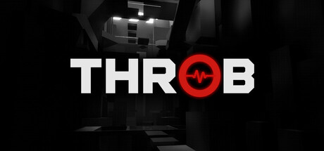
  • Genre Clarity: 7/10 — Horror intent clear, mechanics unclear. The red crosshair/heartbeat symbol and dark brutalist architecture strongly signal psychological horror, and the title treatment supports genre expectation. However, at TINY size the platformer mechanic is not visually evident—there are no jumping poses, level geometry, or movement cues that distinguish this from a general horror game. The architecture alone reads as atmospheric but not specifically platformer-specific.
  • Title Readability: 9/10 — Bold, iconic, legible at all sizes. The title THROB uses heavy white sans-serif letterforms with perfect spacing and a striking red circular heartbeat icon replacing the 'O', creating instant visual memorability. At TINY size it remains perfectly readable and the red accent immediately draws attention without losing legibility; the title placement on dark background with no competing texture ensures clean parsing even under quick scroll stress.
  • Contrast & Color: 8/10 — Strong value separation, red accent pops. White title and red heartbeat icon create excellent contrast against the dark brutalist background (#1b2838-adjacent), and the architectural geometry provides subtle midtone depth without muddying the read. The red circle is saturated and warm enough to stand out in grayscale as a clear silhouette; overall the dark-to-light separation is clean and survives the squint test well.
  • Uniqueness & Polish: 7/10 — Memorable icon, generic architecture backdrop. The heartbeat-as-O substitution in 'THROB' is a clever, thematic branding choice that immediately communicates the game's core mechanic of escalating fear and bodily response, distinguishing it from standard horror fare. However, the brutalist interior setting is a well-trod visual trope in indie horror, and the photographic/3D background lacks distinctive art direction compared to top-tier capsules that feature cohesive painted or stylized environments. The icon idea is premium; the environment feels functional rather than distinctive.
  • Brand Consistency: 6/10 — Thematic alignment present, limited identity markers. The red heartbeat motif creates a clear internal visual hook tied to the game's core mechanic and is reinforced by the psychological horror context; the brutalist setting is consistent with game description. However, without reference to the 5 store screenshots, there are no other recognizable identity cues (character design, palette variation, signature symbols) visible in this single capsule that would establish a stronger memorable brand beyond the heartbeat icon.
  • Composition: 7/10 — Clear focal hierarchy, balanced layout. The title sits in the center-right area with the red heartbeat icon as a natural focal anchor, and the brutalist geometry occupies the upper third as atmospheric context without competing for attention. At SMALL and TINY sizes the hierarchy remains intact—the text and icon read first, background falls back appropriately. Safe margins are observed and the composition is resilient to Steam's standard cropping.

What works

  • Iconic heartbeat substitution. The red circle replacing 'O' in THROB is a thematic masterstroke that communicates the core mechanic (escalating fear/heartbeat) in a single memorable visual.
  • Excellent title legibility across scales. Heavy, high-contrast white letterforms with strong spacing read perfectly at TINY size and remain the clear focal point under quick scroll conditions.
  • Strong dark-light value separation. The white and red elements create clean silhouettes against the dark background and survive grayscale and squint tests without muddy midtones.
  • Thematic visual consistency. Brutalist architecture and red heartbeat symbol align cleanly with the psychological horror platformer description and core mechanic.

What hurts the capsule

  • Generic brutalist backdrop. The photographic 3D interior is a well-trod indie horror visual cue and lacks distinctive art direction compared to top-tier genre capsules.
  • Platformer mechanics not visually evident. At TINY size there are no jumping poses, level progression geometry, or movement cues visible—only psychological horror is communicated, creating genre ambiguity.
  • Limited secondary visual identity. Beyond the heartbeat icon, there are no other distinctive brand markers (character silhouette, unique palette, signature symbols) to build long-term recognition.

Priority fixes

  1. [genre_clarity] Introduce a subtle platforming element such as a character silhouette mid-climb or ascending geometry framing to clarify the platformer subgenre at TINY size.
  2. [uniqueness_polish] Consider stylizing or abstracting the brutalist background with a signature visual effect (blood rise, architectural distortion, particle resonance) that creates a more distinctive and premium look.
  3. [brand_consistency] Develop a secondary visual motif (protagonist character, blood or pulse particle theme, or architectural symbol) visible in the capsule that can establish stronger long-term brand recognition across store pages.

Store copy priority fixes

  1. [feature_communication] Add a sentence clarifying the fail mechanic and checkpoint/progression system (e.g., 'One mistake sends you tumbling back—can you reach the top before your fear consumes you?').
  2. [feature_communication] Include approximate game length or number of levels in the detailed description so players understand scope.
  3. [uniqueness] Add a brief sentence explicitly contrasting this game's rhythm-platforming fusion with traditional horror games (e.g., 'Unlike passive horror experiences, THROB demands active rhythm mastery while your anxiety intensifies').

Related guides

Steam app ID: 4887550 · Tags: Psychological Horror, 3D Platformer, First-Person, Platformer, Atmospheric