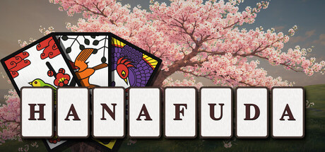
Hanafuda scores 83/100 — better than 97% of Card Battler capsules (n=750).

Quick text summary

Hanafuda scored 83/100 on Steam Analyzer — Good for a Card Battler capsule. Top priority fix: [uniqueness_polish] Add subtle gameplay UI hints (score display, koi-koi mechanic indicator, or player actions) around the card deck to communicate strategic depth without cluttering the composition.

Capsule scores by dimension

  • Genre Clarity: 9/10 — Clear card game identity. The Hanafuda card deck displayed prominently on the left with vibrant traditional Japanese artwork (floral motifs, bright reds and golds) immediately signals a card-based game mechanic. The pink cherry blossom tree reinforces the Japanese cultural context. At tiny size, the card illustration and blossom tree remain distinctly readable and communicate 'card game' and 'Japanese cultural theme' without ambiguity.
  • Title Readability: 9/10 — Bold, clean block letters. The title 'HANAFUDA' uses large, evenly spaced block letters in black on a white background with clear negative space isolation. The letterforms maintain full legibility at all sizes including tiny thumbnail, with no decorative collapse or loss of letterform integrity. The white background region creates a natural frame that protects readability across Steam's dark background.
  • Contrast & Color: 8/10 — Strong value separation. The white title block and colorful card deck (reds, golds, yellows, purples) contrast sharply against the muted sage green landscape background and dark sky. The pink cherry blossom provides warm luminosity that reads clearly at small scale. In grayscale, the white title and mid-tone landscape separate well, though the sky and blossom values compress slightly.
  • Uniqueness & Polish: 8/10 — Premium tabletop aesthetic. The 3D rendered card presentation with detailed traditional Hanafuda artwork, combined with the serene cherry blossom landscape and soft atmospheric lighting, conveys a high-quality, culturally respectful adaptation. The composition feels intentional and premium rather than templated, with cohesive art direction that balances traditional craft with modern polish. The card artwork specifically—with bold stained-glass-like outlines and vibrant color—stands out from generic card game templates.
  • Brand Consistency: 8/10 — Strong cultural identity cues. The cherry blossom tree, traditional Hanafuda card artwork, and serene landscape establish a consistent Japanese cultural brand identity that would be recognizable across marketing materials. The muted color palette (sage greens, soft pinks, neutral sky) creates a cohesive mood distinct from Western card game presentations. The card design with its distinctive bold outlines and floral themes serves as a memorable visual signature.
  • Composition: 8/10 — Clear focal hierarchy. The Hanafuda card deck anchors the left side as the primary focal point, drawing eye immediately while the cherry blossom tree provides secondary interest on the right. The title sits centered below, well-protected in a white frame with ample safe margins. At tiny size, the card illustration remains the dominant read despite reduced detail, and no critical elements risk Steam cropping near edges.

What works

  • Iconic card artwork. The traditional Hanafuda cards with their bold stained-glass-style outlines and vibrant traditional Japanese colors immediately communicate what the game is about and feel premium compared to generic card game visuals.
  • Title legibility perfection. Large block letters with dedicated white background isolation maintain perfect readability from full header down to tiny thumbnail without any typeface collapse or detail loss.
  • Cultural authenticity. The cherry blossom tree, landscape setting, and traditional card design work together to create genuine Japanese cultural context that feels respectful and intentional rather than superficial.
  • Strong small-size performance. The composition scales effectively—the card deck and title remain the clear focal points even at 120×45 pixels with minimal detail loss in contrast or hierarchy.

What hurts the capsule

  • Limited supporting visual context. Beyond the cards and tree, there is minimal indication of gameplay mechanics, player interaction, or game modes that would help casual players understand what distinguishes this from other card games.
  • Muted background competition. While the landscape is beautiful, the sage green and muted sky could potentially blend with Steam's dark background in certain display conditions, requiring careful attention to contrast testing.

Priority fixes

  1. [uniqueness_polish] Add subtle gameplay UI hints (score display, koi-koi mechanic indicator, or player actions) around the card deck to communicate strategic depth without cluttering the composition.
  2. [contrast_color] Verify the sage landscape background maintains clear separation from Steam's #1b2838 background across different monitor color profiles and brightness levels.
  3. [composition] Consider adding a subtle directional element (gaze, card movement, or flow line) to guide the eye from card deck through title to reinforce the gameplay pathway.

Store copy priority fixes

  1. [feature_communication] Expand the 'Learn through a presentation' bullet to specify what tutorial modes exist and how new players graduate from learning to competitive play.
  2. [uniqueness] Add one sentence explaining how the seasonal 12-card month structure creates strategic depth (e.g., 'Knowing which cards remain in the deck shifts your risk calculus').
  3. [audience_targeting] Clarify difficulty levels or AI opponent scaling for solo players (e.g., 'Play against AI opponents on three difficulty levels, or master the court of Japan's hardest players').
  4. [tone_match] Replace the 'Roadmap' section header and plain list with narrative prose that connects planned features to player experience (e.g., 'Upcoming local multiplayer will bring Hanafuda nights to your living room').

Related guides

Steam app ID: 5052180 · Tags: Card Battler, Turn-Based Tactics, Solitaire, Strategy, Poker