Scoring genre clarity...

Hidden Through Time capsule

Hidden Through Time

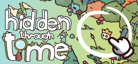
Embark on a colourful hand drawn journey of discovery through the ages! From missing dinosaur eggs in the stone age, to a king's crown in medieval times, can you find them all? Discover, create and share worlds with your own hidden treasures in Hidden Through Time!

$3.99Very Positive(955)
Hidden ObjectCasualPuzzle
RoguesideMar 12, 2020

Hidden Through Time scores 80/100 — better than 90% of Steam capsules we've analysed (n=22,658).

Very Positive (955 reviews) · $3.99 · Released Mar 12, 2020 · By Rogueside

Quick text summary

Hidden Through Time scored 80/100 on Steam Analyzer — Good for a Steam capsule. Top priority fix: [composition] Add a subtle dark vignette or gradient behind the title text zone to reduce competition from surrounding border illustration at small sizes

Capsule scores by dimension

  • Genre Clarity: 9/10 — Hidden object casual instantly clear. The magnifying glass embedded in the letter 'o' of 'time' is a brilliant genre signal, immediately communicating hidden object gameplay without any ambiguity. The densely packed whimsical scene surrounding the title reinforces the seek-and-find mechanic visually, as tiny characters and objects crowd every corner. Even at tiny size, the magnifying glass motif and the busy illustrated world are readable enough to suggest casual hidden object genre.
  • Title Readability: 8/10 — Bold rounded logo reads well. The large white rounded letters with a thick dark outline create strong contrast against the green illustrated background, making 'hidden through time' legible at full and small sizes. At tiny size (120x45) the stacked three-line layout compresses the text considerably, and 'through' in the middle tier becomes harder to parse due to its smaller relative size, but the overall title still reads. The playful hand-drawn lettering style suits the genre and does not sacrifice too much legibility for decoration.
  • Contrast & Color: 7/10 — Warm green pops on Steam dark. The bright lime-green background creates strong separation against Steam's dark #1b2838 background, giving the capsule instant visual pop in a scroll. The white outlined title has excellent contrast against the green field, and the illustrated characters around the border add peripheral visual interest. In grayscale, the title still separates clearly, though the illustrated border elements lose some definition and blend into mid-tone noise at tiny size.
  • Uniqueness & Polish: 8/10 — Charming hand-drawn style stands out. The hand-drawn illustration style is executed with high craft and genuine personality, feeling distinct from typical casual game capsules which often rely on photo-bashed or 3D rendered characters. The magnifying glass integrated into the letterform is a clever and memorable design detail that communicates the core mechanic elegantly. Compared to genre benchmarks like Little Kitty Big City or Snufkin, this holds its own in terms of visual charm and intentionality, though it lacks the singular iconic focal point those capsules use.
  • Brand Consistency: 9/10 — Cohesive whimsical identity throughout. The flat hand-drawn illustration style, warm lime-green palette, chunky white outlines, and playful rounded typography form a tightly cohesive visual identity that would be instantly recognizable across store pages and screenshots. The style signals a family-friendly, lighthearted tone that aligns perfectly with the game's content across historical ages. The consistent line weight and color treatment across both characters and environment elements reinforce a strong unified art direction.
  • Composition: 7/10 — Title central, border detail distracts small. The title is smartly centered with the magnifying glass serving as a natural focal anchor, and the surrounding illustrated vignette frames it well at full size. However the border is densely packed with equally weighted small characters and objects that compete for attention and collapse into visual noise at small and tiny sizes. The composition would benefit from slightly more breathing room around the title and a cleaner background zone to help the logo dominate at compressed sizes.

What works

  • Magnifying glass letterform. Integrating the magnifying glass into the letter 'o' is a clever genre signal that communicates hidden object gameplay instantly without extra text.
  • Strong green contrast on Steam background. The bright lime-green field creates immediate visual separation against Steam's #1b2838 dark UI, ensuring the capsule catches the eye during quick scroll.
  • Cohesive hand-drawn art direction. Consistent line weight, palette, and rounded typography create a highly polished and unified visual identity across the entire capsule.
  • Title legibility with thick outline. The chunky white letters with dark outline maintain readability even when the capsule is compressed to small thumbnail sizes.

What hurts the capsule

  • Border characters collapse at tiny size. The densely packed illustrated characters along the edges become indistinct visual noise at 120x45, losing their charm and potentially making the capsule look cluttered.
  • No single iconic focal character. Unlike top genre benchmarks, there is no memorable hero character or mascot at center to anchor brand recall across marketing touchpoints.
  • 'Through' tier harder to parse small. The middle line of the stacked title is noticeably smaller than 'hidden' and 'time', causing it to lose legibility first as the capsule shrinks.
  • Background mid-tones reduce silhouette clarity. The green illustration background has limited value range between foreground and background elements, reducing overall depth and silhouette separation in grayscale.

Priority fixes

  1. [composition] Add a subtle dark vignette or gradient behind the title text zone to reduce competition from surrounding border illustration at small sizes
  2. [title_readability] Increase the relative size of the word 'through' to match visual weight with 'hidden' and 'time' so the full title reads consistently at tiny size
  3. [composition] Reduce the density of border characters slightly and introduce a cleaner mid-zone so the central title and magnifying glass remain the dominant focal read
  4. [uniqueness_polish] Introduce one memorable central character or mascot element at the base of the title to create a stronger brand anchor and differentiate from generic hidden object competitors

Store copy priority fixes

  1. [hook_strength] Replace 'Embark on a colourful hand drawn journey' with a more specific hook that hints at the time-travel or historical progression mechanic, e.g., 'Hunt for lost treasures across four eras of history: find dinosaur eggs in the stone age, navigate a medieval castle, and more.'
  2. [uniqueness] Add a sentence in the main description that clarifies the level editor's scope and community scale, e.g., 'With thousands of user-created levels in the cloud library, Hidden Through Time offers endless hidden object content beyond the base game.'
  3. [tone_match] Remove 'CHECK THIS GAME OUT!' and 'JOIN OUR DISCORD' from the opening and replace with in-voice narrative that ties to the game, e.g., 'So join Clicky on his wondrous adventure' works—keep personality consistent without marketing clichés.

Related guides

Steam app ID: 524910