Scoring genre clarity...

DARK SOULS™: REMASTERED capsule

DARK SOULS™: REMASTERED

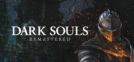
Then, there was fire. Re-experience the critically acclaimed, genre-defining game that started it all. Beautifully remastered, return to Lordran in stunning high-definition detail running at 60fps.

$39.99Very Positive(1,016)
Souls-likeDark FantasyRPG
QLOC, FromSoftware, Inc.May 23, 2018

DARK SOULS™: REMASTERED scores 85/100 — better than 97% of Steam capsules we've analysed (n=22,658).

Very Positive (1,016 reviews) · $39.99 · Released May 23, 2018 · By QLOC

Quick text summary

DARK SOULS™: REMASTERED scored 85/100 on Steam Analyzer — Excellent for a Steam capsule. Top priority fix: [title_readability] Increase the size and weight of the REMASTERED subtitle or add a subtle glow outline so it remains legible at 120x45 thumbnail size

Capsule scores by dimension

  • Genre Clarity: 9/10 — Dark fantasy action RPG clear. The center armored knight silhouette standing over a bonfire against ruined gothic architecture immediately signals dark fantasy action RPG. The bonfire is an iconic genre-specific visual shorthand recognizable to the audience. At tiny size the knight silhouette and fire glow still communicate the genre effectively even if fine armor details are lost.
  • Title Readability: 9/10 — Bold serif logo reads at all sizes. DARK SOULS uses a large, bold serif letterform with strong white contrast against the dark background, making it readable even at tiny thumbnail size. The REMASTERED subtitle in a smaller tracked serif below is legible at full and small sizes but collapses to near illegibility at the tiniest crop, though this is an acceptable hierarchy choice. The controlled dark mid-background behind the text prevents any texture interference with letterforms.
  • Contrast & Color: 8/10 — Strong fire warmth vs dark surround. The warm orange-amber bonfire glow at center creates a strong value contrast against the dark, desaturated background and the dark knight silhouette above it, producing clear separation against Steam's #1b2838 background. In grayscale the bonfire light source remains the brightest point, anchoring the composition with clean tonal separation. Slight muddiness in the upper corners where dark foliage and ruins blend together is the only minor weakness at small size.
  • Uniqueness & Polish: 8/10 — Iconic bonfire visual, premium craft. The bonfire motif is a legendary and distinctive identifier for this franchise, elevating this well above generic action RPG capsules. The lighting craft, ember particles, and painterly background atmosphere give it a high-production feel that competes well with genre benchmarks like Lies of P and Ghost of Tsushima. It is not pushing new creative ground given its age, but the iconic visual hook prevents it from feeling generic.
  • Brand Consistency: 9/10 — Franchise identity instantly recognizable. The bonfire, armored undead knight, gothic ruined architecture, and desaturated warm-amber palette are all deeply embedded brand signals for the Dark Souls franchise. The DARK SOULS logotype with its distinctive serif style is consistent with the established franchise identity across all games and marketing. These elements together create an immediately recognizable identity that needs no external reference to confirm its brand.
  • Composition: 8/10 — Clear vertical hierarchy, strong focal anchor. The composition uses a clean vertical hierarchy: the title sits in the lower third over a controlled dark region, the knight occupies the center upper half, and the bonfire bridges both zones as a warm focal anchor. The background ruins frame the knight without competing, and the ember particles add depth without clutter. At small and tiny sizes the bonfire glow and knight silhouette remain the dominant focal point, though the composition is slightly center-heavy with modest use of foreground depth layering.

What works

  • Iconic bonfire anchor. The central bonfire is a franchise-defining visual that immediately differentiates this capsule from generic action RPG competitors at any size.
  • High contrast title placement. DARK SOULS logotype sits over a deliberately dark and calm background region ensuring clean letterform readability even at small capsule sizes.
  • Strong silhouette readability. The armored knight against the lighter misty background creates a clear, recognizable silhouette that survives the squint test and grayscale reduction.
  • Warm vs cool color temperature. The warm amber fire glow against cool dark surroundings creates immediate visual pop against Steam's dark UI background.

What hurts the capsule

  • REMASTERED subtitle collapses at tiny size. The smaller REMASTERED text below the main logo becomes unreadable at 120x45 thumbnail size, losing the product differentiation from the base game.
  • Upper corner muddiness. The dark foliage and ruin details in the upper left and right corners blend into each other and into Steam's background, reducing perceived frame depth at small sizes.
  • Limited foreground depth layer. There is no strong foreground element to create a three-layer depth stack, making the composition feel slightly flat compared to top-tier benchmarks like God of War Ragnarök.
  • Center-heavy composition. Everything of significance is stacked on the vertical center axis, leaving side real estate unused and reducing compositional dynamism compared to competitors like Helldivers 2.

Priority fixes

  1. [title_readability] Increase the size and weight of the REMASTERED subtitle or add a subtle glow outline so it remains legible at 120x45 thumbnail size
  2. [composition] Introduce a subtle foreground element such as ash, debris, or ground texture to create a three-layer depth stack and add compositional dynamism
  3. [contrast_color] Brighten or add a faint edge vignette separation to the upper corner ruins so they read as distinct from Steam's dark UI background at small sizes
  4. [uniqueness_polish] Consider a slight compositional asymmetry or a stronger atmospheric haze layer to bring the craft closer to current genre benchmarks like Lies of P or Ghost of Tsushima

Store copy priority fixes

  1. [feature_communication] Replace abstract bullet points with concrete mechanics: 'Master deliberate combat against punishing bosses,' 'Explore interconnected dungeons with permanent consequences,' 'Upgrade weapons and magic through discovered materials,' 'Summon or invade other players' worlds for cooperative and competitive play.'
  2. [audience_targeting] Add a 1-2 sentence bridge after the hook that signals tone and difficulty expectation: 'This is a dark, challenging action RPG where every encounter demands precision and patience. Expect death, but also hard-won mastery and unforgettable boss encounters.'
  3. [uniqueness] Clarify why this remaster matters beyond visuals: 'Return to the interconnected world that defined the genre, now enhanced with stable 60fps performance and restored PvP multiplayer.' Optionally compare to successors or highlight design philosophy unique to the original.
  4. [feature_communication] Mention core progression systems explicitly: 'Build your character with hundreds of weapon, armor, and magic combinations. Defeat legendary bosses to gain souls and unlock new pathways through Lordran.'

Related guides

Steam app ID: 570940