Scoring genre clarity...

The Outer Worlds capsule

The Outer Worlds

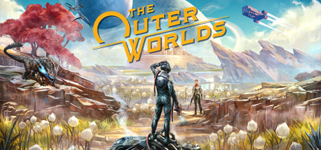
The Outer Worlds is an award-winning single-player RPG from Obsidian Entertainment and Private Division. As you explore a space colony, the character you decide to become will determine how this player-driven story unfolds. In the colony's corporate equation, you are the unplanned variable.

Very Positive(73)
Open WorldAction RPGRPG
Obsidian EntertainmentOct 23, 2020

The Outer Worlds scores 77/100 — better than 77% of Steam capsules we've analysed (n=22,658).

Very Positive (73 reviews) · Released Oct 23, 2020 · By Obsidian Entertainment

Quick text summary

The Outer Worlds scored 77/100 on Steam Analyzer — Good for a Steam capsule. Top priority fix: [uniqueness_polish] Introduce a visual narrative element unique to The Outer Worlds such as a corporate propaganda sign, satirical branding, or a morally conflicted scenario to communicate the game's distinctive tone over generic sci-fi vista imagery.

Capsule scores by dimension

  • Genre Clarity: 8/10 — Sci-fi RPG adventure reads well. The combination of a lone armored protagonist surveying an alien landscape, a creature threat on the left, a companion figure, distant sci-fi architecture, a planet in the sky, and a spaceship all strongly communicate sci-fi RPG. At tiny size the warm alien world with two humanoid figures still implies exploration-focused RPG. The creature on the left adds action-RPG cues without overwhelming the adventuring tone.
  • Title Readability: 8/10 — Bold logo readable at most sizes. The golden stylized 'The Outer Worlds' logo with its distinctive circular O motif is well-placed in the upper center-right against relatively clean sky. At full size it is crisp and distinctive. At small size the bold weight and gold color keep it legible. At tiny size the letterforms compress but the gold-on-sky-blue contrast preserves basic readability, though fine details of the stylized font are lost.
  • Contrast & Color: 7/10 — Warm palette pops on Steam dark background. The warm orange-gold tones of the alien flora, the bright sky, and the glowing landscape provide good contrast against Steam's dark #1b2838 background. The central protagonist in dark armor sits against a bright midground which creates decent silhouette separation. In grayscale the value range is moderate but functional. The left side with the dark creature against shadowed canyon is the weakest contrast zone and loses clarity at tiny size.
  • Uniqueness & Polish: 7/10 — Polished but familiar sci-fi panorama. The painterly wide-vista composition with a lone hero overlooking an alien world is a well-executed but genre-common approach seen in many sci-fi titles including Starfield. The art quality is high with strong lighting, detailed environment, and a cohesive alien-yet-beautiful aesthetic. However compared to benchmarks like Baldur's Gate 3 or Metaphor: ReFantazio it lacks a truly distinctive visual hook or unique stylistic identity that would make it immediately stand apart in a genre row.
  • Brand Consistency: 8/10 — Cohesive Obsidian sci-fi identity. The golden circular logo motif is a recognizable brand signature. The warm alien world palette, retro-futuristic architecture style, and the distinctive armor design of the protagonist are consistent with Obsidian's established Outer Worlds visual identity. The color grading and painterly style feel unified across the composition. The logo treatment with the stylized O acts as a memorable icon that would carry across marketing materials.
  • Composition: 8/10 — Strong hero-vista hierarchy with depth. The composition uses clear foreground-midground-background layering: creature threat and protagonist in foreground, alien meadow and companion in midground, architecture and mountains in distance, planet and sky at top. The protagonist is slightly left-of-center creating a natural eye path toward the glowing horizon. At small and tiny sizes the two standing human figures in the center remain the dominant focal anchor. The logo placement in the upper area avoids competing with the main subject and sits on controlled sky space.

What works

  • Strong depth layering. Three distinct depth planes guide the eye naturally from the armored protagonist foreground through the glowing alien meadow to the distant sci-fi cityscape and planet.
  • Distinctive golden logo. The gold circular Outer Worlds logo has a recognizable stylistic signature and maintains readable contrast against the blue sky region at small sizes.
  • Warm palette contrast on Steam dark UI. The bright orange-gold alien flora and glowing horizon create strong value separation against Steam's #1b2838 dark background during quick scroll.
  • Clear genre and tone messaging. The combination of space vistas, alien creature, and humanoid explorers immediately communicates sci-fi exploration RPG without ambiguity.

What hurts the capsule

  • Generic hero-surveys-world trope. The lone protagonist overlooking a vast alien landscape is one of the most common sci-fi capsule compositions and does not differentiate The Outer Worlds from competitors like Starfield.
  • Dark creature loses clarity at tiny size. The dark blue-grey creature on the left side blends into the shadowed canyon wall and becomes unreadable at tiny thumbnail size, losing a key tension element.
  • Midtone compression in center. The companion character in the midground is similarly dark-armored and muddy against the bright background, causing both human figures to partially merge at tiny size.
  • No unique selling point communicated. The RPG's core hook of corporate satire, player choice, and dialogue-driven narrative is entirely absent and the image could belong to any generic sci-fi action-RPG.

Priority fixes

  1. [uniqueness_polish] Introduce a visual narrative element unique to The Outer Worlds such as a corporate propaganda sign, satirical branding, or a morally conflicted scenario to communicate the game's distinctive tone over generic sci-fi vista imagery.
  2. [contrast_color] Increase the value contrast on the left-side creature by brightening its edge lighting or adding a rim light so it reads as a distinct silhouette at tiny 120x45 size.
  3. [genre_clarity] Consider adding a subtle UI or dialogue choice element as a design motif in the logo lockup area to reinforce the choice-driven RPG identity that separates it from action-adventure competitors.
  4. [title_readability] Add a subtle dark gradient vignette or frosted region directly behind the logo to ensure consistent legibility across varying screen brightness and display conditions.

Store copy priority fixes

  1. [hook_strength] Rewrite the short description to lead with the conspiracy/awakening scenario before credentials: 'You wake decades later in a desperate conspiracy. In a corporate colony's power equation, you're the unplanned variable—and how you survive depends on who you choose to become.' This frontloads drama and emotional stakes.
  2. [uniqueness] Add a sentence in the detailed description that explicitly differentiates from prior Obsidian work: 'Building on the choice-driven legacy of Obsidian's New Vegas, The Outer Worlds condenses the best of that formula into a tighter, sci-fi setting where every NPC faction and companion relationship directly shapes your ending.' This leverages heritage while clarifying distinction.
  3. [feature_communication] Expand the companion section to clarify stakes: 'Your companions have their own agendas—help them or exploit them. Their loyalty and endings shift based on your moral choices throughout the campaign.' This raises clarity on long-term consequences.
  4. [feature_communication] Add a brief line on combat and exploration: 'Combat blends real-time first-person shooting with tactical pause and character builds; exploration reveals hidden factions, side quests, and multiple paths through settlements.' This serves FPS-tag players and completionists.

Related guides

Steam app ID: 578650