Scoring genre clarity...

Lost Words: Beyond the Page capsule

Lost Words: Beyond the Page

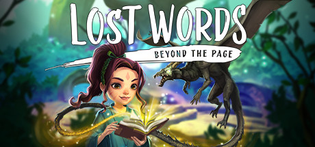
A short, fully voiced, story-first adventure across two worlds. Rearrange words into platforms in Izzy’s diary, then wield word magic to shape your path in the fantasy she writes. Gentle puzzles, watercolour wonder, and a bittersweet story of family, loss, and healing.

$7.49Very Positive(633)
EmotionalSide Scroller2D Platformer
Sketchbook Developments, Fourth State, Sketchbook GamesApr 6, 2021

Lost Words: Beyond the Page scores 88/100 — better than 99% of Story Rich capsules (n=3,709).

Very Positive (633 reviews) · $7.49 · Released Apr 6, 2021 · By Sketchbook Developments

Quick text summary

Lost Words: Beyond the Page scored 88/100 on Steam Analyzer — Excellent for a Story Rich capsule. Top priority fix: [genre_clarity] Consider adding subtle visual cues (glowing word fragments or platform elements) to more explicitly hint at the word-rearrangement mechanic without cluttering composition

Capsule scores by dimension

  • Genre Clarity: 8/10 — Fantasy adventure with magical narrative focus. The capsule clearly communicates a story-driven fantasy adventure through the central character holding an open book with magical effects, paired with a fantastical creature and lush magical environment. At TINY size, the glowing book and character silhouette remain readable, though the specific 'word magic' mechanic is not immediately obvious from visuals alone. The watercolor aesthetic and storybook framing strongly signal indie adventure rather than action or puzzle game.
  • Title Readability: 9/10 — Bold, clear, excellent micro readability. The title 'LOST WORDS' uses clean, bold sans-serif letterforms with strong white contrast against the background, reading flawlessly at all sizes including TINY. The tagline 'BEYOND THE PAGE' sits on a deliberate white banner that ensures complete legibility even at 120x45px. The typography hierarchy and placement on a controlled background region maximizes recognition across all viewing conditions.
  • Contrast & Color: 9/10 — Vibrant separation with excellent silhouette clarity. The capsule employs strong value separation with luminous warm golds and cool blues creating clear depth against the dark Steam background, while the character and creature maintain sharp silhouettes. The gradient from cool teal-green foliage to warm golden light creates intentional visual storytelling with excellent saturation control. At TINY size, the color blocking still reads distinctly with no muddy blending, and the grayscale contrast remains strong.
  • Uniqueness & Polish: 9/10 — Distinctive watercolor art with premium craft. The capsule demonstrates exceptional polish through cohesive watercolor rendering, intentional particle effects (golden light wisps), and a visually distinctive hook that communicates the core mechanic of word-based magic and storybook worlds. The character design and magical book aesthetic create immediate brand recognition and premium feel that stands well above generic fantasy templates. The visual storytelling successfully conveys 'gentle, story-first adventure' rather than combat-focused gameplay.
  • Brand Consistency: 9/10 — Strong iconic identity with signature aesthetic. The watercolor art style, warm-to-cool color palette, character design, and magical book motif create a recognizable and memorable visual identity that aligns with the game's narrative focus on stories and healing. The aesthetic is consistent with fantasy indie adventure expectations while maintaining a distinctive, premium tone. These elements form clear brand identity cues that would be immediately recognizable across other marketing materials.
  • Composition: 9/10 — Excellent hierarchy with focal depth layering. The composition employs masterful layering with the character and book in sharp focus at center, magical effects as midground depth, and soft foliage silhouettes as background, creating clear visual hierarchy at all sizes. The title sits cleanly at top center without competing with the character, and white space usage feels intentional rather than wasted. At TINY size, the focal point remains unmistakable and the composition maintains integrity with safe margins around the primary subject.

What works

  • Title supremely readable at micro sizes. Bold sans-serif letterforms with white contrast and strategic banner placement ensure flawless legibility at 120x45px and maintain strong hierarchy across all viewing conditions.
  • Watercolor aesthetic communicates premium storytelling. The distinctive art style immediately signals an indie narrative adventure with gentle, emotional tone rather than action-oriented gameplay, setting clear expectations.
  • Excellent silhouette clarity and color separation. Strong value contrast between character, magical effects, and background creates sharp silhouettes that read distinctly even at tiny size with no muddy blending.
  • Memorable iconic visual identity. The combination of character design, magical book motif, and warm-cool color palette creates instantly recognizable brand elements that feel premium and distinctive.

What hurts the capsule

  • Word magic mechanic not visually obvious. While the book and magic effects hint at the core gameplay, the specific 'rearrange words into platforms' mechanic is not clearly communicated at any viewing size.
  • Emotional healing theme subtle at glance. The tender narrative themes of family loss and healing are implied but not explicitly visual, so viewers unfamiliar with the game may miss this core emotional pitch at quick scroll.

Priority fixes

  1. [genre_clarity] Consider adding subtle visual cues (glowing word fragments or platform elements) to more explicitly hint at the word-rearrangement mechanic without cluttering composition
  2. [uniqueness_polish] Ensure this watercolor style and book-magic aesthetic is maintained consistently across all store page visuals to strengthen brand identity recognition

Store copy priority fixes

  1. [feature_communication] Expand the detailed description with a paragraph showing the moment-to-moment gameplay loop: e.g., 'In Estoria, you walk across floating words, using them as platforms. Rearrange letters and phrases to form new words that transform the environment—a 'BRIDGE' word becomes a traversable span, while 'SHIELD' protects you from hazards.' This concreteness will help players understand what they're actually doing.
  2. [hook_strength] Add a sentence in the detailed description that reiterates the dual-world framing and emotional core from the short description. The detailed version currently pivots to formal description and loses the 'bittersweet story' hook that makes the premise human.
  3. [feature_communication] Clarify decision scope and save/branch mechanics: are playthroughs radically different, or are story variations subtle? This will set expectation and address whether the game invites replays.
  4. [uniqueness] Replace generic praise ('mesmerize,' 'truly memorable') with a specific differentiator: e.g., 'the only platformer where language itself is both the puzzle and the path forward' or 'where a child's voice, struggles, and imagination directly shape the gameplay.'

Related guides

Steam app ID: 599610 · Tags: Story Rich, Adventure, Atmospheric, Emotional, Puzzle Platformer