Scoring genre clarity...
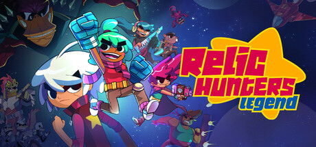
A Top-Down Shooter/Looter RPG with a touching story inspired by JRPG classics. Shoot enemies, get loot, and customize your characters. Multiple endgame systems and over 100 hours of play await you solo or up to 4-player co-op!
$19.99Mixed(1,100)
Action RPGLooter ShooterLoot
Rogue SnailAug 14, 2025