Scoring genre clarity...

My Memory of Us capsule

My Memory of Us

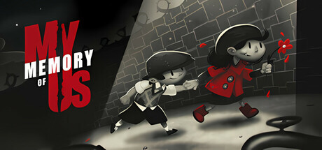
My Memory of Us is a moving fairy tale about friendship and hope in the darkest moments of our times. Enter a hand-crafted, gorgeously animated 2D world full of adventure, exploration, stealth and puzzles. Meet the kids brought up in different worlds and help them survive during times of occupation.

$3.77Very Positive(623)
RelaxingActionWorld War II
Juggler GamesOct 9, 2018

My Memory of Us scores 73/100 — better than 56% of Steam capsules we've analysed (n=22,658).

Very Positive (623 reviews) · $3.77 · Released Oct 9, 2018 · By Juggler Games

Quick text summary

My Memory of Us scored 73/100 on Steam Analyzer — Good for a Steam capsule. Top priority fix: [genre_clarity] Add a single striking visual element (e.g., a glowing heart, broken doll, or period-specific detail) that immediately communicates the emotional or historical fairy-tale narrative.

Capsule scores by dimension

  • Genre Clarity: 7/10 — Indie adventure, clear but soft. The hand-drawn art style, storybook aesthetic, and two child characters in dynamic poses immediately signal indie adventure with narrative weight. At tiny size, the silhouettes of the kids and red accent color remain readable, though the exact genre blend (stealth, puzzle, adventure) is less obvious without text. The aesthetic clearly avoids action-shooter or hardcore game vibes.
  • Title Readability: 8/10 — Bold red title, solid legibility. The red 'MY MEMORY OF US' text uses strong value contrast against the dark background and maintains clarity at small size due to large letterforms and weight. The white outline on the red provides additional definition that survives the tiny thumbnail test. Tagline and small text below the title are not readable at tiny size, but the main title remains the clear focal point.
  • Contrast & Color: 8/10 — High-value red and contrast clarity. The bright red title and red clothing on the characters pop distinctly against the #1b2838 dark background and grayscale brick environment. Strong light-to-dark separation between the white-outlined children and the shadowed stone background creates silhouette clarity that reads well at all sizes. The limited warm palette (red and cream tones) against cool gray prevents muddy mid-tones.
  • Uniqueness & Polish: 7/10 — Handcrafted charm, familiar indie. The hand-drawn 2D animation style and storybook character design feel intentional and premium, communicating a narrative-driven indie game with artistic heart. However, the composition—two kids in action poses against a monochrome brick wall—follows familiar indie adventure visual tropes and does not immediately signal what makes this game's story or mechanics uniquely memorable. The craft is clean but the hook is subtle.
  • Brand Consistency: 7/10 — Cohesive art direction, limited icons. The black-and-white character rendering with red accent clothing creates a consistent, memorable visual identity that aligns with the game's darker fairy-tale tone. The hand-drawn style, limited palette, and focus on the two child protagonists feel unified and recognizable. No iconic logo or signature motif beyond the title text itself limits distinctiveness for future brand recall.
  • Composition: 7/10 — Balanced focus, title placement safe. The two children occupy the center-right foreground with clear focal hierarchy, while the title anchors the upper left in a safe margin away from edges. The brick wall provides subtle layered depth without overwhelming the character silhouettes. At small size, composition remains clear; at tiny size, the subjects read as a unified pair, though supporting brick detail becomes noise.

What works

  • Strong red title contrast. Bold red letterforms with white outline stand out sharply against dark background and survive at tiny thumbnail size.
  • Clear protagonist silhouettes. Two distinct child characters in dynamic poses are immediately recognizable and emotionally engaging even at reduced scales.
  • Cohesive hand-drawn aesthetic. Unified black-and-white rendering style with red accents communicates premium indie craft and narrative tone.

What hurts the capsule

  • Generic adventure backdrop. Gray brick wall setting is functional but does not clearly communicate the game's unique selling point or 'fairy tale in occupation' premise.
  • No iconic brand symbol. The capsule relies entirely on title text and character art for identity; no memorable logo, motif, or visual signature aids future recognition.
  • Tagline illegible at small sizes. Subtext below 'MY MEMORY OF US' becomes unreadable at small and tiny views, reducing narrative context.

Priority fixes

  1. [genre_clarity] Add a single striking visual element (e.g., a glowing heart, broken doll, or period-specific detail) that immediately communicates the emotional or historical fairy-tale narrative.
  2. [uniqueness_polish] Replace or augment the neutral brick background with a scene or symbol that hints at the occupation theme or friendship core mechanic, moving beyond generic backdrop.
  3. [brand_consistency] Develop a signature visual motif or icon (e.g., intertwined hands, shared memory symbol) that can anchor the brand identity across store pages and marketing.

Store copy priority fixes

  1. [hook_strength] Rewrite the opening of the detailed description to lead with the pair mechanic and cooperative gameplay ('Control two children with unique abilities and switch between them to solve puzzles and survive occupation') before diving into the story setup.
  2. [feature_communication] Add a brief gameplay sentence after the mechanic description explaining the strategic value of pairing (e.g., 'Combine their abilities to unlock new paths and outsmart the robot soldiers').
  3. [uniqueness] Add one sentence articulating the game's mechanical hook: 'This pair-based puzzle system is unique because [X differentiates it from character-switching games]' or frame it as the core innovation.

Related guides

Steam app ID: 651500