Scoring genre clarity...

Super Bunny Man capsule

Super Bunny Man

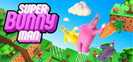
A physics-based co-op platformer about a guy in a rabbit costume! Team up with a friend or three (local or online) to beat levels, find hidden carrots and race against the clock. Experience bunny madness. Embrace carrot chaos. Become Super Bunny Man.

$7.49Very Positive(155)
PlatformerSandboxMultiplayer
CatobyteMay 16, 2023

Super Bunny Man scores 77/100 — better than 77% of Steam capsules we've analysed (n=22,658).

Very Positive (155 reviews) · $7.49 · Released May 16, 2023 · By Catobyte

Quick text summary

Super Bunny Man scored 77/100 on Steam Analyzer — Good for a Steam capsule. Top priority fix: [composition] Reduce secondary characters to one supporting figure and push the pink protagonist larger and more isolated so a single clear focal point survives at tiny size

Capsule scores by dimension

  • Genre Clarity: 8/10 — Physics platformer instantly implied. The wobbly, cartoonish bunny characters mid-air with exaggerated poses and a giant carrot prop immediately suggest a goofy physics-based platformer. The chunky clay-style level geometry in the background reinforces a platformer setting. At tiny size the bright pink character and carrot prop still communicate silly co-op party game energy clearly.
  • Title Readability: 8/10 — Bold logo reads well at small. The 'Super Bunny Man' logo uses a thick purple-to-pink gradient with a strong white stroke outline, placed on the upper-left against a light blue sky background providing solid contrast. At small size the three-line stacked layout remains legible. At tiny size the logo compresses but the outline still separates it from the background, though 'Man' risks merging with the busier lower area.
  • Contrast & Color: 8/10 — Vibrant palette pops against dark Steam. The bright pink protagonist against the light blue sky creates strong value and hue contrast, and the orange carrot provides a vivid accent that draws the eye. Against Steam's dark #1b2838 background the entire image edge-vignettes naturally due to the light sky. In grayscale the pink character still separates well from the mid-tone background. At tiny size the pink silhouette remains identifiable.
  • Uniqueness & Polish: 7/10 — Charming clay style stands out. The claymation-inspired 3D render style with googly-eyed rabbit characters is distinctive and not commonly seen in this genre, giving it personality that stands apart from generic indie platformers. The carrot as a comedic prop is a strong visual storytelling hook that implies the game's chaotic tone. Craft is solid but not exceptional; the composition feels a little crowded with three characters competing for attention.
  • Brand Consistency: 8/10 — Cohesive claymation identity throughout. The clay-textured characters, chunky block level geometry, pastel color palette, and whimsical tone form a recognizable and internally consistent visual identity. The logo style with its gradient and stroke is appropriately playful and matches the art direction. The carrot motif and bunny costume characters are strong recurring brand signals that would be recognizable across store assets.
  • Composition: 7/10 — Dynamic but slightly cluttered mid area. The pink protagonist is the clear primary focal point placed centrally with the carrot prop reinforcing the eye anchor, while the yellow and purple characters serve as supporting elements. The logo is well-placed top-left on a clean sky region. However, at small size the three characters cluster together and compete for attention, weakening the single clear subject rule. The right edge platform element feels slightly cropped and peripheral.

What works

  • Distinctive clay art style. The claymation-inspired rendering is immediately memorable and communicates a playful, goofy tone that differentiates it from typical indie platformers.
  • Strong primary character contrast. The bright pink bunny against the light blue sky creates excellent value and hue contrast that keeps the hero readable even at tiny thumbnail size.
  • Effective logo placement. The title sits on the clean sky region top-left, avoiding noisy texture and maintaining readability across sizes.
  • Carrot as genre storytelling prop. The oversized carrot immediately signals comedy and co-op chaos, communicating the game's unique hook without any text.

What hurts the capsule

  • Three characters compete for focus. At small and tiny sizes the yellow and purple bunnies dilute attention from the pink protagonist, reducing the single clear focal point.
  • Right edge element feels cropped. The green platform and character in the top-right corner feel peripheral and risk being cut off, adding visual noise without contributing to hierarchy.
  • Mid-area clutter at tiny size. The overlapping characters and carrot merge into a busy blob at tiny thumbnail size, reducing immediate readability of the scene.
  • Sky background may soften on Steam dark UI. The very light blue sky creates an abrupt contrast edge against Steam's dark sidebar chrome which can make the image feel ungrounded.

Priority fixes

  1. [composition] Reduce secondary characters to one supporting figure and push the pink protagonist larger and more isolated so a single clear focal point survives at tiny size
  2. [contrast_color] Add a subtle dark vignette or drop shadow around the outer edges of the image to better ground it against Steam's dark #1b2838 UI chrome
  3. [title_readability] Slightly increase the stroke weight on 'Man' at the bottom of the logo stack to prevent it merging with the busier mid-ground at small sizes
  4. [uniqueness_polish] Trim or push the right-edge platform element inward so no key visual element risks being cropped by Steam's capsule frame

Store copy priority fixes

  1. [uniqueness] Add one sentence explaining what the physics system does that other platformers don't (e.g., 'Use momentum and ragdoll physics to solve puzzles in ways no other platformer lets you') to clarify the mechanical differentiation beyond the bunny costume.
  2. [feature_communication] Replace '... and much, much more!' with 2-3 actual game mode names or brief descriptions (e.g., 'Survival Mode, King of the Hill, Bomb Tag, and more') so players know the content scope without guessing.
  3. [hook_strength] Strengthen the short description's second sentence by leading with 'Race through 50 levels' instead of 'Team up with a friend' to emphasize the solo story experience alongside co-op, broadening appeal.

Related guides

Steam app ID: 673750