Scoring genre clarity...

Pogostuck: Rage With Your Friends capsule

Pogostuck: Rage With Your Friends

Climb a surreal mountain on a pogo stick and make friends along the way.

$2.09Very Positive(15)
Psychological HorrorPrecision PlatformerDifficult
SuperkuFeb 28, 2019

Pogostuck: Rage With Your Friends scores 70/100 — better than 30% of Steam capsules we've analysed (n=22,658).

Very Positive (15 reviews) · $2.09 · Released Feb 28, 2019 · By Superku

Quick text summary

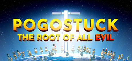
Pogostuck: Rage With Your Friends scored 70/100 on Steam Analyzer — Good for a Steam capsule. Top priority fix: [genre_clarity] Emphasize a single prominent pogo stick character in a clearly active jumping or climbing pose in the foreground to immediately communicate the core mechanic at tiny size.

Capsule scores by dimension

  • Genre Clarity: 6/10 — Casual quirky arcade vibes. The small pogo stick characters arranged around a globe and the giant glowing pogo stick centerpiece hint at a quirky casual/arcade game, but the genre is ambiguous at tiny size. The surreal planetary setting and crowd of tiny characters suggest multiplayer chaos but don't clearly communicate climbing or rage-game mechanics. At tiny size the characters become indistinguishable blobs and the pogo stick theme is nearly lost.
  • Title Readability: 8/10 — Bold gold title reads well. The large bold gold and orange 3D title 'POGOSTUCK' dominates the upper portion with strong letterforms and good outline contrast against the bright center glow. The subtitle 'THE ROOT OF ALL EVIL' is readable at full size but collapses to near-illegibility at tiny size. At small capsule size the main title still holds up reasonably well due to its thick weight and high contrast placement against the blue-lit background.
  • Contrast & Color: 7/10 — Strong warm-cool contrast overall. The warm gold and orange title pops well against the cool blue central glow and dark starfield, creating a strong warm-cool contrast dynamic that separates nicely from Steam's dark #1b2838 background. The giant glowing pogo stick creates a bright central beacon that draws the eye. In grayscale the title maintains reasonable separation from the background, though the lower globe characters merge into a cluttered mid-tone band at small sizes.
  • Uniqueness & Polish: 7/10 — Quirky and memorable concept. The image of a giant glowing pogo stick rising from Earth surrounded by tiny pogo-stick characters is genuinely distinctive and communicates the game's irreverent tone well. The 3D rendered style is clean and polished with good lighting on the central pogo stick creating a comedic 'monolith' parody. Compared to genre peers it stands out for humor and concept, though the execution feels slightly below top-tier indie polish.
  • Brand Consistency: 7/10 — Cohesive quirky 3D identity. The warm gold palette, chunky 3D character design, and absurdist humor create a recognizable internal identity that feels consistent with a game about chaotic pogo stick climbing. The planetary globe, small character crowd, and glowing central object reinforce a signature motif that could be recognized across assets. The font style and color treatment are consistent with the game's lighthearted but bold personality.
  • Composition: 7/10 — Clear hierarchy with busy base. The composition has a strong vertical hierarchy: title at top, giant glowing pogo stick as central focal anchor, and character crowd on the globe at the bottom. The bright central glow acts as an effective natural eye magnet and depth creates a reasonable foreground-midground-background read. However, the lower third featuring the character crowd becomes a cluttered noisy band at small sizes, and the composition feels slightly bottom-heavy with much of the interesting detail lost at tiny thumbnail size.

What works

  • Strong title legibility. The bold gold 3D title 'POGOSTUCK' maintains readable letterforms at small capsule size due to its thick weight and strong warm-cool contrast against the blue glow.
  • Distinctive central focal point. The giant glowing pogo stick rising from Earth is a unique and immediately memorable image that communicates absurdist humor and sets the game apart from genre peers.
  • Warm-cool contrast dynamic. The orange-gold title against the cool blue central glow creates a strong value and color contrast that pops against Steam's dark background.
  • Polished 3D render quality. The lighting on the central pogo stick and the clean character designs feel professionally rendered and intentional rather than asset-flip quality.

What hurts the capsule

  • Subtitle lost at small sizes. The subtitle 'THE ROOT OF ALL EVIL' becomes illegible at tiny thumbnail size, wasting valuable brand messaging space.
  • Cluttered lower character band. The crowd of small pogo stick characters along the globe base merges into an unreadable noisy texture at small and tiny sizes, adding visual noise without communicating content.
  • Genre ambiguity at tiny size. At 120x45 the pogo stick mechanic and climbing genre are not clearly communicated, making the game feel like a generic quirky casual title.
  • Bottom-heavy composition. The globe and character crowd weigh down the lower half and the center of visual interest sits awkwardly between the title and the bottom cluster with no clear midground anchor.

Priority fixes

  1. [genre_clarity] Emphasize a single prominent pogo stick character in a clearly active jumping or climbing pose in the foreground to immediately communicate the core mechanic at tiny size.
  2. [title_readability] Either remove the subtitle or increase its size and weight significantly so it remains readable at small capsule dimensions, or replace it with a shorter punchy line.
  3. [composition] Reduce the number of background characters on the globe to 3-5 hero characters with cleaner silhouettes, eliminating the cluttered band that collapses at small sizes.
  4. [contrast_color] Add a subtle dark vignette or gradient behind the title text to ensure legibility is maintained even if background elements shift in future variants.

Store copy priority fixes

  1. [feature_communication] Reorganize the detailed description to lead with core mechanics: 'Pogostuck is a precision platformer where you climb surreal mountains using momentum, tilting, and 360° boosts on a pogo stick. Play solo, co-op, or competitive modes with up to 16 players.' Then list game modes.
  2. [genre_clarity] Add a single sentence early in the detailed description that anchors the genre: 'Master physics-based pogo stick controls to overcome brutal platforming challenges.'
  3. [uniqueness] Replace or expand the 'Inspired by Getting Over It' line with specific design differentiators: 'Unlike single-player rage climbers, Pogostuck's multiplayer modes let you tether with friends, compete for loot, or chain skateboard tricks together—transforming solitary frustration into shared chaos.'
  4. [audience_targeting] Add a line clarifying the intended experience: 'Play solo for a brutal precision challenge, or team up with friends for co-op platforming and leaderboard races.' This signals both the hardcore and social paths explicitly.

Related guides

Steam app ID: 688130