Scoring genre clarity...

The Invincible capsule

The Invincible

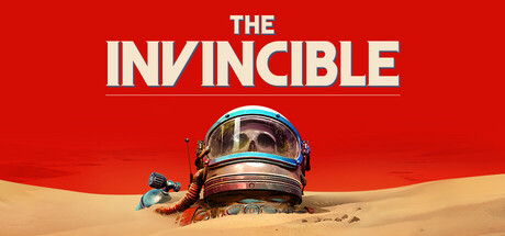
Rethink human’s dominion in The Invincible: a story-driven adventure set in a hard sci-fi world by Stanisław Lem. Discover planet Regis III as scientist Yasna, use atompunk tools looking for a missing crew and face unforeseen threats. Make choices in a philosophical story that’s driven by science.

$2.99Very Positive(173)
Dialogue HeavyAdventureRobots
Starward IndustriesNov 6, 2023

The Invincible scores 82/100 — better than 97% of Dialogue Heavy capsules (n=678).

Very Positive (173 reviews) · $2.99 · Released Nov 6, 2023 · By Starward Industries

Quick text summary

The Invincible scored 82/100 on Steam Analyzer — Good for a Dialogue Heavy capsule. Top priority fix: [contrast_color] Slightly increase the value contrast on the helmet silhouette against the sandy ground to improve separation in grayscale and at tiny sizes.

Capsule scores by dimension

  • Genre Clarity: 8/10 — Sci-fi mystery, clear atmosphere. The half-buried astronaut helmet with a skull visible through the visor instantly communicates retro sci-fi and a sense of isolation or death on an alien desert world. The atompunk aesthetic and warm orange-red desert palette reinforce the hard sci-fi adventure genre effectively. At tiny size the helmet silhouette with skull is still readable enough to imply sci-fi survival or horror-adjacent mystery.
  • Title Readability: 9/10 — Bold serif title, highly legible. The title 'THE INVINCIBLE' uses a large, bold serif font with strong cream-white coloring against the deep red background, creating excellent contrast that holds even at tiny thumbnail size. The word hierarchy with 'THE' smaller above 'INVINCIBLE' in oversized lettering creates a clean typographic lock-up. At small and tiny sizes the main word 'INVINCIBLE' remains fully readable due to its generous weight and scale.
  • Contrast & Color: 8/10 — Strong red field, clear separation. The bold red upper field creates strong contrast against Steam's dark #1b2838 background, making the capsule pop immediately in a quick scroll. The helmet subject in the lower half sits on warm sandy tones which separate it clearly from the red sky zone, creating a natural two-zone composition. In grayscale the helmet reads well against both the sand and sky, though the lower sandy section has slightly compressed value range.
  • Uniqueness & Polish: 8/10 — Distinctive atompunk visual hook. The half-buried helmet with a skull is a striking and memorable visual metaphor that immediately communicates danger and loneliness without being generic. The retro-futurist atompunk design language on the helmet with its blue visor ring and copper tones gives it a distinctive period-specific identity that sets it apart from modern sci-fi capsules. The composition avoids the common 'hero character facing camera' trope, which adds originality and intrigue.
  • Brand Consistency: 8/10 — Cohesive atompunk desert identity. The red planet desert palette, retro-futurist helmet design, and warm sandy tones form a coherent internal visual identity that aligns well with the Stanisław Lem hard sci-fi source material. The limited palette of red, cream, sand, and aged copper creates a recognizable signature that would carry through store screenshots and marketing materials. The skull motif within the helmet adds a recurring brand anchor that is memorable and thematically resonant.
  • Composition: 8/10 — Clean two-zone hierarchy, strong focal point. The composition splits cleanly into a bold typographic red upper zone and a detailed illustrative lower zone, creating a natural reading order of title then subject. The helmet is centered and large enough to dominate the lower half without feeling cramped, and the scattered debris elements to the sides add environmental storytelling without cluttering the focal point. At small size the helmet silhouette and title both compress well, though at tiny size the skull detail inside the visor is lost and becomes a generic dark smudge.

What works

  • Bold red background contrast. The saturated red field immediately separates the capsule from Steam's dark interface and draws the eye in a quick scroll.
  • Iconic skull-in-helmet motif. The half-buried helmet with visible skull is a memorable and genre-appropriate visual hook that communicates mystery and danger without relying on a conventional hero pose.
  • Highly readable serif title. The oversized bold cream 'INVINCIBLE' text reads cleanly even at tiny thumbnail sizes due to strong weight and red background contrast.
  • Distinctive atompunk aesthetic. The period-specific retro-futurist design of the helmet and scattered tools creates a unique visual identity that stands apart from contemporary sci-fi capsules.

What hurts the capsule

  • Skull detail lost at tiny size. The skull visible through the visor, which is the emotional core of the image, becomes an unreadable dark smudge at 120x45 thumbnail size.
  • Lower half value compression. The sandy desert floor and helmet share similar mid-tone warm values, reducing silhouette clarity in grayscale and at very small sizes.
  • No gameplay or genre UI cue. While the sci-fi theme is clear, there is no visual hint at the first-person walking simulator or choice-driven narrative nature of the game, which may mislead players expecting action.
  • Debris elements read as clutter at small size. The small scattered equipment pieces on either side of the helmet lose their storytelling value at small sizes and can appear as visual noise around the focal point.

Priority fixes

  1. [contrast_color] Slightly increase the value contrast on the helmet silhouette against the sandy ground to improve separation in grayscale and at tiny sizes.
  2. [genre_clarity] Consider adding a subtle UI or narrative cue such as a compass or notebook element to hint at the exploration and choice-driven gameplay loop.
  3. [composition] Reduce or simplify the scattered debris elements at the sides so the helmet remains the unambiguous sole focal point when the image is compressed.
  4. [title_readability] Ensure 'THE' subtitle text above 'INVINCIBLE' is not further reduced in any variant, as it approaches the minimum legibility threshold at tiny size.

Store copy priority fixes

  1. [hook_strength] Rewrite the short description opening to lead with a concrete action: 'Explore the hostile planet Regis III as scientist Yasna, piecing together your crew's disappearance through atompunk tools and dangerous encounters' to immediately clarify exploration and search mechanics.
  2. [feature_communication] Add a sentence in the detailed description explaining the core gameplay loop: e.g., 'Explore environments, examine artifacts, conduct conversations with other beings, and choose dialogue paths that reshape the story outcome' to clarify minute-to-minute player actions.
  3. [genre_clarity] Clarify whether threats involve combat, stealth, puzzle-solving, or avoidance by revising 'face unforeseen threats' to 'confront the planet's lethal ecology and advanced robotic civilizations through dialogue and careful navigation' to resolve action vs. walking simulator tension.
  4. [uniqueness] Add a comparative sentence: 'Unlike typical space adventures, The Invincible grounds sci-fi in hard science and evolutionary biology inspired by Stanisław Lem's philosophical masterwork' to sharpen differentiation from broader narrative adventure games.

Related guides

Steam app ID: 731040 · Tags: Dialogue Heavy, Adventure, Robots, Futuristic, Walking Simulator