Scoring genre clarity...

Workers & Resources: Soviet Republic capsule

Workers & Resources: Soviet Republic

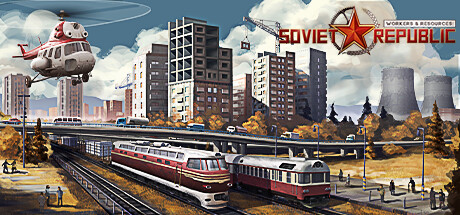
Build a soviet republic from an impoverished country into a rich industrial superpower in a city builder with intricate production chains and a fully simulated global economy. Manage the lives of your citizens from education to work and party loyalty to criminal activity.

$9.99Very Positive(381)
StrategySimulationCity Builder
3DivisionJun 20, 2024

Workers & Resources: Soviet Republic scores 82/100 — better than 93% of Steam capsules we've analysed (n=22,658).

Very Positive (381 reviews) · $9.99 · Released Jun 20, 2024 · By 3Division

Quick text summary

Workers & Resources: Soviet Republic scored 82/100 on Steam Analyzer — Good for a Steam capsule. Top priority fix: [title_readability] Reduce tagline size or remove secondary text to ensure title focus remains strong at all sizes, keeping the red star logo as the sole primary mark.

Capsule scores by dimension

  • Genre Clarity: 9/10 — Soviet industrial city-builder immediately clear. The capsule communicates strategy and simulation through iconic Soviet visual language: the red star logo, Cyrillic text, utilitarian apartment blocks, industrial smokestacks, and a command-economy transportation network (helicopter, train, rail infrastructure). At TINY size, the red star, blocky architecture, and autumn industrial aesthetic still read as distinctly Soviet strategy-building, leaving no ambiguity about the core loop of managing infrastructure and resources.
  • Title Readability: 8/10 — Bold Soviet star logo reads at all sizes. The 'SOVIET REPUBLIC' title uses a large red star with bold serif lettering positioned in the top-right area against a controlled sky background, ensuring strong separation from the busy mid-ground. The logo maintains legibility at SMALL size and remains recognizable at TINY size as a distinct mark. The tagline 'WORKERS & RESOURCES' above is readable at full and SMALL sizes but becomes soft at TINY scale, a minor secondary element that doesn't harm primary title clarity.
  • Contrast & Color: 8/10 — Warm golden-hour palette pops cleanly. The capsule uses a strong warm color palette—golden autumn foliage, cream clouds, red vehicles and star—that contrasts well against the cool blue-gray sky and Steam's dark background #1b2838. The red star and red train cars create clear silhouettes with good value separation; the white clouds and sky read as distinct layers. At TINY size, the red accents and industrial gray structures still create readable contrast without muddy mid-tones.
  • Uniqueness & Polish: 8/10 — Distinctive retro-Soviet aesthetic, polished execution. The art direction is visually cohesive and thematically specific—this is not a generic city builder but explicitly a Soviet-era industrial fantasy with carefully curated period-appropriate vehicles (Mi-8 helicopter, streamlined train, brutalist apartments), autumn color grading, and realistic lighting. The composition feels premium and intentional compared to template-heavy simulator capsules, with layered depth and a clear visual hook that communicates the unique selling point of building a Soviet superpower.
  • Brand Consistency: 8/10 — Consistent Soviet industrial visual identity. The capsule establishes strong internal brand consistency through repeated visual motifs: the iconic red star (top right), Cyrillic typography, red and white color palette, utilitarian architecture, and heavy-industry iconography (smokestacks, trains, cranes visible in mid-ground). These elements form a recognizable identity cue set that distinguishes it from competing city builders; the aesthetic is distinctive enough that this same scene would be identifiable as Soviet Republic in a mix of genre peers.
  • Composition: 8/10 — Clear depth layers, strong focal hierarchy. The composition uses effective layering: foreground rail station and citizens provide scale, midground features the iconic red and white train and apartment blocks as the primary visual anchor, and background sky with clouds creates atmospheric depth. The red star logo positioned in the top-right corner guides attention without crowding the central scene; the helicopter adds upper-left interest without overwhelming balance. At SMALL and TINY sizes, the train silhouette remains the primary focal point, and the logo serves as a recognizable brand mark without competing for attention.

What works

  • Immediately communicates Soviet theme. Red star, Cyrillic text, brutalist architecture, and industrial vehicles create unmistakable genre and setting clarity that reads even at TINY thumbnail size.
  • Polished retro-realist art style. Golden-hour lighting, period-appropriate vehicle design, and clean rendering elevate the capsule above template-heavy simulator competitors.
  • Strong color hierarchy and contrast. Warm reds and golds pop against cool sky and Steam's dark background, creating visual separation that survives grayscale and compression.
  • Effective layered composition. Foreground, midground, and background elements guide the eye logically without scattered attention or dead zones.

What hurts the capsule

  • Secondary tagline fades at TINY size. 'WORKERS & RESOURCES' text above the star becomes soft and difficult to parse at thumbnail scale, though the primary logo remains clear.
  • Busy mid-ground could risk cropping. Train and building cluster in center is safe, but some peripheral details (left-side crane, right-side structure edges) sit close to boundaries that may crop on some Steam platform layouts.

Priority fixes

  1. [title_readability] Reduce tagline size or remove secondary text to ensure title focus remains strong at all sizes, keeping the red star logo as the sole primary mark.
  2. [composition] Verify safe margins on left and right edges to ensure no key infrastructure details (crane, structures) are cropped by Steam's capsule frame at any display size.

Store copy priority fixes

  1. [feature_communication] Add a sentence clarifying win/end conditions or confirm this is an open-ended sandbox so players understand the core loop's structure.
  2. [tone_match] Reframe the citizen oppression mechanic with slightly more explicit irony or satirical framing to ensure players understand the dark comedy rather than read it as genuinely dystopian advice.
  3. [hook_strength] Elevate the short description's final clause by replacing 'party loyalty to criminal activity' with a more specific mechanism that hints at consequence (e.g., 'where low loyalty breeds unrest and economic sabotage').

Related guides

Steam app ID: 784150