Scoring genre clarity...

Outward Definitive Edition capsule

Outward Definitive Edition

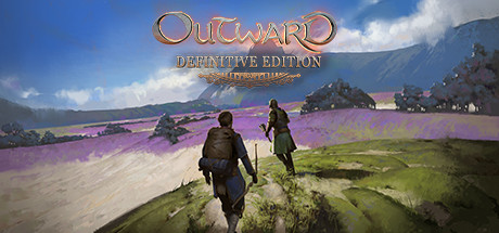
No remarkable journey is achieved without great effort. In Outward, the cold of the night or an infected wound can be as dangerous as a predator lurking in the dark. Explore the vast world of Aurai solo or in Co-op. The Definitive Edition features both DLCs and quality of life improvements.

$4.79Mostly Positive(203)
RPGOpen WorldSurvival
Nine Dots StudioMay 17, 2022

Outward Definitive Edition scores 63/100 — better than 6% of Steam capsules we've analysed (n=22,658).

Mostly Positive (203 reviews) · $4.79 · Released May 17, 2022 · By Nine Dots Studio

Quick text summary

Outward Definitive Edition scored 63/100 on Steam Analyzer — Solid for a Steam capsule. Top priority fix: [contrast_color] Add a subtle dark vignette or shadow beneath the two characters to separate their silhouettes cleanly from the path and increase contrast at small sizes.

Capsule scores by dimension

  • Genre Clarity: 7/10 — Open world RPG journey implied. Two travelers walking away down a dirt path through a lavender-colored landscape clearly signals an adventure or open-world RPG. The backpack on the left character, the weapon on the right, and the vast landscape ahead reinforce exploration and survival themes. At tiny size, the two-character silhouettes read as co-op or companion RPG, which aligns well with the game's identity, though subgenre nuance like survival RPG is lost.
  • Title Readability: 6/10 — Readable full size, collapses small. The 'OUTWARD' logo uses a metallic serif treatment with decorative filigree and sits at the top center against the sky, offering decent contrast at full size. 'Definitive Edition' in a smaller serif below is already marginal at full size and completely unreadable at tiny size. At small and tiny sizes, the decorative letterforms in the main logo become indistinct and the ornate styling competes with legibility rather than aiding it.
  • Contrast & Color: 6/10 — Soft palette limits separation. The overall image uses a soft, painterly palette of muted greens, purple, and sky blue that is pleasant but does not pop strongly against Steam's dark #1b2838 background. The two foreground characters are mid-toned and do not have strong silhouette separation from the midground landscape. In a grayscale mental test, the characters blend into the path and grass, reducing their clarity at small sizes where value contrast is critical.
  • Uniqueness & Polish: 6/10 — Painterly but generically executed. The painterly art style gives it some visual warmth and charm, and the two-travelers-on-a-road composition is evocative. However, compared to top-tier RPG capsules like Baldur's Gate 3 or Metaphor: ReFantazio, this lacks a strong visual hook or memorable identity element that makes it stand out on a browse page. The decorative filigree on the title feels like a generic fantasy asset rather than a distinctive brand element.
  • Brand Consistency: 6/10 — Cohesive tone, weak identity signal. The painterly landscape style and warm-meets-melancholy tone are internally consistent and likely reflect the game's visual direction. However, there is no iconic symbol, character face, logo mark, or signature motif that would make this immediately recognizable as Outward in a lineup. The co-op travelers concept is meaningful to returning players but offers little anchoring brand identity for new audiences.
  • Composition: 7/10 — Classic road framing works adequately. The central dirt road creates a strong leading line toward the background mountains, giving the composition natural depth with foreground characters, midground lavender fields, and a distant sky. The title sits in the sky area at the top, which is a controlled, relatively clean region. At small sizes, the two character silhouettes at the bottom center remain the dominant focal point, though the title area competes for attention and the overall image feels balanced but not exceptional.

What works

  • Co-op theme clearly communicated. Two distinct character silhouettes walking side by side immediately suggests companion or co-op adventure gameplay without any text.
  • Leading line composition. The dirt road draws the eye naturally from the foreground characters toward the distant mountains, creating a sense of journey and scale.
  • Painterly art style. The landscape uses a soft illustrative treatment that gives the image warmth and sets it apart from photorealistic or pixel-art genre peers.
  • Title placed in clean sky region. Positioning the logo against the lighter sky area reduces background noise competing with letterforms at full size.

What hurts the capsule

  • Characters lack silhouette contrast. The two foreground figures are mid-toned against a similarly mid-toned path, causing them to merge with the background in grayscale or at tiny size.
  • Definitive Edition subtitle disappears at small size. The smaller serif subtitle is unreadable at 231x87 and invisible at 120x45, meaning edition distinction is entirely lost for browsing users.
  • No strong brand identity anchor. There is no iconic logo mark, symbol, or signature element that would make the capsule identifiable as Outward specifically rather than any generic fantasy RPG.
  • Weak contrast against Steam dark background. The soft pastel and muted palette does not create a strong pop against #1b2838, causing the capsule to feel recessive in a crowded browse grid.

Priority fixes

  1. [contrast_color] Add a subtle dark vignette or shadow beneath the two characters to separate their silhouettes cleanly from the path and increase contrast at small sizes.
  2. [title_readability] Increase the weight and outline thickness of the OUTWARD logotype and consider integrating 'Definitive Edition' within the logo treatment at a scale that remains legible at 231x87.
  3. [uniqueness_polish] Introduce a distinctive brand element such as a glowing lantern, rune, or symbolic motif associated with Outward's survival identity to anchor recognition.
  4. [contrast_color] Boost the saturation and brightness of the foreground characters slightly so they read as clear silhouettes against the background in a quick scroll grayscale test.

Store copy priority fixes

  1. [hook_strength] Add a secondary hook in the short description that emphasizes the unique spellcasting or consequence systems; current opening focuses heavily on survival stakes but doesn't hint at the ritualistic magic or permanent-decision mechanics that differentiate Outward.
  2. [uniqueness] Expand the City Building and Enchantment System subsections with concrete examples: e.g., 'help refugees build New Sirocco to unlock new merchants and quest lines' or 'combine 85+ enchantment recipes like frost armor with elemental damage for custom builds,' showing what players will actually do.
  3. [feature_communication] Dedicate 2-3 sentences to explaining DLC additions specifically: list 2-3 unique weapons, describe the new dungeons' themes, and explain new mechanics (e.g., The Soroboreans adds X, The Three Brothers adds Y), so upgrade value is clear.
  4. [tone_match] Replace generic phrases like 'ultimate experience' and 'immersive RPG' with grounded, mechanical language ('unforgiving survival where every decision persists,' 'build your legacy through co-op city-building') that matches the challenge-focused opening.

Related guides

Steam app ID: 794260