Scoring genre clarity...

The Sojourn capsule

The Sojourn

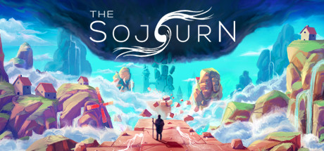
The Sojourn is a first-person puzzle game set in an immersive colour-drenched world of light and darkness. Think your way through dozens of puzzles as you traverse parallel worlds, awaken mysterious artifacts and overcome challenging obstacles on an unforgettable journey.

$3.74Mostly Positive(186)
PuzzleAtmosphericFirst-Person
Shifting TidesSep 29, 2020

The Sojourn scores 80/100 — better than 90% of Steam capsules we've analysed (n=22,658).

Mostly Positive (186 reviews) · $3.74 · Released Sep 29, 2020 · By Shifting Tides

Quick text summary

The Sojourn scored 80/100 on Steam Analyzer — Good for a Steam capsule. Top priority fix: [genre_clarity] Introduce a subtle environmental puzzle element or artifact glow to signal the puzzle-adventure core mechanic at TINY size.

Capsule scores by dimension

  • Genre Clarity: 7/10 — Adventure puzzle game clear. The surreal landscape with geometric structures, a solitary figure on a path, and vibrant color-blocking immediately signal a stylized adventure experience. At TINY size, the silhouette of the protagonist centered on the red platform and the architectural environment still reads as exploratory, though the puzzle-specific mechanics are not immediately obvious from visuals alone.
  • Title Readability: 8/10 — Bold logo with clean serif. THE SOJOURN title uses strong white serif letterforms positioned in the upper-center area against dark sky gradient, ensuring legibility at all sizes. The decorative swirl integrated into the O adds personality without compromising readability; even at TINY size the title maintains clarity and doesn't collapse into illegibility.
  • Contrast & Color: 9/10 — Vibrant saturation pops dramatically. The turquoise-cyan sky, magenta-purple rocks, and warm salmon-red platform create exceptional value separation against the dark Steam background. At SMALL and TINY sizes, the warm-cool color contrast and bright saturation still read distinctly; the grayscale silhouette test shows strong separation between foreground figure, mid-tone platforms, and background architecture.
  • Uniqueness & Polish: 8/10 — Distinctive art style journey. The low-poly geometric aesthetic with bold color choices and dreamy atmospheric lighting sets this apart from generic adventure capsules. The composition conveys a sense of wonder and scale without feeling derivative; the polished render quality and intentional color palette suggest AAA craft rather than template asset use.
  • Brand Consistency: 8/10 — Cohesive surreal world identity. The color palette, geometric art style, and themes of light and darkness are reinforced across the visual design with a consistent low-poly aesthetic. The solitary explorer motif and ethereal environment create a recognizable identity that aligns with the puzzle-adventure genre positioning and the game's thematic promise.
  • Composition: 8/10 — Balanced hierarchy focal point. The centered protagonist figure on the red platform creates a clear primary focal point, with architectural elements framing and leading the eye upward toward the logo. Title placement in the upper third avoids clutter; the layered depth from foreground path through midground rocks to background structures maintains visual interest at SMALL and TINY sizes without scattered attention.

What works

  • Exceptional color contrast. Vibrant turquoise, magenta, and coral hues create outstanding separation against the dark Steam background and maintain legibility at thumbnail size.
  • Strong focal point hierarchy. The solitary figure on the red platform immediately draws attention and creates an emotional focal point that communicates exploration and journey.
  • Polished art direction. The consistent low-poly geometric aesthetic feels intentional and premium, distinguishing it from generic adventure capsules in the market.
  • Readable logo integration. The white serif title with decorative swirl remains clear at all sizes and complements rather than competes with the scenic composition.

What hurts the capsule

  • Genre ambiguity at tiny size. While the aesthetic is striking, the puzzle-specific gameplay hint is not immediately evident; viewers may perceive this as a walking simulator rather than a puzzle game.
  • Limited visual gameplay indicator. No UI elements, interaction cues, or mechanical hints are present to reinforce that this is a puzzle-focused experience rather than pure exploration.

Priority fixes

  1. [genre_clarity] Introduce a subtle environmental puzzle element or artifact glow to signal the puzzle-adventure core mechanic at TINY size.
  2. [uniqueness_polish] Consider adding a light orb or glowing artifact near the central figure to reinforce the game's thematic focus on light and illumination mechanics.

Store copy priority fixes

  1. [feature_communication] Rewrite the short description to lead with the core puzzle mechanic: e.g., 'Master the interplay of light and shadow to solve intricate environmental puzzles across four visually distinct worlds.' This explains what you *do*, not just the setting.
  2. [uniqueness] Add a single sentence explaining the core mechanic that sets this apart: e.g., 'Each chapter introduces new light-manipulation rules that transform how you approach the same spaces.' This differentiates from generic puzzle games.
  3. [feature_communication] Expand the KEY FEATURES section with a concrete mechanic example: e.g., 'Manipulate light sources to reveal hidden paths and unlock puzzle solutions' instead of 'Banish the darkness to reveal obstacles'—be specific about player interaction.
  4. [audience_targeting] Add a brief emotional or audience signal at the end of the short description: e.g., 'Perfect for players seeking meditative, challenging puzzles in a visually stunning world' to help borderline browsers self-identify.

Related guides

Steam app ID: 794960