Scoring genre clarity...

Green Hell capsule

Green Hell

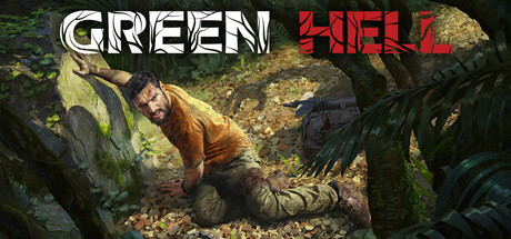
Plunge into the open-world survival simulation set in the extreme conditions of the uncharted Amazon jungle. Use real-life survival techniques to craft, hunt, fight, and gather resources, set a makeshift shelter, or raise a fortress. Survive alone or team up with your friends and challenge the jungle together.

$2.49Very Positive(1,448)
SurvivalOpen World Survival CraftMultiplayer
Creepy JarSep 5, 2019

Green Hell scores 70/100 — better than 30% of Steam capsules we've analysed (n=22,658).

Very Positive (1,448 reviews) · $2.49 · Released Sep 5, 2019 · By Creepy Jar

Quick text summary

Green Hell scored 70/100 on Steam Analyzer — Good for a Steam capsule. Top priority fix: [uniqueness_polish] Incorporate a distinctive visual element—such as a unique character detail, HUD element, crafting item, or Amazon-specific threat (fauna, environmental hazard)—that signals what makes this game's survival mechanics unique.

Capsule scores by dimension

  • Genre Clarity: 8/10 — Survival jungle action clear. The capsule immediately communicates survival gameplay through a grounded, desperate character pose in dense jungle foliage with rock outcrops and tropical vegetation. The khaki/brown clothing and prone survival posture against mossy rocks signal outdoor survival mechanics clearly, though it reads more as general survival than distinctly Amazon-focused at tiny size. At TINY size, the jungle setting and character struggle remain readable and reinforce the genre effectively.
  • Title Readability: 7/10 — Good contrast, minor size issues. The title uses clean, high-contrast white and red text split across the top left and top right against darker background areas. At FULL size the text is sharp and clear with good letterform definition. At TINY size, the spacing between GREEN and HELL creates readable letterforms, though the red HELL portion becomes slightly harder to parse due to thinner strokes, and the overall title compresses enough to require focus.
  • Contrast & Color: 8/10 — Strong separation, warm tones pop. The character's warm yellow-brown shirt creates excellent value separation against both the dark foliage and mossy green rocks, making the subject silhouette immediately clear against the Steam dark background. The white title text and red accent further enhance pop with high contrast. In grayscale test, the character remains a distinct light midtone against darker surroundings, providing solid readability even during quick scroll or blur conditions.
  • Uniqueness & Polish: 6/10 — Competent but familiar survival setup. The image shows solid photography quality and realistic rendering of a genuine survival scenario, but the composition—a prone character in jungle rocks—feels like a stock survival trope rather than a distinctive visual hook or unique mechanic showcase. The visual execution is clean and well-lit, but lacks a memorable art direction, iconic character moment, or unique selling point that differentiates it from other survival game capsules.
  • Brand Consistency: 6/10 — Realistic style, weak identity signal. The photorealistic rendering and gritty survival aesthetic are internally consistent with no visual conflicts, but the image lacks memorable brand identity cues—no iconic character, signature UI element, distinctive color palette, or recognizable motif that would make the game recognizable in future marketing. The style is competent but generic within the survival genre without clear visual differentiation.
  • Composition: 7/10 — Clear focal point, good depth layering. The character positioned center-left in the midground creates a clear primary focal point with dark foliage bracketing left and right sides, establishing depth and framing. The horizontal layout works well across sizes, with the title positioned safely in the top corners away from the critical character area. At SMALL and TINY sizes, the subject remains visually dominant and the composition doesn't collapse, though the surrounding vegetation detail becomes abstract at extreme reduction.

What works

  • Character silhouette remains readable at all sizes. The prone survivor figure maintains clear visual separation from background across full, small, and tiny scales due to warm clothing color against dark foliage.
  • Title contrast effective and well-positioned. White and red text in top corners avoids cluttering the focal character and maintains good contrast against background at all scales.
  • Depth composition guides eye naturally. Foreground rocks, midground character, and background vegetation create clear layering that reads at thumbnail size without visual confusion.

What hurts the capsule

  • Generic survival theme lacks distinctive hook. The image depicts a standard survival struggle scenario without communicating a unique mechanic, setting detail, or memorable visual that differentiates from other jungle survival games.
  • No recognizable brand identity or icon. The capsule shows a realistic scene but offers no signature character, UI element, or distinctive style that would make 'Green Hell' recognizable in future marketing materials.
  • Red text loses definition at tiny sizes. The 'HELL' portion's thinner red stroke becomes less crisp at very small scales compared to the robust white 'GREEN' text, creating minor readability degradation.

Priority fixes

  1. [uniqueness_polish] Incorporate a distinctive visual element—such as a unique character detail, HUD element, crafting item, or Amazon-specific threat (fauna, environmental hazard)—that signals what makes this game's survival mechanics unique.
  2. [brand_consistency] Add a subtle recurring visual motif or signature color accent that could become an iconic brand identifier for Green Hell across future marketing.
  3. [title_readability] Increase stroke weight or add a thin dark outline to the red 'HELL' text to maintain crispness and contrast parity with white 'GREEN' at tiny sizes.

Store copy priority fixes

  1. [uniqueness] Add a sentence explicitly contrasting Green Hell's approach to survival with its competitors—e.g., 'Unlike other survival games, mental health mechanics force you to manage psychological decay, not just hunger and health,' or highlight what makes the Amazon setting or story unique to this game.
  2. [hook_strength] Rewrite the opening line to lead with a specific emotional or mechanical hook rather than setting alone—e.g., 'Survive the Amazon's deadliest threats while unraveling the mystery of your missing wife,' which combines gameplay with narrative urgency.
  3. [feature_communication] Expand the mental health and inspection mode mechanics into a dedicated sentence or bullet explaining how these systems work and why they matter—currently they are mentioned but feel disconnected from the main gameplay loop.

Related guides

Steam app ID: 815370