Scoring genre clarity...

Resident Evil 2 capsule

Resident Evil 2

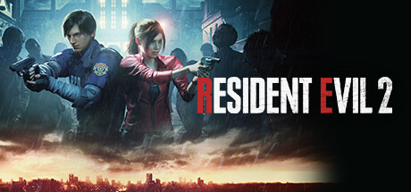
A deadly virus engulfs the residents of Raccoon City in September of 1998, plunging the city into chaos as flesh eating zombies roam the streets for survivors. An unparalleled adrenaline rush, gripping storyline, and unimaginable horrors await you. Witness the return of Resident Evil 2.

$7.99Overwhelmingly Positive(3,687)
ZombiesSurvival HorrorHorror
CAPCOM Co., Ltd.Jan 24, 2019

Resident Evil 2 scores 85/100 — better than 97% of Steam capsules we've analysed (n=22,658).

Overwhelmingly Positive (3,687 reviews) · $7.99 · Released Jan 24, 2019 · By CAPCOM Co., Ltd.

Quick text summary

Resident Evil 2 scored 85/100 on Steam Analyzer — Excellent for a Steam capsule. Top priority fix: [contrast_color] Increase the rim lighting or brightness separation on the zombie silhouettes in the midground to ensure they read as distinct horror elements at tiny size.

Capsule scores by dimension

  • Genre Clarity: 9/10 — Survival horror genre unmistakable. Two armed characters in defensive postures against a dark, rain-soaked cityscape with shadowy zombie silhouettes in the background leave no ambiguity about survival horror. The guns, tense body language, and ominous stormy atmosphere communicate the genre immediately. Even at tiny size, the armed duo and dark horror atmosphere are readable enough to signal action-horror clearly.
  • Title Readability: 9/10 — Bold logo reads at all sizes. The RESIDENT EVIL 2 logo uses large, bold white capital letters with a signature red accent on the R, placed against a relatively clean dark mid-right area of the image that provides strong contrast. At small and tiny sizes the chunky letterforms hold up well and the title remains legible. The iconic franchise logo styling adds instant recognition for returning fans.
  • Contrast & Color: 8/10 — Strong dark atmosphere with clear subjects. The two foreground characters are well-lit with warm highlights that separate them cleanly from the cold dark blue-grey background, creating solid value separation. Leon's blue police jacket and Claire's bright red jacket provide deliberate color contrast against the desaturated environment. In grayscale the character silhouettes still read cleanly, though the zombie silhouettes in the background merge somewhat with the sky at tiny size.
  • Uniqueness & Polish: 8/10 — Premium cinematic craft, recognizable IP. The render quality is high-fidelity AAA cinematic, with convincing rain effects, volumetric lighting, and detailed character models that feel premium and polished. The composition avoids generic fantasy tropes and instead leans into the specific Resident Evil aesthetic with recognizable characters. However, as a remake of a beloved title, it relies heavily on IP recognition rather than a unique visual hook that would distinguish it from other dark action capsules to unfamiliar players.
  • Brand Consistency: 9/10 — Strong Resident Evil identity signals. The iconic red-accented RESIDENT EVIL logo, Leon and Claire as immediately recognizable franchise characters, and the signature cold desaturated horror palette are all strong brand identity signals. The rain-soaked Raccoon City backdrop and the specific character costumes are deeply tied to RE2 lore and would be recognized by fans instantly. The capsule would coherently match screenshots and promotional materials from the same game.
  • Composition: 8/10 — Dual character focal point, solid hierarchy. The two characters dominate the left-center of the frame as a clear primary subject, with the title logo occupying the right side in a clean split that avoids overlap and clutter. The background layers from zombie silhouettes in midground to the stormy city skyline create effective depth. At small size the dual character arrangement still reads clearly, though at tiny size they compress into a single merged shape, which still communicates a human subject adequately.

What works

  • Iconic character recognition. Leon and Claire in their signature RE2 costumes serve as instant recognition triggers for franchise fans at any size.
  • Strong value contrast. Warm-lit character foreground against a cold dark background creates clean silhouette separation that holds up in grayscale.
  • Logo placement on clean background. The title logo is positioned against a relatively uncluttered dark area, ensuring high legibility even at small capsule sizes.
  • Genre tone immediately communicated. The combination of armed characters, zombie silhouettes, and stormy atmosphere removes any ambiguity about the survival horror genre.

What hurts the capsule

  • Background zombies merge at tiny size. The shadowy zombie figures in the midground blend into the dark sky at tiny thumbnail size, losing an important horror context element.
  • IP-dependent uniqueness. Without franchise recognition, the capsule reads as a competent but somewhat generic dark action-horror image with no single standout visual hook.
  • Dual characters compress at tiny size. The two-character arrangement merges into a single indistinct shape at 120x45, reducing compositional clarity at the smallest viewing size.
  • Limited warm color variety. The warm highlight on characters against a uniformly cold-blue background is effective but leaves the overall palette feeling narrow and slightly monotonous.

Priority fixes

  1. [contrast_color] Increase the rim lighting or brightness separation on the zombie silhouettes in the midground to ensure they read as distinct horror elements at tiny size.
  2. [uniqueness_polish] Introduce a more singular iconic visual hook such as a closer crop on one character's face with a zombie reflection or a more dynamic environmental detail that communicates the specific RE2 setting without relying solely on IP recognition.
  3. [composition] Consider a slight crop adjustment to push the two characters slightly closer together and more centered so they read as one cohesive subject shape at the smallest thumbnail size.
  4. [brand_consistency] Ensure the Capcom or Resident Evil franchise mark is visible at full header size to reinforce publisher trust signals for players unfamiliar with the characters.

Store copy priority fixes

  1. [hook_strength] Replace 'Witness the return of Resident Evil 2' with a forward-looking statement about what makes the remake essential, e.g., 'Experience the remake that redefined survival horror for a new generation' or lead with the dual-perspective mechanic.
  2. [uniqueness] Add a sentence after 'modernized controls' that explicitly compares this remake to the original or competitors, e.g., 'Built on Capcom's RE Engine, this is the first time Raccoon City has been rendered in photorealistic detail with dynamic gore physics.'
  3. [audience_targeting] Insert a brief accessibility or difficulty note such as 'Designed for both series veterans and newcomers to survival horror' or mention difficulty options to clarify who the intended audience is.
  4. [feature_communication] Expand the 'collect and use items' language into one sentence about resource scarcity or inventory puzzles, e.g., 'Manage limited resources and inventory as you scavenge the RPD for weapons and healing items to survive.'

Related guides

Steam app ID: 883710