Scoring genre clarity...

Bee Simulator capsule

Bee Simulator

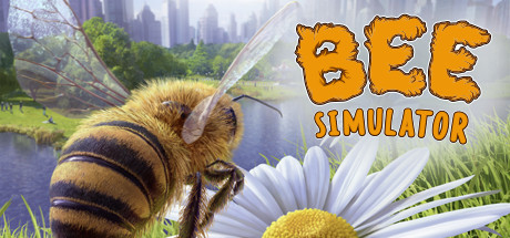
Live the big adventure of a small bee! Explore a world brimming with life in which you collect pollen, defy dangerous wasps and save your hive! Play with others in three game modes, including four players co-op and PvP on split screen.

$3.99Mostly Positive(10)
FlightFamily FriendlyAdventure
VARSAV Game StudiosNov 17, 2020

Bee Simulator scores 70/100 — better than 30% of Steam capsules we've analysed (n=22,658).

Mostly Positive (10 reviews) · $3.99 · Released Nov 17, 2020 · By VARSAV Game Studios

Quick text summary

Bee Simulator scored 70/100 on Steam Analyzer — Good for a Steam capsule. Top priority fix: [title_readability] Increase the size and weight of SIMULATOR text and add a stronger dark outline or drop shadow so it remains readable at tiny thumbnail sizes.

Capsule scores by dimension

  • Genre Clarity: 9/10 — Instantly clear bee simulation. The large photorealistic bee dominates the left side with a daisy flower in the foreground, and a city park environment in the background, immediately communicating a nature simulation about bees. The word SIMULATOR in the title reinforces the genre beyond any doubt. Even at tiny size the yellow-black bee body is iconic enough to telegraph the concept, making this one of the clearest genre signals possible for a simulation title.
  • Title Readability: 7/10 — BEE reads well, SIMULATOR smaller. BEE is rendered in a large, chunky orange textured font with dark outlines that reads clearly at full and small sizes. SIMULATOR is noticeably smaller and in a thinner white font below it, which starts to lose legibility at tiny thumbnail size. The title placement on the right half benefits from a relatively controlled mid-tone background, though the organic texture on the BEE lettering adds noise that slightly reduces crispness at reduced sizes.
  • Contrast & Color: 7/10 — Warm bee pops on cool background. The warm golden-yellow of the bee contrasts well against the cool green and blue background, creating good value separation. The white daisy flower in the foreground also provides bright contrast. However, the background city skyline and green foliage share mid-tone values that create some muddiness, and against Steam's dark #1b2838 background the overall image reads acceptably but the green mid-tones don't separate dramatically in grayscale.
  • Uniqueness & Polish: 6/10 — Competent but genre-standard approach. The close-up photorealistic bee with a flower is an expected and somewhat generic presentation for this type of game, feeling like a stock photography approach rather than a distinctive artistic statement. The orange chunky BEE font has personality and the macro photography angle is well-executed, but compared to top-tier capsules like COCOON or Little Kitty Big City it lacks a unique visual hook or memorable stylistic distinction. It communicates the product clearly but does not stand out strongly in a crowded browse session.
  • Brand Consistency: 6/10 — Cohesive but generically natural. The warm golden palette ties the bee, font color, and daisy together coherently, and the chunky textured BEE logo has a recognizable character that could serve as a brand identifier. However, the photorealistic nature photography style is common across many simulator titles, and the capsule does not establish a truly distinctive visual identity that would be immediately recalled on a second encounter. The internal elements are consistent with each other but do not form a strongly memorable brand.
  • Composition: 7/10 — Clear split subject and title layout. The composition uses a clean left-right split with the bee occupying the left two-thirds and the title anchored to the right, which is a functional and readable structure. The daisy in the lower foreground adds depth and a natural focal anchor, while the city skyline provides context without competing. At small and tiny sizes the bee silhouette remains the dominant focal point, though the title SIMULATOR risks being cut or unreadable at the smallest crop sizes given its position near the right edge.

What works

  • Instant genre recognition. The photorealistic bee combined with the word SIMULATOR makes the game concept unmistakable even at a glance.
  • Strong warm-cool color contrast. The golden-yellow bee against the cool green and blue background creates natural value separation that reads well on Steam's dark UI.
  • Chunky BEE logo personality. The orange textured chunky font for BEE adds character and remains readable down to small capsule sizes.
  • Effective depth layering. The foreground daisy, midground bee, and background cityscape create a clear three-layer composition that conveys a living world.

What hurts the capsule

  • SIMULATOR text too small at tiny size. The secondary SIMULATOR text in thin white becomes illegible at 120x45 thumbnail size, weakening the full title read.
  • Generic photorealistic approach. The stock-photography style bee close-up does not differentiate the capsule from other nature or animal simulators and lacks a unique artistic hook.
  • Mid-tone background muddiness. The green foliage and city background share similar mid-tone values that reduce overall contrast in grayscale and at small sizes.
  • No memorable brand icon or motif. Beyond the logo font there is no distinctive recurring symbol or mascot that would make the brand immediately recognizable in future encounters.

Priority fixes

  1. [title_readability] Increase the size and weight of SIMULATOR text and add a stronger dark outline or drop shadow so it remains readable at tiny thumbnail sizes.
  2. [uniqueness_polish] Introduce a more stylized or illustrative art direction element, such as a distinctive graphic treatment or unique character expression, to differentiate from generic animal simulator capsules.
  3. [contrast_color] Darken and simplify the mid-tone background foliage to increase value separation between the bee subject and environment, improving grayscale legibility at small sizes.
  4. [brand_consistency] Develop a small recurring graphic motif such as a honeycomb pattern or stylized bee icon that can anchor the brand identity across the capsule and related materials.

Store copy priority fixes

  1. [hook_strength] Rewrite the short description to lead with the unique micro-perspective mechanic: 'Experience the park from a honeybee's eyes—explore hidden corners, collect pollen, and save your hive from wasps' before mentioning multiplayer modes, making the core experience clearer at a glance.
  2. [audience_targeting] Move 'Play with others in three game modes' or co-op messaging earlier in the short description or lead with family/educational benefits, since families browsing for co-op games need that signal before clicking into details.
  3. [uniqueness] Add one sentence emphasizing what separates this bee game from other insect/adventure sims, such as 'the only flight-based collectathon built for family co-op with realistic Central Park ecosystems' or similar concrete claim.
  4. [feature_communication] Elevate the 'relaxing' and 'educational' angles in the opening paragraph or add a sentence highlighting learning elements (bee behavior, pollination, ecology) to match the Education tag and casual audience expectation.

Related guides

Steam app ID: 914750