Scoring genre clarity...

Zombie Rollerz: Pinball Heroes capsule

Zombie Rollerz: Pinball Heroes

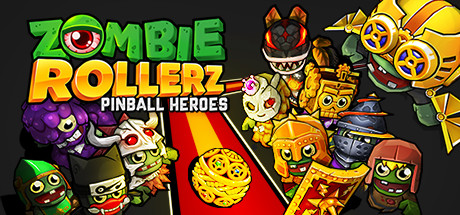
Zombie Rollerz is the ultimate mashup of classic pinball, zombie defense and rogue-like! Shoot, slam and smash your way through hordes of zombies and epic boss fights. Select your hero, it’s time to become a pinball wizard!

$1.49Very Positive(305)
PinballZombiesRoguelite
Zing Games Inc.Mar 2, 2022

Zombie Rollerz: Pinball Heroes scores 70/100 — better than 30% of Steam capsules we've analysed (n=22,658).

Very Positive (305 reviews) · $1.49 · Released Mar 2, 2022 · By Zing Games Inc.

Quick text summary

Zombie Rollerz: Pinball Heroes scored 70/100 on Steam Analyzer — Good for a Steam capsule. Top priority fix: [title_readability] Add a larger standalone PINBALL HEROES subtitle lockup or integrate the word Pinball into the main logo so the genre keyword survives at tiny size

Capsule scores by dimension

  • Genre Clarity: 8/10 — Pinball zombie mashup clear. The glowing golden pinball on a red lane converging toward zombie characters communicates pinball mechanics immediately, and the zombie cast makes the theme unmistakable. At small size the ball-and-lane motif still reads as pinball, though the rogue-like element is not communicated visually. At tiny size the genre cues compress but the ball remains visible and zombie silhouettes still register.
  • Title Readability: 7/10 — Title reads well at full size. ZOMBIE ROLLERZ uses bold, outlined green and yellow lettering with a large eyeball motif that reads clearly at full and small sizes. The subtitle PINBALL HEROES is smaller and at tiny size becomes unreadable, but the main title holds. The outlined cartoon font has good stroke weight that prevents total collapse at reduced sizes.
  • Contrast & Color: 7/10 — Warm palette pops on dark Steam background. The red lane and golden ball create a warm focal anchor that contrasts well against the dark Steam background, and the bright green title text separates cleanly. However the zombie characters on the left side in darker purples and grays blend together and lose individual silhouette clarity at small size. In grayscale the center lane still reads but the flanking character cluster becomes muddy.
  • Uniqueness & Polish: 6/10 — Competent but genre-generic cartoon style. The art is clean and consistent cartoon styling with good character variety, but it carries a mobile-game-adjacent aesthetic that feels familiar rather than distinctive within Steam's marketplace. The central pinball lane is a smart compositional hook that elevates it above pure zombie schlock, but the overall execution does not feel premium or especially memorable compared to top indie benchmarks like Balatro or DAVE THE DIVER.
  • Brand Consistency: 7/10 — Cohesive cartoon identity throughout. The eyeball logo in the title, consistent chunky cartoon rendering across all characters, and the signature warm red-and-gold color scheme form a recognizable visual identity. The character roster approach reinforces the hero-selection mechanic described in the game concept. Internal cohesion is strong with no jarring style breaks between the title treatment and character art.
  • Composition: 7/10 — Strong central lane focal point. The converging red lane creates clear perspective depth and guides the eye from the glowing ball in the center toward the title in the upper left, which is a solid compositional flow. However the character crowd on both sides creates near-equal visual weight competing with the central subject, and at small size the left cluster of darker zombies becomes a muddy mass rather than readable individual characters. The title placement in the upper left is safe but leaves a large dead zone in the upper right.

What works

  • Pinball lane as focal anchor. The red converging lane with the golden glowing ball immediately communicates the core pinball mechanic and creates strong depth perspective that reads even at small sizes.
  • Bold outlined title lettering. The thick black outline on ZOMBIE ROLLERZ prevents the green and yellow text from dissolving into the busy background at reduced sizes.
  • Character variety sells hero selection. The diverse zombie hero roster visually reinforces the game's hero-selection mechanic and gives the capsule a sense of content richness.
  • Warm palette contrast on Steam dark background. The red, gold, and green tones create strong separation against Steam's #1b2838 dark background, making the capsule pop during quick scroll.

What hurts the capsule

  • Left cluster loses definition at small size. The darker purple and gray zombies on the left side merge into an unreadable mass at small and tiny sizes, hurting silhouette clarity.
  • Subtitle unreadable at tiny size. PINBALL HEROES is too small to read at 120x45 thumbnail size, losing the genre-clarifying keyword pinball from the text layer at the smallest viewing condition.
  • Mobile-adjacent polish ceiling. The cartoon art style reads as competent but has a mobile game aesthetic that may signal lower production value to Steam PC audience browsing premium indie titles.
  • Upper right quadrant is dead space. The top right area of the capsule is largely empty, wasting prime real estate that could carry a visual interest element or reinforce the brand.

Priority fixes

  1. [title_readability] Add a larger standalone PINBALL HEROES subtitle lockup or integrate the word Pinball into the main logo so the genre keyword survives at tiny size
  2. [contrast_color] Brighten or add rim lighting to the left-side zombie cluster so individual silhouettes separate from each other at small and tiny sizes
  3. [uniqueness_polish] Introduce a more distinctive background treatment such as a stylized pinball table felt or neon bumper glow to differentiate from mobile-game aesthetic
  4. [composition] Use the empty upper right quadrant to place a small but legible icon or motif such as a bumper or flipper graphic to reinforce genre and reduce dead space

Store copy priority fixes

  1. [uniqueness] Rewrite the mobile continuation sentence to highlight 2–3 specific mechanical improvements for Steam (e.g., 'new Hero synergy system,' 'dynamic difficulty scaling') that justify the port and strengthen differentiation.
  2. [audience_targeting] Add a single sentence after the hero selection text that clarifies the intended player type, e.g., 'Perfect for roguelite veterans seeking arcade precision, or casual pinball fans looking for quick adrenaline rushes.'
  3. [feature_communication] Expand the boss fight description to include what makes each fight distinct (e.g., 'Each boss demands a unique pinball strategy and ability selection') to explain the mechanical depth.
  4. [uniqueness] Replace 'Addicting mashup' bullet with a comparative claim that explains how pinball mechanics solve zombie defense differently, e.g., 'Pinball precision replaces tower placement—control the ball, control the horde.'

Related guides

Steam app ID: 915230