Scoring genre clarity...

DOOMBLADE capsule

DOOMBLADE

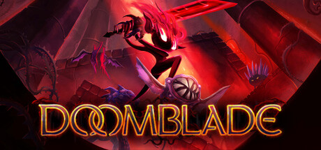
Deep underground, Gloom Girl discovers DOOMBLADE, a sentient weapon hellbent on escape after eons in chains. Together, “Doom and Gloom” embark on a vengeful quest to unlock the powerful abilities and destroy the Dread Lords once and for all in this 2D Action Metroidvania.

$3.99Very Positive(285)
ExplorationMetroidvaniaSide Scroller
Muro StudiosMay 31, 2023

DOOMBLADE scores 77/100 — better than 77% of Steam capsules we've analysed (n=22,658).

Very Positive (285 reviews) · $3.99 · Released May 31, 2023 · By Muro Studios

Quick text summary

DOOMBLADE scored 77/100 on Steam Analyzer — Good for a Steam capsule. Top priority fix: [brand_consistency] Introduce a distinctive visual motif or character design element that could become iconic to DOOMBLADE—consider a unique silhouette feature, color accent, or symbol that differentiates it from generic action game aesthetics.

Capsule scores by dimension

  • Genre Clarity: 8/10 — Action-adventure silhouette reads clearly. The dynamic pose of a character wielding a glowing weapon against demonic/industrial architecture immediately signals action gameplay. At TINY size, the weapon glow and aggressive stance remain readable, though specific Metroidvania mechanics aren't explicitly communicated. The silhouette strength and combat framing successfully convey fast-paced action without ambiguity.
  • Title Readability: 8/10 — Golden text stands out reliably. DOOMBLADE is rendered in warm golden-orange lettering with clean outlines positioned over a controlled mid-ground region, avoiding the busiest visual noise. At TINY size the text remains legible due to strong value contrast and substantial letterform weight. The logo placement below the action keeps the upper focal area open while maintaining clear separation.
  • Contrast & Color: 9/10 — Vibrant palette pops on dark background. The warm red-orange glow and golden title create exceptional separation against the dark purplish background, with strong value contrast that maintains clarity even when squinting. The saturated reds and golds remain distinct in grayscale due to brightness variation, and the character silhouette is cleanly outlined by the neon weapon glow. This design punches hard in quick scroll and at all viewing sizes.
  • Uniqueness & Polish: 7/10 — Stylish but follows genre conventions. The neon-lit action pose and demonic environment aesthetic feel polished and intentional, with coherent lighting and good craft in the glow effects. However, the overall composition—glowing weapon wielder against dark industrial/hellscape—aligns closely with established action game visual language seen in the benchmark titles. The execution is solid but the core hook isn't visually distinctive from peers.
  • Brand Consistency: 6/10 — Competent but generic identity. The warm color palette and neon aesthetic are internally consistent, and the title treatment is memorable. However, there are no iconic character motifs, signature symbols, or distinctive visual markers that would make this capsule immediately recognizable as DOOMBLADE on repeat viewing. The demonic/action theme is thematically sound but doesn't establish a unique brand signature.
  • Composition: 8/10 — Clear hierarchy with strong focal point. The character and weapon occupy the upper-center region as the dominant focal point, with supporting demonic architecture framing the action without competing for attention. The title placement at the bottom provides balance and doesn't interfere with the primary visual read. At SMALL and TINY sizes, the glowing silhouette remains the clear anchor, though some fine detail in the background machinery becomes soft.

What works

  • Exceptional contrast against dark background. The saturated reds and golden typography create strong value separation that reads instantly in quick scroll and maintains clarity at all sizes including TINY.
  • Dynamic action pose communicates genre instantly. The aggressive character silhouette with raised weapon unmistakably signals combat-focused action gameplay without requiring text decoding.
  • Clean title readability and placement. DOOMBLADE's golden outline lettering is positioned on a controlled mid-ground region that avoids visual noise, remaining legible at TINY size.
  • Coherent lighting and glow effects. The neon weapon glow and atmospheric lighting create depth layering that guides the eye naturally through the composition.

What hurts the capsule

  • Generic visual identity for the genre. The neon-glowing-weapon-wielder aesthetic closely mirrors established action game conventions without a distinctive DOOMBLADE-specific visual signature.
  • Limited brand recognition potential. The capsule lacks iconic character traits, symbols, or thematic markers that would make it memorable or recognizable as unique to DOOMBLADE versus other action titles.
  • Metroidvania mechanics not visually communicated. The capsule emphasizes combat and demonic threat but gives no hint of exploration, ability-unlock progression, or the core Metroidvania loop described in the game summary.

Priority fixes

  1. [brand_consistency] Introduce a distinctive visual motif or character design element that could become iconic to DOOMBLADE—consider a unique silhouette feature, color accent, or symbol that differentiates it from generic action game aesthetics.
  2. [genre_clarity] Add subtle environmental or UI cues that hint at exploration and progression systems (e.g., a doorway, lock mechanism, or ability unlock indicator) to communicate the Metroidvania element beyond pure combat.
  3. [uniqueness_polish] Develop a signature art style or thematic detail that signals DOOMBLADE specifically, such as distinctive weapon design language or a unique character identifier that stands out in genre peer comparison.

Store copy priority fixes

  1. [feature_communication] Rewrite the core mechanic paragraph to explicitly define the 'ride through the air to attack' system—e.g., 'Chain air dashes to reach distant enemies and platforms, combining mobility with combat in a fluid action system.' This clarifies the platforming-combat loop.
  2. [audience_targeting] Add one sentence explaining what 'Souls-like' means mechanically in this game—e.g., 'Master punishing combat timing and loss mechanics as you hunt the Dread Lords,' or conversely, 'Enjoy approachable Souls-like design without brutal difficulty spikes' if that's the case.
  3. [feature_communication] Expand the power progression section to clarify progression depth—e.g., 'Unlock new abilities from hidden shrines to unlock previously inaccessible areas and face tougher enemies' (true Metroidvania gating) rather than just 'regain powers.'
  4. [genre_clarity] Add a sentence about the platforming challenge level or precision requirements, especially given the 2D Platformer and Souls-like tags together, so players know if this is a twitch-reflex or puzzle-platformer experience.

Related guides

Steam app ID: 922050