Scoring genre clarity...

Later Alligator capsule

Later Alligator

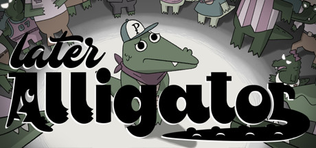
Pat the alligator, a (mostly) harmless and (probably) innocent reptile is at the center of a conspiracy that could bring down the biggest, scariest family in Alligator New York City: his own! Explore the city, meet the Family, and try to save Pat before the clock runs out.

$5.93Overwhelmingly Positive(16)
IndieCutePoint & Click
SmallBü, Pillow FightSep 18, 2019

Later Alligator scores 78/100 — better than 84% of Steam capsules we've analysed (n=22,658).

Overwhelmingly Positive (16 reviews) · $5.93 · Released Sep 18, 2019 · By SmallBü

Quick text summary

Later Alligator scored 78/100 on Steam Analyzer — Good for a Steam capsule. Top priority fix: [title_readability] Increase letter spacing or weight of 'later' prefix at small sizes to ensure the full pun phrase remains separable at 120x45 resolution.

Capsule scores by dimension

  • Genre Clarity: 8/10 — Adventure narrative with quirky charm. The anthropomorphic alligator character in a fedora with a worried expression immediately signals an adventure-comedy game with personality-driven storytelling. At tiny size, the central green character remains distinctive and readable, though the narrative/mystery angle is not immediately obvious without color context. The whimsical art style and character-focused composition clearly avoid action or combat genres.
  • Title Readability: 7/10 — Readable with minor small-size degradation. The title 'Later Alligator' uses a bold, rounded sans-serif font with strong letter separation and clear outline strokes. At full size it reads cleanly; at small size (231x87) the text remains legible though slightly loses dimensional impact. At tiny size (120x45), the subtitle 'later' becomes difficult to distinguish as separate from 'alligator,' but the core title still functions.
  • Contrast & Color: 8/10 — Strong value separation with bright focal point. The white-to-light gray central character and title text create excellent silhouette contrast against the darker background machinery and deep tone of the supporting alligators. The large white oval background behind Pat provides a clear stage that pops against #1b2838, and the green character maintains distinct color separation. In grayscale, the focal point reads cleanly with clear edges and a well-defined rim-lit effect.
  • Uniqueness & Polish: 8/10 — Distinctive indie art style with personality. The deliberately crude, hand-drawn cartoon aesthetic with thick outlines and playful character design feels intentional and charming rather than generic. The visual storytelling—a nervous alligator surrounded by shadowy family members and urban decay—hints at an unusual premise without feeling like a template asset pack. The style matches the quirky, comedic tone described in game metadata and differentiates it from typical action-adventure capsules.
  • Brand Consistency: 8/10 — Coherent character-driven visual identity. Pat the alligator is presented with consistent rendering, expression, and a memorable visual hook (the fedora, nervous eyes, striped shirt). The color palette of muted greens, purples, and grays appears cohesive throughout, and the art direction—hand-drawn cartoon with urban/family conspiracy elements—establishes a recognizable brand voice. The style should remain memorable across future marketing and would be identifiable as this game in isolation.
  • Composition: 8/10 — Strong focal hierarchy with supportive framing. Pat sits clearly in the center with a white spotlight-like background that isolates him from the busier machinery and family members surrounding him. The title sits above in a controlled text zone with adequate spacing, and supporting character silhouettes frame the composition without competing for attention. At small and tiny sizes, the eye naturally reads Pat first, then the title, avoiding clutter or scattered focal points, though the background machinery could create slight noise at medium zoom.

What works

  • Clear character focal point. Pat is isolated by a bright white background oval that immediately draws attention and remains readable even at tiny size, establishing strong visual hierarchy.
  • Distinctive art direction. The hand-drawn cartoon style with thick outlines and playful character design feels premium and intentional, avoiding generic asset library look.
  • Strong contrast and silhouettes. The white-light gray character and title stand cleanly against the darker background, maintaining clear separation in both color and grayscale modes.
  • Readable title at multiple sizes. The bold rounded font with clear letter spacing remains legible from full header down to small capsule view, though some subtitle nuance is lost at tiny.

What hurts the capsule

  • Background machinery adds visual noise. The detailed gears and urban elements surrounding Pat can create slight clutter at medium zoom, potentially competing slightly with the focal point in quick scrolls.
  • Subtitle 'later' merges at tiny sizes. At 120x45 resolution, the 'later' prefix becomes harder to parse as a distinct element, potentially reducing the playful phrasing impact on quick glance.
  • Genre premise not immediately obvious. While the character is charming, the mystery-narrative or point-and-click adventure angle is not visually explicit; viewers might initially guess slice-of-life rather than conspiracy game.

Priority fixes

  1. [title_readability] Increase letter spacing or weight of 'later' prefix at small sizes to ensure the full pun phrase remains separable at 120x45 resolution.
  2. [genre_clarity] Add a subtle environmental or UI hint (e.g., clock element, clue note, or dialogue bubble) to signal the mystery-narrative premise more clearly at tiny size.
  3. [composition] Slightly reduce opacity or desaturate background machinery to push supporting elements further back and protect the focal point in quick-scroll scenarios.

Store copy priority fixes

  1. [genre_clarity] Add 'point-and-click adventure' or 'explore and investigate' to the short description to name the core mechanic upfront.
  2. [feature_communication] Briefly describe the minigame variety or give 1–2 specific examples (e.g., 'including reflex challenges, logic puzzles, and absurdist mini-adventures') to make gameplay more tangible.
  3. [uniqueness] Expand on why the hand-drawn animation and 'densely animated' city elevates this beyond typical point-and-click games.

Related guides

Steam app ID: 966320