Scoring genre clarity...

King of Retail capsule

King of Retail

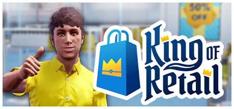
The store is your kingdom! Expand your humble boutique into a thriving business: hire the right staff, decorate your displays, and lure in customers. Even your wildest ideas can turn a profit. Why not start a business that sells only white T-shirts and ketchup? PCs and beans? Your rule, your rules!

$6.49Very Positive(783)
CasualSimulationManagement
Freaking GamesSep 14, 2022

King of Retail scores 70/100 — better than 30% of Steam capsules we've analysed (n=22,658).

Very Positive (783 reviews) · $6.49 · Released Sep 14, 2022 · By Freaking Games

Quick text summary

King of Retail scored 70/100 on Steam Analyzer — Good for a Steam capsule. Top priority fix: [composition] Replace or sharpen the blurred background with a readable store scene or iconic gameplay element (e.g., merchandise display, quirky product combo) that hints at the creative freedom mechanic and reduces visual noise at TINY size.

Capsule scores by dimension

  • Genre Clarity: 8/10 — Clear retail simulation hook. The blue shopping bag with crown logo immediately signals a retail/business theme, reinforced by the thumbs-up character in a shop setting. At TINY size, the bag icon and character pose still read as 'retail business sim' without ambiguity, though fine details of the store background blur into generic office space.
  • Title Readability: 8/10 — Strong legible serif typography. The 'King of Retail' title uses clean blue serif lettering with white outline that maintains clarity at SMALL and TINY sizes. The text placement to the right of the logo avoids the character and provides good contrast against the white background, though at TINY the letterforms compress slightly.
  • Contrast & Color: 7/10 — Good value separation with minor softness. The yellow character shirt, blue shopping bag, and white text create strong silhouette separation against the neutral background. Against Steam's dark theme, the bright yellow and blue-white combo will read well at scroll speed, though the blurred office background creates some mid-tone softness that slightly reduces edge sharpness at TINY sizes.
  • Uniqueness & Polish: 6/10 — Competent but generic presentation. The thumbs-up character and shopping bag logo are functional and appropriate, but the overall aesthetic feels like a standard cheerful retail sim template rather than a distinctive visual identity. The 3D rendered character and clean UI design are well-executed, but lack a memorable hook that distinguishes it from other casual business sims in the market.
  • Brand Consistency: 6/10 — Simple but limited identity signals. The blue shopping bag with crown is a clear icon that could be recognized again, and the yellow-shirt character creates basic brand consistency. However, the capsule offers no signature art style, palette motif, or visual gameplay hook that would make King of Retail immediately recognizable among screenshots from the 22 available store images.
  • Composition: 7/10 — Clear focal hierarchy with good spacing. The character anchors the left side, the shopping bag logo sits prominently center-right, and the title extends across the right—creating a natural left-to-right flow. At SMALL size this reads cleanly; at TINY the character and logo remain distinct, though the store background becomes visual noise that could be simplified for stronger thumbnail impact.

What works

  • Iconic shopping bag logo. The blue bag with crown motif is a clear, memorable visual anchor that immediately communicates 'retail business sim' and remains identifiable at TINY sizes.
  • Readable title treatment. White-outlined serif text on a controlled background maintains legibility across FULL to TINY viewing sizes without collapsing or becoming illegible.
  • Strong color-to-background contrast. Yellow character shirt and blue logo pop distinctly against Steam's dark theme and will read well in quick scroll.

What hurts the capsule

  • Generic blurred background. The soft-focus office/shop interior adds visual clutter without readable detail and doesn't reinforce the unique 'build your kingdom' core mechanic at any viewing size.
  • Undifferentiated visual style. The 3D rendered cheerful character and layout feel templated and don't establish a distinctive art direction or premium identity compared to other casual sims.
  • No gameplay hook communicated. The capsule shows a character and logo but doesn't visually hint at the wild 'sell anything' premise or strategic gameplay, relying only on genre expectation.

Priority fixes

  1. [composition] Replace or sharpen the blurred background with a readable store scene or iconic gameplay element (e.g., merchandise display, quirky product combo) that hints at the creative freedom mechanic and reduces visual noise at TINY size.
  2. [uniqueness_polish] Add a signature visual detail or palette accent (e.g., playful product silhouettes, distinctive typography treatment, or character expression) that differentiates the brand from standard retail-sim templates.
  3. [genre_clarity] Include a secondary visual element that teases the core mechanic—such as absurd product combinations or store customization hints—to elevate genre clarity beyond generic 'retail sim' at TINY size.

Store copy priority fixes

  1. [feature_communication] Add a brief sentence in the detailed description clarifying core customer mechanics—do they have individual preferences, buying patterns, or loyalty systems? Specificity here would strengthen feature understanding.
  2. [hook_strength] Reinforce the high-level pitch in the short description with one sentence about the unique appeal over other tycoon games—e.g., 'build the business only you would dare create' or mention the depth of employee/customer systems.
  3. [audience_targeting] Add a subtle signal about accessibility or complexity level (e.g., 'whether you want a relaxing sandbox or a challenge mode') to clarify who should buy and what playstyles are supported.

Related guides

Steam app ID: 968250