Scoring genre clarity...

Spiritfarer®: Farewell Edition capsule

Spiritfarer®: Farewell Edition

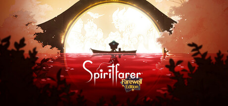
Spiritfarer® is a cozy management game about dying. As ferrymaster to the deceased, build a boat to explore the world, care for your spirit friends, and release them into the afterlife. The Spiritfarer Farewell Edition includes the heartwarming base game and three major content updates.

$4.49Very Positive(233)
EmotionalStory RichIndie
Thunder LotusAug 18, 2020

Spiritfarer®: Farewell Edition scores 85/100 — better than 99% of Emotional capsules (n=1,090).

Very Positive (233 reviews) · $4.49 · Released Aug 18, 2020 · By Thunder Lotus

Quick text summary

Spiritfarer®: Farewell Edition scored 85/100 on Steam Analyzer — Excellent for a Emotional capsule. Top priority fix: [title_readability] Increase spacing or slightly reduce 'Farewell Edition' font size to maintain clarity and breathing room at small capsule size without crowding the primary title.

Capsule scores by dimension

  • Genre Clarity: 8/10 — Strong cozy adventure mood established. The silhouetted boat on calm red water against a luminous sky immediately signals a contemplative journey game with peaceful, narrative-driven gameplay. At tiny size, the boat and water composition remain readable and evoke the cozy management adventure genre. The warm color palette and serene scene composition clearly communicate this is not action-focused but atmospheric and emotional.
  • Title Readability: 8/10 — Clear title with minor tagline concerns. The 'Spiritfarer' wordmark is prominent, well-spaced, and uses a readable serif font with clean white contrast against the red background. The 'Farewell Edition' tagline in yellow-gold reads clearly at full size but becomes slightly cramped at tiny size; however, the primary title remains legible. At small and tiny sizes, the main title carries the recognizability while the subtitle fades acceptably.
  • Contrast & Color: 9/10 — Excellent value separation and warmth. The composition uses a striking warm gradient from cream sky through golden arch to deep red water, creating powerful value contrast against the dark Steam background. The silhouetted boat and foreground elements maintain clean dark-to-light separation even at tiny size, and the grayscale silhouette reads with exceptional clarity. The saturated red-gold palette feels intentional and premium, not muddy.
  • Uniqueness & Polish: 9/10 — Distinctive artistic direction, premium craft. This capsule demonstrates exceptional visual storytelling beyond generic asset use—the backlit boat framed by an arch against a vast glowing sky creates a memorable, cinematic moment that communicates the game's spiritual journey core mechanic. The color grading, lighting effects, and composition feel hand-crafted with intentional art direction rather than template-based. At small and tiny sizes, the evocative silhouette and color work still convey a premium, distinctive identity.
  • Brand Consistency: 8/10 — Consistent warm palette and serene tone. The warm cream-gold-red color scheme aligns with the game's cozy, contemplative brand identity visible in store screenshots. The serif font treatment and silhouette-focused composition reinforce a calm, emotional aesthetic consistent with Spiritfarer's narrative focus. The visual language feels cohesive across the capsule without generic elements, though the arch bridge motif could be more uniquely branded to Spiritfarer specifically.
  • Composition: 9/10 — Perfect focal hierarchy and depth layering. The composition uses excellent depth with clear foreground (red water and silhouettes), midground (boat and arch), and background (luminous sky), creating natural eye flow. The boat sits as a strong primary focal point in the center without feeling flat, and supporting silhouettes guide attention without competing. The title placement below the main scene avoids clutter and ensures safe margins; nothing critical sits near destructive crop edges.

What works

  • Luminous, layered sky creates depth. The glowing arch and gradient sky create a three-dimensional space that feels cinematic and memorable even at small sizes, establishing the game's contemplative, spiritual atmosphere.
  • Silhouette reads perfectly at all sizes. The boat and foreground elements maintain clear, recognizable shapes from full size down to tiny thumbnail, ensuring instant visual communication of the core journey concept.
  • Color palette feels intentional and premium. The warm warm cream-to-gold-to-red gradient balances saturation control with visual interest, avoiding muddy mid-tones and standing out sharply against the dark Steam background.
  • Strong focal point with balanced negative space. The centered boat creates a clear primary subject without wasting prime real estate, and surrounding space guides the eye naturally upward to the luminous sky.

What hurts the capsule

  • Farewell Edition tagline cramping at small size. The yellow-gold 'Farewell Edition' text loses breathing room at small and tiny sizes, potentially reducing legibility in rapid scrolling.
  • Generic arch bridge motif lacks brand uniqueness. While the scene is beautifully executed, the arch and boat composition could feel familiar in indie game marketing, lacking a signature Spiritfarer visual that would aid brand recall.

Priority fixes

  1. [title_readability] Increase spacing or slightly reduce 'Farewell Edition' font size to maintain clarity and breathing room at small capsule size without crowding the primary title.
  2. [brand_consistency] Introduce a subtle signature element—such as a distinctive spirit glow pattern or iconic character silhouette—to make the capsule more uniquely Spiritfarer and aid brand recall across capsule variants.

Store copy priority fixes

  1. [feature_communication] Move the 'About the Game' section and Features list to immediately follow the short description, above all update announcements, so core game information is discovered before patch notes.
  2. [genre_clarity] Add a subheading or brief intro to the Features section such as 'Core Gameplay Loop:' before the activity list to reinforce that these are interconnected systems players will cycle through, not disconnected activities.
  3. [audience_targeting] Consider adding a one-sentence descriptor like 'Perfect for players seeking emotional storytelling, relaxing gameplay, and co-op moments' after the 50+ hour note to further clarify who the game is for.

Related guides

Steam app ID: 972660 · Tags: Emotional, Story Rich, Indie, Management, Relaxing